
The signature of your company, a strong logo has the power to make people think your name without actually seeing the words. It’s your symbol, and as such it should immediately telegraph what you stand for in the minds of your customers. This is why it’s important to consider the attributes of your primary customer in addition to those of your own ecommerce business. When you get a handle on those two things it becomes easier to design a symbol capable of concise communication.
With that said, these are the six elements of an effective logo:
Simplicity
The key to creating a memorable logo is to distill your brand values down to one simple design so it communicates at a glance. Think “less is more.” Keep in mind it will be used in more places than just on your website, particularly if you plan to engage in advertising, events and other marketing activities. It will likely appear on business cards and your digital stationery too. Therefore, it should telegraph its meaning immediately, while consuming as little space as possible.
Unforgettable
An effective logo should be capable of summoning your name all on its own once someone has seen it and connected it with your company. It has been said a picture is worth a thousand words, but in most cases, you will only need your logo to communicate one or two. The brain tends to remember things it can take in easily. That’s exactly why simplicity is also a key element of memorability.
Different
If you’re doing business in an area with many competitors, you might be tempted to go with a design evocative of the industry. The only problem there is everyone else probably has too. Think of the number of dentist logos you’ve seen based on the shape of a tooth. Yes, you know it’s a dentist—but which one? Like your ecommerce theme, the best logos are evocative of your core values more so than what your company actually does in its daily operations. If Apple had gone with a picture of a computer, its logo would’ve been out of place on an iPhone.
Evergreen
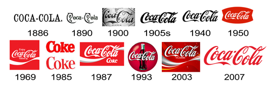
Your goal in this regard is to come up with something that looks good now and will still look good well into posterity. Coca Cola has had the same basic logo since the 1800s. The more stylization you incorporate, the less likely it will be to stand the test of time. Try to avoid falling back upon current design trends. Bear in mind modern and trendy are two different things. Modern is sleek and tasteful, while trendy is stylized and frilly—here today, gone tomorrow.
Versatility
Whether placed on a baseball cap or a building, your logo should look good and be equally communicative regardless of the colors in which it is rendered. In fact, the best logo designers start in black and white to get the basic shape down, then they add color when the outline communicates the desired message.
Appropriateness
If you’re engaged in an industry like law or accounting, you’ll want to avoid a logo evocative of playfulness. Similarly, if your business centers on children, pets or leisure, you want to keep it light rather than somber. To be effective, your logo has to appropriately embody one key aspect of your company’s personality. When you get it right, the viewer will connect the dots and infuse it with meaning based upon their perception of your company.
