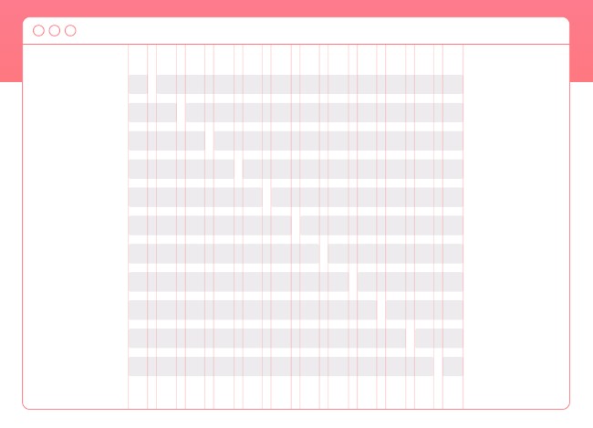
Simple Grid is a mobile-first 12-column CSS grid system to make developing responsive websites easy and fast.
All the code you need is simple and familiar. A parent container class contains the grid. Within the container are rows. Row classes denote rows of content, which can be filled with up to 12 columns. Columns must be nested within a row.
To define your column width, declare how many columns you want your content to take up on desktop and large screens. For example, if your content should take up 6 out of 12 columns (or half the container), your class name will be .col-6.
If you don’t want columns to expand on mobile devices and small screens, simply add -sm to the end of your column class name.


