Web design is an extremely tricky subject. People opine differently about the things that constitute a good web design and the things that doesn’t. While some people believe that websites need to be sleek with an updated and modern design to get attention, others believe that web designs do not matter much and you just need a website that allows people to do what they wish to.
Both the answers are correct depending upon the business or industry you are speaking about.
So how do you figure out what’s right for you? How do you know whether the web designer is aware of the things that they are speaking about and they won’t make any mistake?
There is good news for you. There are a few simple principles you need to follow. Regardless of whether it’s a slick design or not, you need to be aware of a few design principles and the way it applies to your website.
Here are a few mistakes popularly made while designing a website.
Rotating Slider
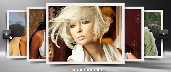
Rotating sliders are a poor way of representing the homepage of a given website. They don’t look good on a page and must be removed immediately. The chief problem with using sliders is that the users hardly get the time to go through the content on sliders since they change quite frequently.
This is not right for websites.
It’s better to avoid the moving sliders unless you have a solid reason to come with one.
Too Small Fonts
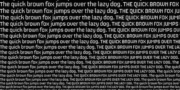
This is one of the most common mistakes that people make. Typography and Readability is one of the most important part of web design
Earlier, websites used very small fonts. The standard was around 12- 14 px and most people followed this standard. With time, people started realizing that fonts of this size are hard to go through.
People also started realizing that there is only limited time to get the attention of visitors and assure them of the fact that they are in the right place.
To secure people’s attention right away, you must:
Remember that the sole purpose behind writing a great copy is to get it read. You certainly don’t want to make the copy hard to read. Right?
Messy Homepage
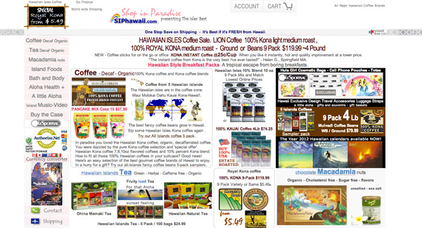
There are several homepages that look absolutely overwhelming. There are numerous things that the website owners intend to communicate to the users and it’s hard to compensate with real and relevant content on a page. The boggling design of the homepage is quite a disaster for users.
The homepage is actually the most important page and this page should tell the users about the product, brand or information that the user is looking for.
Simplicity and cleanliness are prime aspects that are to be followed for the homepage. If a given web page is simple and clean, it will attract more traffic.
Low Contrast Fonts
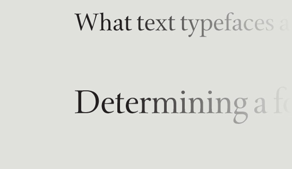
Low contrast fonts are yet another mistake made by people. Low contrast refers to lighter font on light colored background or darker font on the dark colored background. It’s hard to say whether this will look good on print design but it’s better to avoid it in case of the web.
You need to ensure that your website copy is easy to go through. According to a Smashing Magazine article, the amount of light that gets through eyes at 40 is only half the amount that gets through eyes at 20. By the age of 60, this drops further.
With the stats in mind, do you still want to make the text hard to go through especially after you have worked so hard in getting visitors to your website at the first place?
This problem is easy to solve by using the high contrast fonts. If you are using a dark background, go for the light colored fonts and if it’s a light background, go for dark colored fonts.
Remember that it’s not enough to go for high contrast but you also need to use the reverse type sparingly.
Little Focus on User Requirement
Users occupy a crucial part of websites and significance lies in keeping the user on a given website longer and make him feel obliged to visit the website again. There are several websites that do not organize relevant details. They choose to stay focused on internal categories rather than chief content. Everything on a given page must be covered by users and this is possible only when details on a given page are organized perfectly, by using bullets or something similar. It is important for the users to know who you are and what are the services on offer rather than chiefly focus on irrelevant content.
Some sins made in web design are legitimate. Pop-up windows are often deemed vital for a website. They prove their efficiency if you need the users to sign up for a weekly newsletter or provide with a few special offers.
Everything on your page must be so compelling that the users feel excited to visit your website. Remember that this must be your priority while you design a website. You need to incorporate quality information on the website to help the users return in future. So, deploy the sins delicately to help the users be comfortable in visiting a given website. Use them whenever necessary since unwanted sins can annoy the visitors.
