
Even if you have a small business, your brand can be big. Corporate branding occupies a significant part of business as it allows the customers to distinguish you from the rest of the crowd. So how can you choose this identity? Both small as well as large business houses benefit of right branding that refers to the usage of right typeface and colors befitting your identity. Development of a brand for your organization helps to build trust for your company and products.
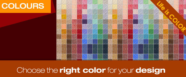
How to pick up the Right Color?
Color is the very first element that people notice. Before shapes, scale, fonts or design, the color registers in the eye of prospects. Choosing the right color palette is vital to promote your brand. Remember that the color must match the identity of your agency. Since different colors end up portraying different meanings and ideas, it’s significant to find the right one. Some colors are more powerful, some are fun and some even looks serious.
– Why Consider the Color?
Color enhances recall and attention span by around 82%. So can you imagine what that means for your business?
By establishing recognizable brand colors, you can build awareness with the marketing pieces you create. It’s really worth taking the effort to create as well as use a color palette that will be associated with your company.
– How to Choose the Right Colors that will Work for your Business?
The most significant questions that you must answer while deciding on the color palette include:
While deciding on the action that you want them to take, check out whether you need them to
– Accentuate Action with Colors
As soon as you have decided on the action, it’s time to use colors to draw people’s attention. The site owners eager to get the visitors opt in to email list may apply accent colors to the opt-in form.
Now let’s check out on some colors with the organization corresponding to them.
Blue
Integrity, authority, loyalty, peace, intelligence
Green
Optimism, growth, youth, relaxation, nature
Yellow
Happiness, warmth, energy, warning
Black
Powerful, mystery, elegant, dramatic, strength, expensive
Orange
Determination, force, success, productivity, vitality
White
Pure, clean, simplicity, clarity, innocence
Red
Power, passion, desire, action, love
Purple
Mystery, spirituality, royalty, ambition, wealth
These are the basic colors. There are several shades of each color that you can use but keeping the chief concepts in mind while picking up the exact shade is significant.
It’s better to choose more than one color but don’t make it more than three. Usage of two different colors works best while choosing an identity. However, you can have accent colors to bring in some variation in the design. If you have a kids daycare, you can use green or bright pink. But if you are a business selling electronics, go for red or deep blue.
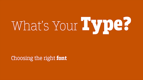
How to Choose the Right Fonts for Marketing?
Well-crafted typography can capture attention, instill emotion as well as reinforce brand message. Choosing the font should never be left to chance; there are quite a few strategic considerations while selecting the perfect typeface.
– Design Following Visual Hierarchy
For most design scenarios, you need two different fonts.
The goal here is creating a visual hierarchy that allows the viewers to scan marketing material, identify the most significant elements and understand how each of these elements relate to other compounds of the screen or the page. This is quite crucial for the marketers. Rather than fastidiously reading all the words, the website visitors often scan only the headlines focusing on the things that interest them most.
– Go for Fonts that are Comfortable to Read
There are a large number of things contributing to how easy a font is to go through. These factors are chiefly broken down into:
Legibility refers to the way typeface is designed and how well a character is possible to distinguish from the other.
Readability refers to the way the blocks or words are arranged on a given page.
– Check out on Utility
Readability is about the way groups of words are arranged on a given page and ease to scan the words and make sense of the layout and the content. There are several technical components of typography contributing to the readability of the typeface including font size, letter spacing and paragraph spacing.
While working through the process of font selection, using just white and black aids in focusing choice on attributes of the font rather than being misguided by color. Color casts an impact on behavior and viewers psychology. Owing to this, choosing fonts and choosing colors are two different steps involved in the process of brand designing.


