

It is rather a tough process to select a typography that will go around the images. There seems to be endless choices- from conventional looking fonts to funky fonts. The success of any dynamic design depends not only on the image but also on the typographical representation- in fact the whole presentation matters.
If you learn to juggle with the typeface, color, and white spaces, you will be virtually able to create any message with proper focus on each of the element.
Selecting a particular font style
Most of the time the beginners have a tendency to search for the new fonts. They always look for something unique and distinctive to express their feelings. However, a new style may be suitable to express your individuality, but may not convey the inherent message. Therefore, this approach is problematic.
You have to understand the differences between the typefaces that are expressive and stylish in relation to those which are appropriate and useful. Striking the right balance may create the wonder. The designers have their personal favorite fonts which they use occasionally. Along with that, in their kit there are some fonts that go with everything. These fonts are more vital than the stylish ones. As you enrich the collection of usable fonts, you will certainly be in a better position as a designer.

In the logo, the phrase “Walt Disney” is in stylish font that blends well with the simple font style.
Use of typefaces
You may have an incredible collection of typefaces in your tool kit. That does not mean that you will put all of them in the same image. Though, there is no hard and fast rule regarding the number of typefaces you can include in a design, it is a safe standard to use two typefaces in the same design. If you try to use more than two typefaces, it can result to a distracting and cluttered effect.
A stylish font goes well with a neutral one. You may use one for body and another one for the title. If you are trying to push another style of font into the mix, the visual cue that guide the eye through the design may be lost. Combining two vivid fonts in the same design can also be distracting.
The age old rule still prevails in case you are trying to use two distinct fonts for your design: concord or contrast, but do not conflict. Using different fonts of similar typeface family is perhaps the easiest way to achieve “concord”. Common examples are Lucida and Lucida Sans or Meta and Meta Sans.
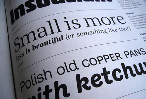
You can find totally different yet complementary typefaces also. You will often find dramatic contrast within the modern serifs. These have more pronounced thick and thin stylish effects. The Bodoni, Walbaum, New Century Schoolbook, and Didot combine best with Geometric sans serifs.
Remember, each typeface has its own personality. Whatever, be the number of typefaces you want to include in a particular design, the personality of each of them should match with the key information you want to convey.
Contrasting colors
Colors can be used to add personality to a design and classify information. Colors are attached with emotions and with numerous qualities. When you are using pink color is a design, the viewers may perceive that you are trying to convey funky and playful information.
Colors can elevate the mood of a copy and give a new meaning to the design elements. There should be enough variation in the color of the texts so that these are visible in relation to the background.
If your background contains a lot of colors, put the texts inside another frame. It will make the texts stand out.
Using white space in design
The design crowded with texts cannot convey a clear idea. Most of the people will not even to bother to read such cluttered messages. Therefore, there should be enough white spaces within the message so that individual words are prominent and overall appearance is clean.
Using whitespace does not signify that your message has to be simple. Make use of the spaces wisely and take best advantage of it through your design. Proper use of white spaces will guide the viewers to the focal point of your design.
Still confused
When you are not sure what will work best for your copy, go big. Larger than life image or texts will grab users’ attention and help to convey the message easily.
There are no ironclad rules suggesting how you will blend the colors, incorporate white spaces, and use the font styles in your design? We have only suggested you a few conventions. It is worth trying every alternative that comes to your mind, just to see what happens. With time and practice, you will develop a sense about what to keep and which one to discard for the design.

")


