If you are serious about your online credibility, the first thing you must do is get a good website designed that impresses your audience. However, if you are making web design mistakes during the course of the web design process, you are definitely going to hurt the reputation of the business the website represents.
There are mistakes, and then there are blunders. While visitors tend to ignore certain mistakes, they don’t like designers making blunders.
Let’s talk about 10 ridiculous webs design blunders that will repel visitors and result in your business profitability taking a beating:
Content Clutter
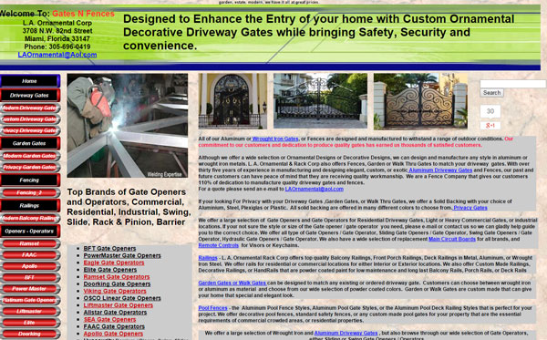 Take a look at this website. All you can see is a large collection of text, links and navigation buttons coming together on the page; these seem to have no specific purpose whatsoever. There is no white space between two lines and low quality images are scattered throughout the site. Did you like what you see? No! That’s not a surprise because visitors don’t like cluttered content on a site.
It seems the designers weren’t very concerned about the impression this site would make on its target audience; that is why they designed the website for themselves and not for users!
Actionable Insight: Use a white background and increase the space between two lines. Focus on better fonts and bulleted lists so that readers grasp important information at a glance.
Bad Navigation
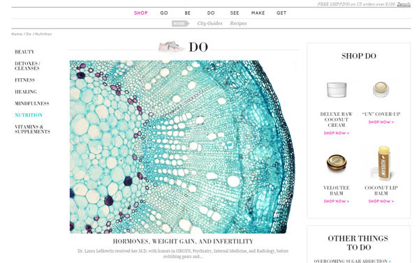 You have a great looking website and good content but if the navigation is confusing, it won’t do any good to your online business.
Look at Goop.com (this is Gwyneth Paltrow’s website) – the navigation bar in the top header is dotted with vague categories like “go”, “be”, ‘do”, etc. It is so frustrating for visitors because they will have no idea what the categories are.
Do not commit that mistake in your website and give your visitors the opportunity to ask questions like:
- Where am I?
- Where can I go next?
- Where will I get what I am looking for?
Actionable Insight: Stick to accepted web navigation conventions and use elements that are easily recognized. Do not invent visual text.
Colors Repel
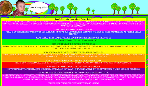 Colors have a special place in web design. If you know how to use the right color at the right place, your job as a web designer is half done. But if you use it the way Penny Juice has done, your visitors will have to use goggles to surf your website!
The color contrast is very harsh and not easy on the eyes. Your eyes strain to read white colored text against the dark coloured background. There is a chance the designer got carried away and decided to use rainbow colors, to terrible effect.
Actionable Insight: Use primary Red, Green and Blue (RGB) colors and analogous and complimentary shades to create matching and contrast color shading wherever required.
Too Much Advertising
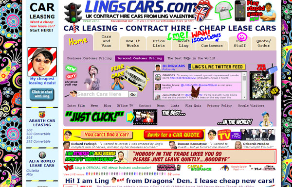 Lings Cars is a fine example of a website that has gone overboard with advertisements. It is difficult to differentiate between content and ads. The entire page distracts and is “good” enough to give you migraine if you focus too hard on the content.
If you find the site has high bounce rates and abysmal ranking in search results, don’t be surprised.
Actionable Insight: Replace advertisement clutter with content that provides insight and incorporate bigger images. Keep one or two ads per page and spread content across pages rather than bombarding it on a single page.
Typos and Grammar Errors
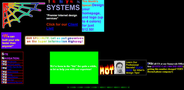 Nothing appears more unprofessional on your website than glaring typo and grammar errors. Look at that headline – Our Specialty: Let us put youselves on the super information Highway!
Was the owner in such a hurry to launch the website that he forgot to proofread the webpage?
Actionable Insight: If you cannot afford a professional editor at least ask your friends, family members or customers to review and provide feedback before the website is launched.
Slow Load Time
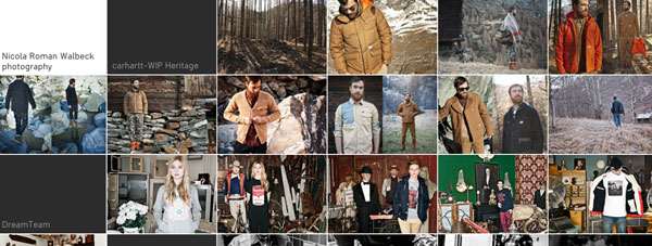 Does your website load so slowly that visitors have enough time grab a cup of tea and cookie?
If this is true, be prepared to face an unsavory truth – your visitors will definitely enjoy their tea and cookie; not at your website but your competitor’s.
Same thing maybe happening at the nicolawalbeck.com; new visitors will definitely move to some other site, the moment they see the slow ticking loading icon on the home page. Many will punish the site by quitting, which leads to higher bounce rates that will also earn the wrath of search engines.
Actionable Insight: Remove unnecessary graphics, links, images and choose a good hosting company to speed up loading time. 3 seconds is an ideal loading time.
Long registration forms
 Visitors are wary of giving away their personal information on the internet. So if you are asking them to fill up a long registration form on your website or blog, do not expect many of them to sign in. Keep in mind, lengthy registration forms act as conversion barriers because it takes time to fill them and the task is quite boring.
Look at the registration form of READOZ, an online publishing company. It is asking for lots of information instead of limiting the registration form size to two fields- email or username and password. Remember, users visit a website to acquire information and not to share information (unless they think it is a good idea).
Actionable Insight: Avoid a long registration form or use social logins to enable visitors to log into your website with their social accounts.
Too many Images/Animations
 Images and animation are used to capture visitor attention but too many of them can backfire and turn off visitors.
Too much of anything is a bad thing.
When you visit the above website, you will have to wait patiently for the home page to display all its images and show off the animation in its attempt to woo you. But I think you will prefer to have a cup of coffee in that time and come back once the home page finally loads.
If you have that kind of patience, you might not find anything wrong with this website! If not, it will just leave you frustrated and irritated.
Actionable Insight: Stick to a minimal numbers of relevant images and use animation only when absolutely needed.
No Search Box
I searched the website Afterlife, from top to bottom for the search box but could not find one. Imagine a website without a search box. How do you search such sites, especially those websites that are packed with information?
Maybe the designer got too smart and thought there was no need for a search box when you (I mean visitors) will fly from hell to heaven along with the website.
Actionable Insight: Put a search box where it is easy to find.
Website is Directionless
Super Web Solutions
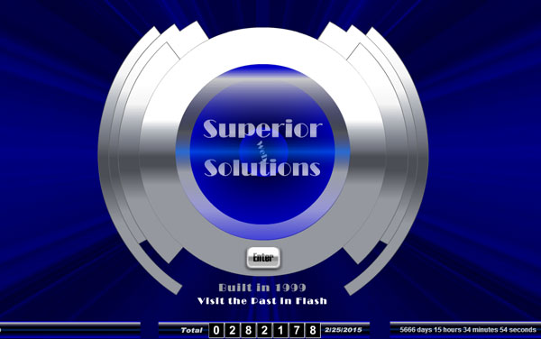
The home page of this site gives you a feeling that Batman might pop up on your screens any time (look at the logo). For quite some time, you will be unaware of what the website actually offers because the space for text is taken up by pointless animations and senseless music.
Most visitors will stay away from such directionless websites and spend their time wisely somewhere else.
Actionable Insight: Get the right content on board and remove unwanted animations and navigational links. Look like a professional company.
The Wrap
My apologies for taking you through some nerve-wracking, migraine inducing websites; but it’s important that we should all learn from somebody’s mistakes. I hope you will not make all these mistakes on your website.
