
Creating an attractive visual identity is paramount to developing a memorable brand that will be remembered. With the development of the internet, even the smallest web sites now have their own logo, corporate (or web site) colors, and aspects that can make them stand out from the crowd.
Because of the level of global competition, it is more important than ever to pay for quality logo development, letterhead and other materials that can be used to present a compelling and unified business image to the world.
The majority of web sites are made cheaply, with poor quality logos . Do please bear in mind that just like with a business card printed on cheap, flimsy card stock, if it looks or feels cheap, prospective clients will be unimpressed. They may want a deal, but they want to be assured that they’ll receive a quality service.
Professional design speaks volumes… We’ve found some examples of classy, creative and eye-catching visual identities to provide an idea how much impact a brilliant design can have for your business and brand.
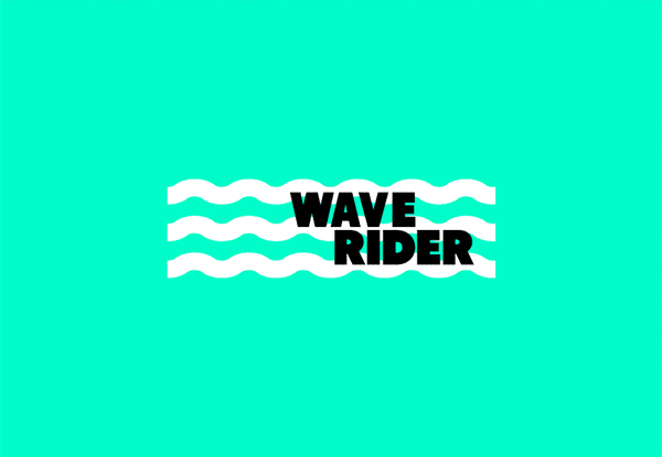
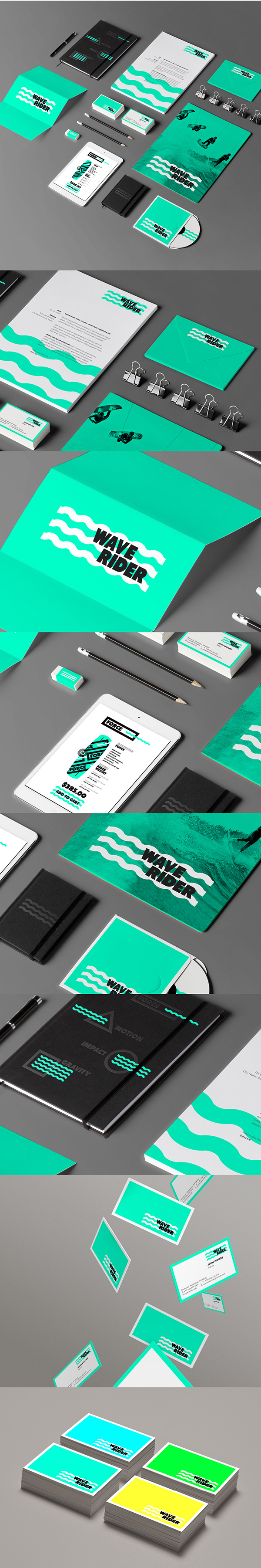
Today we are showcasing WAVE RIDER designed by Jonathan Quintin.Founder & Creative Director
STUDIOJQ.This is the development of a new branding project for a wake boarding company. Developing clean shapes and patterns to illustrate the product range.

