“The mobile pundits got it right: sites should be minimal, functional, with everything designed to help the user complete a task, and then go. But that doesn’t mean that you need to make a separate mobile site from your normal site. If your normal site isn’t minimal, functional, with everything designed to help the user complete a task, it’s time to rethink your whole site. And once you’ve done that, serve it to everyone, whatever the device.” Quotes Bruce Lawson.

I have spent half of my life working on mind-boggling and very challenging web design projects that have garnered me enough respect and attention among my clients. As an experienced web designer I cannot less agree with the above quote by Lawson. He insists on building sites that are highly adaptable, functional and responsive in every sense of the word.
Why so? Simply because ‘content optimization’ is an intimidating medium. When done properly, it has the potential to drive businesses to any level they wish for. As they say, content is king, but I believe that context is important too as well as the device carrying it. A time will soon come when businesses that fail to build responsive sites will no longer enjoy their user’s attention.
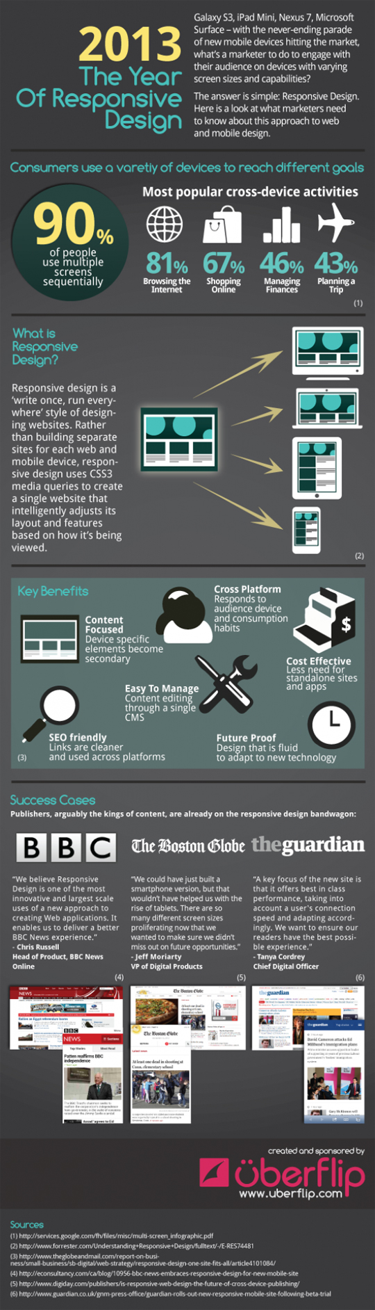
Marketers have realized that people are increasingly using their devices for accessing information about the world. Responsive design helps businesses reach their market and even expand it at a rather exponential pace. An infographic by uberclip beautifully illustrates: the why and how of responsive web design.
A survey by Gartner states that mobile devices will overtake PCs as the most common web access device worldwide and by 2016 PC shipments will be less than 50% than the combined PC and tablet shipments. If this does not ring a bell in your ear, think about it this way – with more and more people asking for wearable or mobile devices you cannot afford to be sticking to the desktop-site-only approach.
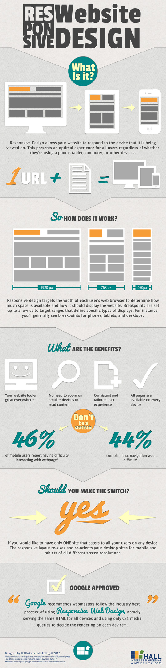
In addition, a variety of devices that serve your content will increasingly demand support from your business and you will be left with no choice but to adopt a multi-device strategy. Google recommends that web-masters must follow the industry’s best practices of using responsive web design namely serving the same HTML for all devices and using only CSS media to decide the rendering on each device.
It is interesting to note, what Van Vuuren argues in this regard – that the responsive approach does not take ‘mobile context’ into account. Yet, a simple search returns many excellent examples of responsive design achieving success in a mobile context. Some successful examples of responsive sites are Sony.com and Disney.com. According to Vuuren, the winning factor with responsive sites is its One Web approach – to offer the same user experience across multiple platforms.
It is no surprise to see responsive design making its way to the e-commerce marketing checklist for 2013. CEO of Trighton Interactive Jody Resnick rightly points out that responsive design is an emerging field. As of now it is being used extensively in web applications too and designers and developers are keenly working on to look for new integrations of responsive design with intense testing.
Resnick predicts, “As the internet transforms further into a platform of services and user interfaces that tie those services together, leveraging this technology in the future will allow companies to integrate a plethora of back-end services, such as Facebook, Twitter, Salesforce.com and Amazon Web Services, and then present the integrated data back out the front-end iad layer on a responsive design so the application looks great on all devices without custom coding needed for each device or screen size. No longer are expensive back-end solutions needed to integrate legacy systems with business partners.”
A new research by Nielsen states that teens in the age group of 12-17 years spend seven hours forty eight minutes per month on average viewing videos on their mobile handsets than on TV. While, 18–24 year olds spend six hours thirty six minutes and 25-34 year olds spend five hours twenty minutes. As per these figures the mobile viewing of videos of 12-17 year olds are 18% more than 18-24 year olds and 46% more than 25-34 year olds.
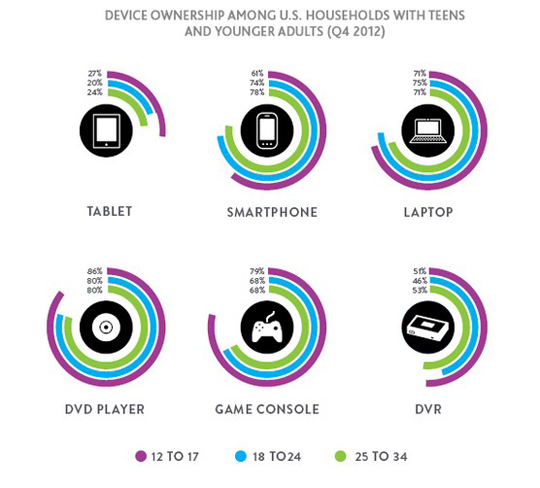
This data shows that device penetration among teens has increased by 45% between the end of 2011 and the end of 2012. The device ownership among U.S teens and young adult households as per Q4 2012 is as follows:
- 12 – 17 year olds – 61% own smartphones
- 18 – 24 year olds – 74% own smartphones
- 25 – 34 year olds – 78% own smartphones
These figures are indeed expressive but what do they really mean for responsive web designers and ambitious brands? You must concentrate your efforts on generation Y by prioritizing responsive design for your business. Users do not need websites for mobile, desktop and tablets separately they need ‘consistent online experiences’ weaved across various platforms.
To Summarize
“My kids are sometimes confused when using the Web to do their homework, as sometimes (often!) two sites will disagree or have conflicting “facts”. It’s a good lesson for them that what we used to call the Information Superhighway is really a ‘communication’ superhighway. It’s good for us to remember that, too, as we finesse our design or finesse our APIs: all the design, all the tech is merely a vehicle for communication. That’s what we’re building”. Quotes Bruce Lawson.
In my opinion, the future is indeed adaptive – the sooner we realize the better we build. With mobile adoption touching the sky brands are left with little or no choice. I feel that this has presented a great opportunity for web designers to better express themselves via different mediums. Not to forget, more traffic and more sales from just a single website that works well on any user-chosen device.
