2012 has come and gone. With that, certain trends are expected to fade away as well. This is not the case with Web design. Although the technology in this field develops at a rapid pace, there are some approaches that have the ability to blend in and still work wonders for websites.
Here is a look at some Web design trends from 2012 that will still work their magic in 2013:
The use of responsive Web design (RWD)
Despite being around for a couple of years, this trend really took off in 2012. RWD aims to create websites that will display well on a wide range of devices, from desktops to tablets. Put simply, people see more or less the same webpage content on different platforms.
As a testament to its rising influence, several sites, including Mashable, TIME, and USA Today, have been redesigned with RWD in mind. With that said, it is good to ask, “Are there benefits to this type of design?”
The answer is YES, and here are the reasons that make it so:
It is great for search engine optimisation (SEO). Since there is only one copy to work with, sites are not plagued with duplication issues. In addition, it helps with ranking efforts because visitors won’t end up frustrated when the site they see on a mobile device looks different from the one they have accessed on a desktop. Satisfied visitors equate to lesser bounce rates and increased engagement making this a great choice for doing well in search results.
It is compatible with several devices. As mentioned above, designers don’t need to bother about creating multiple sites for different devices. They only have to create one and everything is good to go.
It is recommended by Google. More people are using hand-held devices to access the Internet. With that in mind, the search engine giant announced through a post on their Webmaster Central Blog that responsive Web design is the way to go for mobile sites.
Through the desire to reach a wider audience across various devices, look forward to seeing more of this design approach this year.
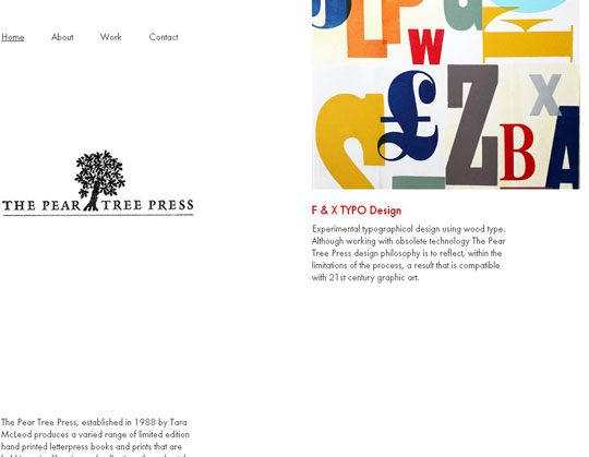
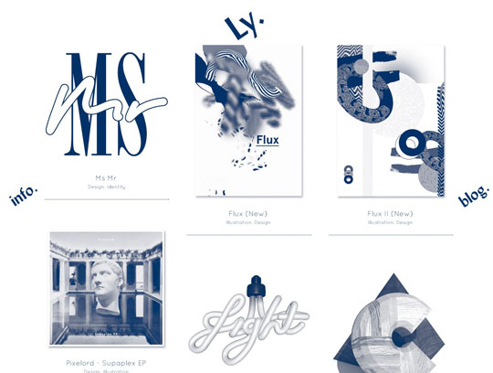
The use of typography for aesthetics
In the past, designers were forced to use fonts that would most likely be installed on the computers of visitors. Luckily, advances in technology have changed this and lots of fancy fonts are now being utilised by many websites.


Without a doubt, creatively designed fonts have the ability to catch the attention of users. Since the attractiveness of a site plays a part in making visitors stay, expect to see loads of really cool typography used on websites.
The use of other technologies instead of Flash
The content put into Flash files can’t be “seen” by search engines; therefore, it is not good in terms of SEO. Imagine not being able to rank for a certain keyword just because it was put into a Flash file.
In addition, Flash isn’t supported by most (if not all) mobile device. Since a lot of users now use hand-held devices to browse the Internet, the chance of reaching this audience is hindered if a website relies heavily on Flash.
Sure, designers can get really creative with Flash. They can create engaging animations that would leave users wanting for more. The thing is, this is easily accomplished through the use of other technologies like CSS3, HTML5, and JavaScript. Even better, most of these are supported across a wide range of devices.
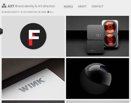
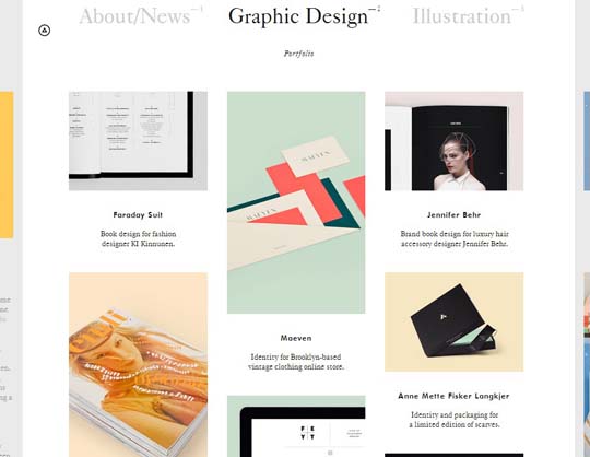
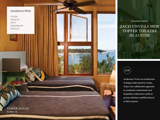
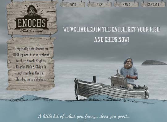
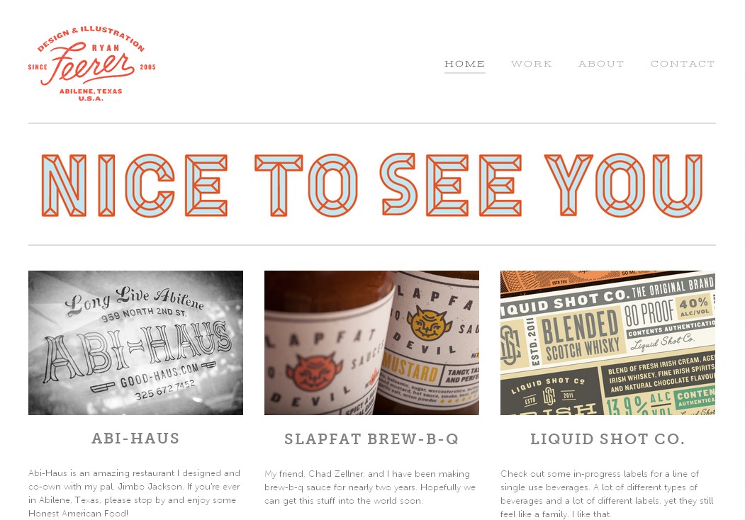
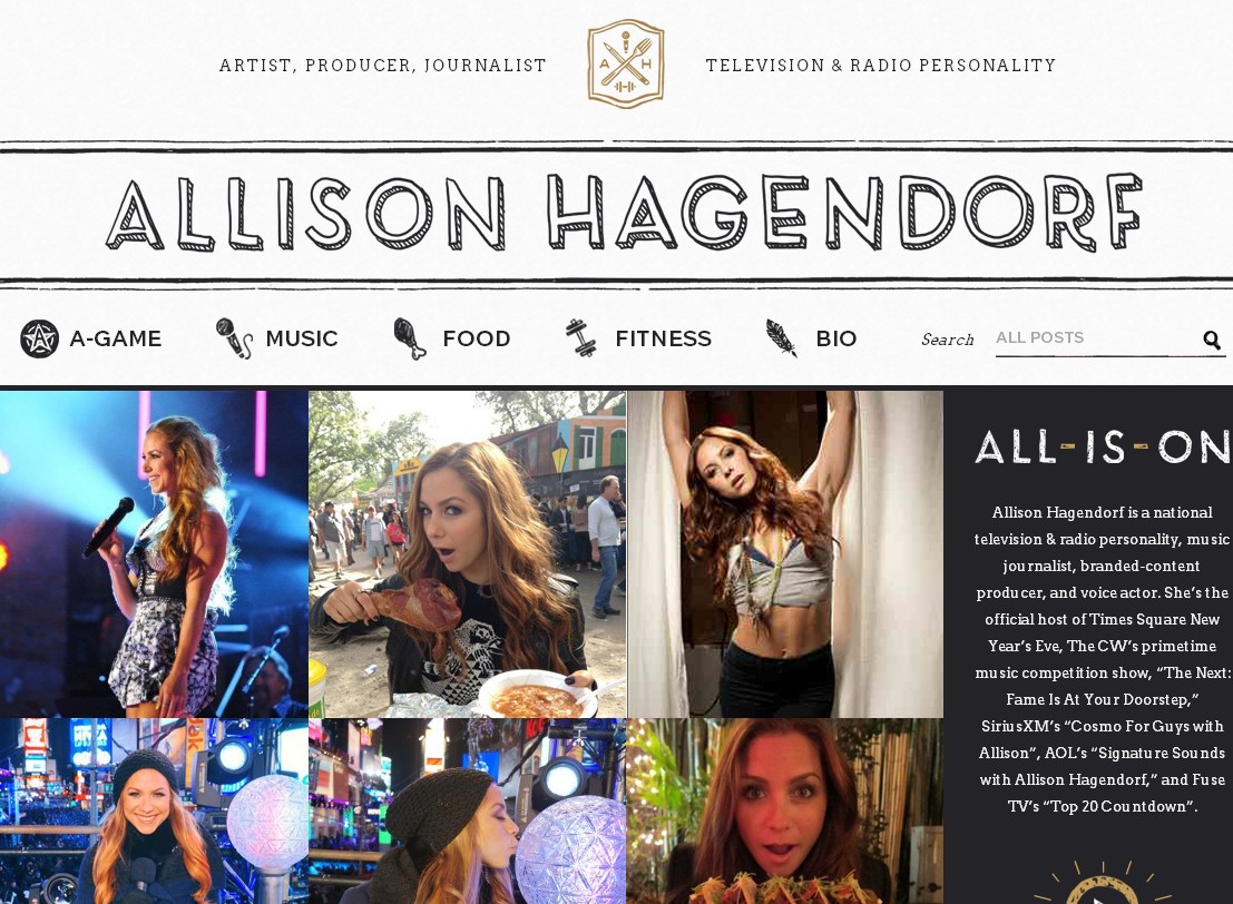
The use of larger images to draw attention
Attracting visitors is one thing, but getting them to stay is a different story. There is no question that big and beautiful photographs have the capability to grab attention. However, these can cause a strain in terms of page loading times causing people to leave, which is not good for anyone who owns a website.
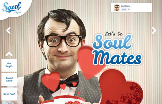
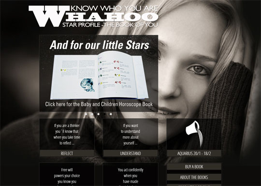

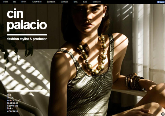
Despite that fact, the past year saw a lot of sites utilising large images on their home pages. Designers of Web pages apply this factor by considering the screen size of users. In short, only those with wide monitors can load big pictures.
The use of minimalistic designs
It has been said repeatedly “less is more”. This phrase is never truer when designing a professional-looking website.

Although great looking visuals capture attention, there is a way to balance both and still leave a sufficient amount of white space. Plus, having a minimum number of elements in the home page helps it load faster.
Wrap up
There is a saying that goes “out with the old, in with the new”. True, 2013 is a brand new year, but in terms of Web design, old tricks still have the ability to do wonders.
