Category

RESOURCES

Category

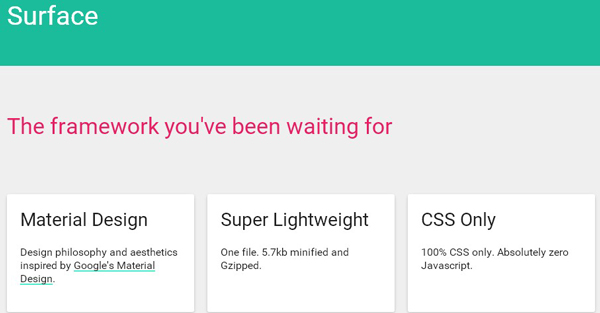
Surface is a Material Design CSS only framework designed and developed by Ben Mildren.Surface is super lightweight – One file. 5.7kb minified and Gzipped. Surface works back to IE10 and Safari 6.1 and it will work on the majority of Firefox, Chrome and Opera builds. Set the variables to your liking in the _variables file. Things like the color scheme, amount of grid columns and spacing are yours to freely alter. Once you’ve had a…

This is a tutorial to create a secondary content panel that folds flat, powered by CSS Transformations and jQuery.Developed by Codyhouse. These kind of folding panels are being integrated quite often in mobile apps ane became very popular. There will be cases when you need to load content, a process that requires time (even if it’s just half a second). In these cases an animation can be a nice way to replace a loading bar,…

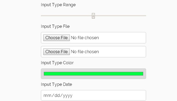
FormHack is a hackable SASS-based css form reset. FormHack works by providing a few variables that allow you to change some common attributes such as border-radius, input height/width, and colours. By changing these attributes, you will get a beautiful form that is consistent across all major browsers. Although there are standard css resets for forms out there, you can easily customize for any site, without having to worry about cross-browser compatibility and differences. SCSS and…

Penguin is a lightweight and extensible front-end framework built with Sass to kickstart any web project for front-end developers. Penguin includes a small Gruntfile for compiling your SCSS, and a set of powerfull Sass mixins. No compass.It’s been developed under MIT license and built with open source tools like Sass, Jekyll, Grunt, and more. Here are the components: Alert, Banner, Breadcrumb, Button, Dropdown, Form, Grid, Icon, Modal, Navigation, Paginator, Panel, Spinner, Tab,Table, Text, Utils.  …

A small, fast, modern, and dependency-free library for lazy loading.Lazy loading boosts page speed by deferring the loading of images until they’re in (or near) the viewport. This library makes it completely painless – maximizing speed by keeping options to a minimum. The scroll event has been debounced to minimize the weight on the browser, and images are revealed within rAF to ensure optimal rendering. For each image, put a placeholder in the src attribute,…

This is a little fun experiment where you can color a website mockup by dragging and dropping a color droplet from a palette.(by Codrops). The idea is to simply drag a color from a color palette to a website mockup and color designated areas of it (like sections or texts). And this is how it can be used: you can drag a color from the color palette and drop it on any area that lights…

Brand new volume 7 from TOP popular deal is really something special. As always, with only highest quality resources – best sellers with retro/vintage and also modern feel in one mega bundle! With almost 96% off, and available for limited time only, you’ll need to grab this mega bundle while you can. This new megabundle is definitely one of best quality design bundles so don’t miss it!!! And with 49 bestseller items from 11 premium…

Scally is a Sass-based, BEM, OOCSS, responsive ready, CSS framework that provides you with a solid foundation for building reusable UI’s quickly. It is a framework focused on scalability and reuse, there when you need it and getting out of your way when you don’t. Scally is designed to be configurable, only requiring you to bring in the parts you are using, keeping your CSS architecture light weight and scalable. It is unopinionated about design…

This is s responsive, magazine-like website layout with a grid item animation effect that happens when opening the content.It’s been developed by Codrops. The responsive layout has a sidebar and grid items that animate to a larger content area when clicked. In the first demo the content area fills the grid (inspired by a concept by Virgil Pana) and in the second demo, the whole layout moves to the left while the grid item is…