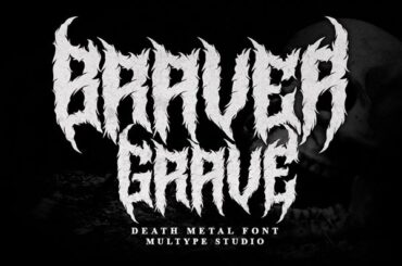
Braver Grave Font Braver Grave Font is an Evil Font by Multype Studio loaded with spikes and cursed details that…
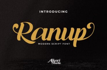
Ranup Font Ranup Font is a Romantic Font by Afkari Studio — a bold, charming handwritten script with stylish characters…
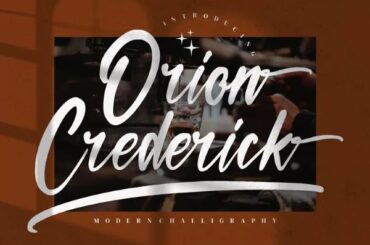
Orion Crederick Font Orion Crederick Font is a Calligraphy Font by Integritype Studio — a graceful blend of hand-drawn lines…
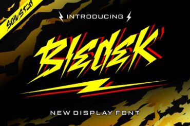
Bledek Font Bledek Font is a Display Font by Solv Vast constructed entirely from bolts of lightning — a one-of-a-kind…
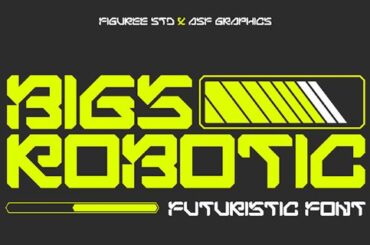
Bigs Robotic Font Bigs Robotic Font is a Robot Font by Figuree — a genuinely surprising geometric design that combines…
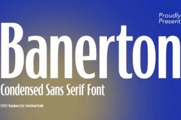
Banerton Font Banerton Font is a Condensed Font by Letterhend Studio that brings a striking formal presence to any design…
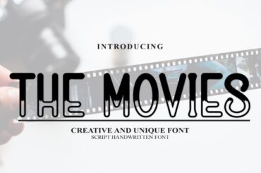
The Movies Font The Movies Font is a Doodle Font by Andi Moz that nails a playful two-tone style with…
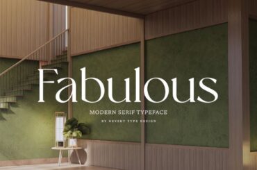
NT Fabulous Font NT Fabulous Font is a Serif Font by Artem Nevsky that conveys timeless elegance and gravity with…
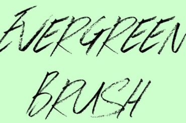
Evergreen Brush Font Evergreen Brush Font is a Brush Font by JSH Creates — a thin, italic script with a…

