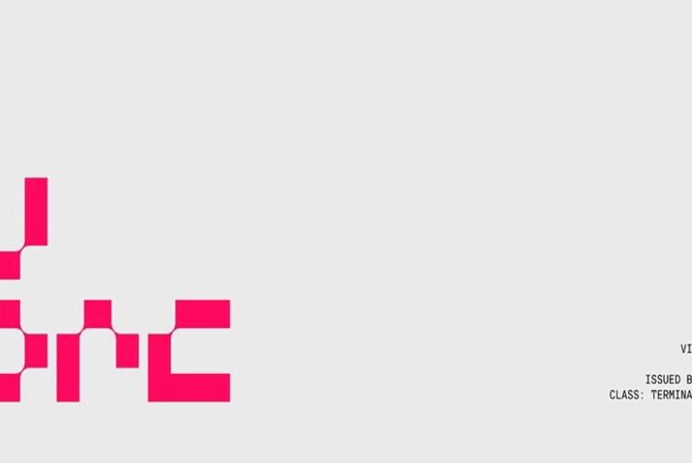
THANKS LAB Font THANKS LAB by Authen Type is a futuristic soft font that achieves a genuinely appealing tension between two usually incompatible typographic personalities: the sleek, hard-edged language of sci-fi and technology design, and the approachable warmth of rounded, smooth forms. The result is a typeface that feels simultaneously bold and friendly — forward-looking without being cold or alienating. Designed for branding, posters, headlines, and UI/UX work with sci-fi or tech themes, it carries…
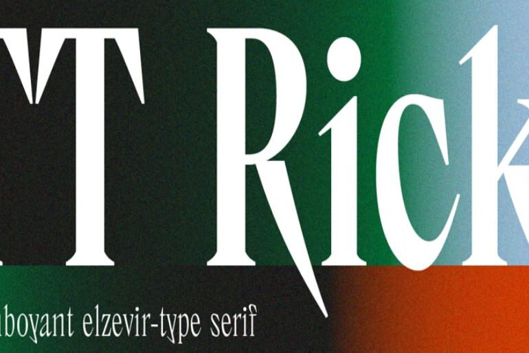
TT Ricks Font TT Ricks by TypeType Foundry is an expressive serif with a genuinely edgy temperament — a historical typeface radicalized. Its roots trace to De Vinne, the pre-digital display serif designed by Gustav F. Schroeder in 1892, but TypeType took that prototype as a departure point rather than a constraint. The resulting typeface keeps some historical DNA while pursuing an entirely new personality: high contrast, extremely dense spacing, narrow letterforms, and serifs that…
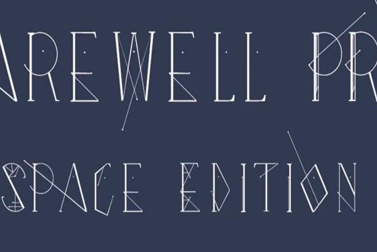
Farewell Pro Font Farewell Pro (Space Edition) by Marianela Grande is a refined update to the designer’s original Farewell Regular, reworked after a year of real-world use to improve on-screen performance and letter rendering. Its clean, understated character makes it a natural fit for titles, posters, and short display texts where legibility at a glance matters — a typeface that reads with quiet confidence rather than asserting itself loudly. The Space Edition brings a particular…
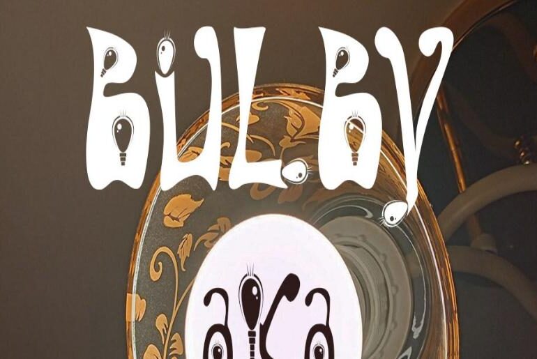
Bulby Font Bulby by Mircea Boboc is a display typeface with a concept as distinctive as its name suggests: the designer created an original light bulb symbol from scratch and then embedded it — in various forms and rhythms — within every single letter and punctuation mark in the font. The result is a typeface that carries a consistent visual motif throughout, creating a letterform ecosystem with a remarkably cohesive and recognizable personality. It is…
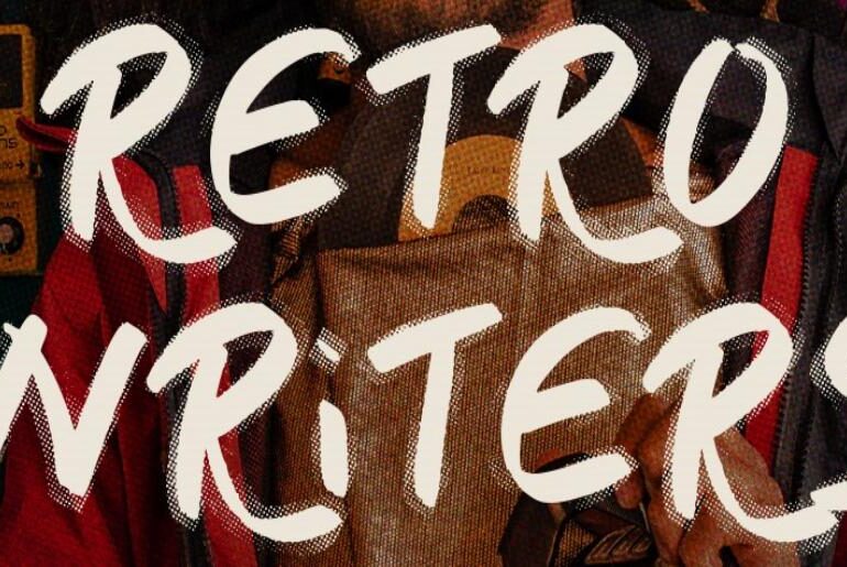
Retro Writers Font Retro Writers by SilverStag Type Foundry is a quirky, grunge-textured display typeface that channels the raw, imperfect energy of hand-lettered signs, old typewriter ribbons, and worn-in print culture. Its genuinely handwritten character — supported by full uppercase and lowercase sets plus an uppercase alternates set — gives it a richness and variation that prevents any two compositions looking identical. Logos, social media graphics, quotes, and retro-themed branding all benefit from the texture…
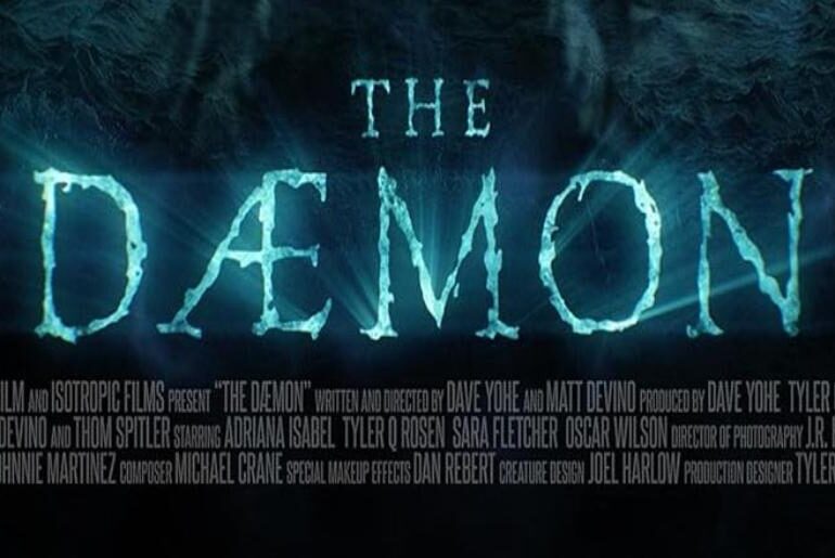
The Dæmon Font The The Dæmon Font (also known as The Daemon) used in the movie’s title design is XXII Totenkult, a typeface created by Doubletwo Studios. It is a decorative gothic display font featuring sharp edges, dramatic strokes, and intricate medieval-inspired details that create a dark, ominous, and ritualistic visual identity. The stylized letterforms give the title a strong supernatural and horror-driven presence, making it ideal for eerie and atmospheric branding. XXII Totenkult is…
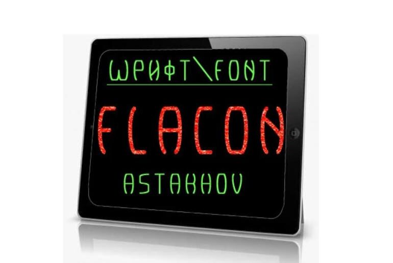
Astakhov Flacon Font Astakhov Flacon by D’ Astakhov is a free font family from Penza-based designer D’ Astakhov, available in both a sans and a serif variant — the Flacon and Flacon Serif. The name evokes the elegant proportions of a glass vial or bottle, and the typefaces carry a corresponding sense of refined structure and quiet character. Whether used in poster work, packaging, branding, or editorial design, the Flacon family offers the rare advantage…
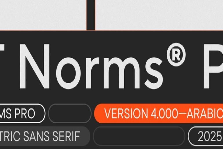
TT Norms Pro Font TT Norms® Pro by TypeType Foundry is, by any reasonable measure, one of the most thoroughly engineered geometric sans-serif families available — a TypeType bestseller with the kind of real-world adoption that speaks for itself. Its client roster includes ASUS, AliExpress, CBSN, DreamWorks, DoorDash, and Intercom, among many others. The typeface occupies a carefully calibrated middle ground between aesthetic and functional: expressive enough to use as an accent, neutral enough to…
NuCore Display Font NuCore by Artyom Galinov is a sleek, angular display typeface from the same Yekaterinburg-based designer behind MARATYPE, and it shares that font’s clear affinity for the visual language of sci-fi gaming — particularly the aesthetic universe of Bungie’s Marathon and Destiny franchises. Where MARATYPE leans into graphic realism, NuCore brings a sharper, more structural character — clean lines and precise geometry that suggest an interface designed for a world far beyond ours.…
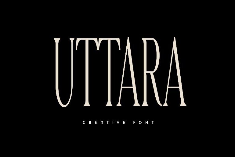
Uttara Font Uttara by VP creativeshop is a free display serif from Varna-based studio VP creativeshop — a typeface with the kind of composed, logo-ready presence that makes it equally at home on packaging, editorial mastheads, and brand identities that call for something classic but with individual character. Its serif construction gives it weight and authority at large sizes, while the overall proportions keep it from feeling stiff or overly formal. A reliable choice for…

