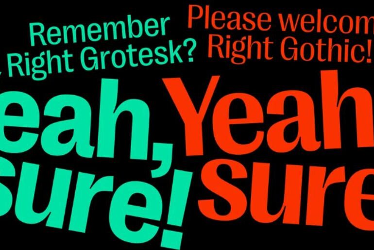
Right Gothic Font Right Gothic by Alex Slobzheninov is the high-contrast sibling of his acclaimed Right Grotesk — a variable type family that deliberately steps back toward serif anatomy, introducing a clearly pronounced stroke contrast that sets it apart from the low-contrast norms of contemporary sans design. The name “Gothic” pays homage to the early pre-Swiss sans-serif tradition, sometimes described as “serif without serifs.” The family is staggeringly large: 98 styles across 7 weights, 7…
For two decades, SEO was the game. Build links. Target keywords. Earn a spot on page one of Google. Entire industries were built around that single algorithm. Then, almost overnight, the rules changed. Large language models — ChatGPT, Claude, Gemini, Perplexity — are now answering millions of questions that used to flow through traditional search engines. Users are skipping the results page entirely and asking AI directly: “What’s the best project management tool for a…
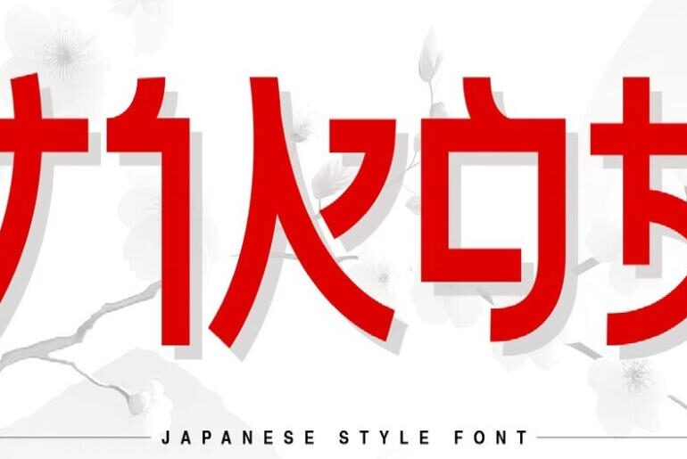
Tikoa Font Tikoa by NaZmuL and FONTYY™ is a bold modern display typeface with a Japanese-influenced flair that brings an unmistakable visual energy to headlines, logos, and advertising. Its letterforms balance assertive weight with a playful, anime-inflected spirit — readable in both digital and print, decisive at large sizes, and dynamic enough to carry a message with genuine personality. Whether you’re working on a brand identity, a poster, or a product label that needs a…
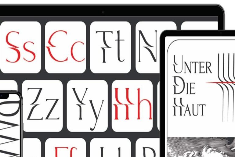
MyScharf Font MyScharf by Artem Saranow is a sharp-edged display typeface that makes a confident statement with minimal fuss. Its crisp letterforms carry a directness and graphic authority that makes it naturally at home on posters, artwork, and anywhere type needs to assert itself cleanly against a composition. There’s a restrained European precision to the design — the word “scharf” means “sharp” in German, and the font delivers on that promise in every stroke. Released…
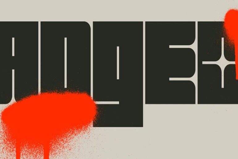
Adgeo Font Adgeo by Ahmet Demir is a screen display typeface built around a genuinely unusual design concept: the negative spaces within each character are shaped to evoke the shimmer and faceting of glitter. Rather than treating counters as simple voids, Demir has styled them as small reflective highlights, adding visual texture and depth to what would otherwise be conventional letterforms. The result is a typeface that catches the eye twice — first for its…
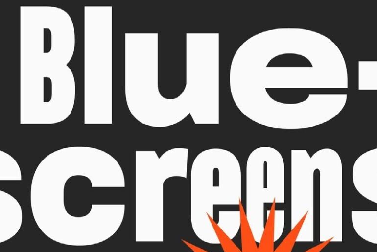
TT Bluescreens Pro Font TT Bluescreens Pro by TypeType Foundry is a modular sans-serif with a decade of evolution behind it. Originally created in 2015 for movie posters and credits, its defining characteristic was a distinctly narrow proportion. Over successive versions it grew into a richer, more multifaceted tool — and in its fourth major release, the designers took an unexpected leap in the opposite direction, adding wide proportions alongside the narrow originals. The result…
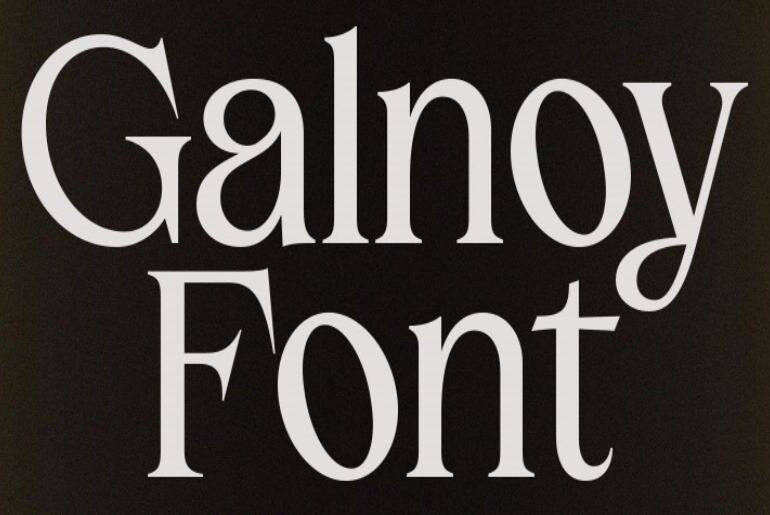
Galnoy Font Galnoy by bydani is a distinctive serif typeface that achieves something genuinely rare: a harmonious marriage of Garalde classical elegance with the ornamental spirit of two Baroque-era movements — Gothic art and Art Nouveau. Rather than simply reviving historical aesthetics, the designer has channelled these influences toward a more modern and contemporary result, producing a typeface that feels both rooted in tradition and thoroughly usable today. Three style variants — designed for display,…
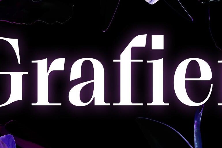
Grafier Font Grafier by Alex Slobzheninov is a serif typeface that takes the 18th-century English tradition of Baskerville as its starting point, then charts its own unmistakable course. Its most defining feature is an uncompromising set of perfectly straight, sharply joined serifs — a brutal linearity that permeates the entire design through flag-terminals, chopped forms, and squarish punctuation. The family spans 10 styles across five weights (Regular to Black) in two contrast variations, all unified…
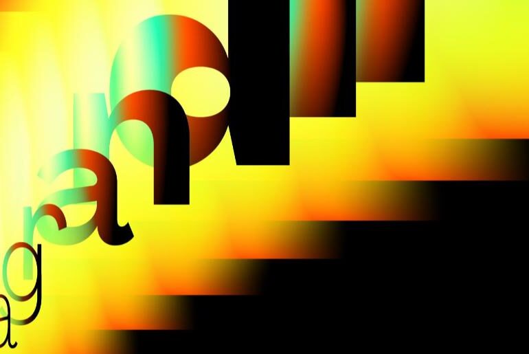
Agrandir Font Agrandir by Alex Slobzheninov is a contemporary serifless type family built on a clear philosophical stance: a celebration of imperfection as a form of humanity. Designed as a deliberate antidote to the neutral precision of modernist fonts, Agrandir embraces unaligned, quirky, and funky letterforms that feel made by people rather than machines. The family is vast — 74 fonts spanning 7 weights, 5 widths, italics, and 4 text styles, all distillable to a…
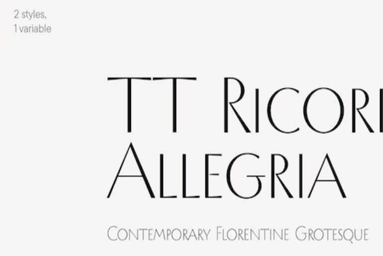
TT Ricordi Allegria Font TT Ricordi Allegria by TypeType Foundry is a modern high-contrast sans with a genuinely unusual origin story. Designed by Antonina Zhulkova as part of the Ricordi font line — a series dedicated to rediscovering typographic treasures in old stone inscriptions and plaques — this typeface draws its inspiration from the semi-erased lettering found in Florence’s Basilica di Santa Croce. A free personal-use trial is available. TT Ricordi Allegria is an architecturally…

