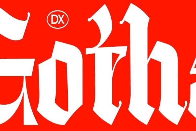
Gotha Blackletter Font Dx Gotha by Hendra Maulia and M. Sadikun is a contemporary blackletter typeface built on a meticulous design principle: fitting the maximum number of letterforms into minimal space. The result is an exceptionally dense, character-rich face — intense and claustrophobic in its rhythm, yet deliberately so. Every glyph is crafted to pack as much detail and presence as possible without losing legibility, making it a powerful tool for display work that wants…
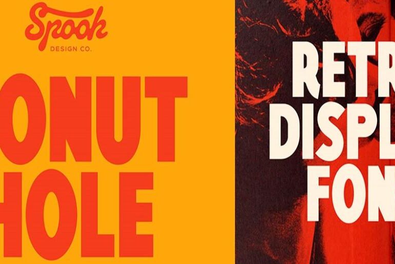
Donut Hole Font Donut Hole by Casper Schutte is a retro display typeface inspired by the hand-painted signage of old-school cafés — warm, imperfect, and immediately likable. It leans into its own awkwardness with confidence, giving any project a quirky, nostalgic character that feels both vintage and fresh. Whether used for food and beverage branding, event graphics, social content, or any design that benefits from a touch of playful handmade personality, Donut Hole brings a…
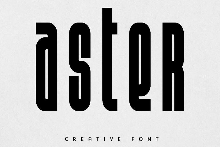
Aster Font Aster by VP Creativeshop is a bold, creative display typeface built for impact. Its confident, heavy letterforms carry a strong graphic presence — the kind of face that anchors logos, makes headlines stop traffic, and gives branding projects an immediate visual authority. Clean enough to work across a wide range of applications, distinctive enough to leave an impression, Aster is a dependable display companion for designers who need weight and personality without compromise.…
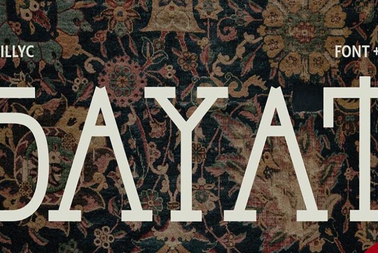
Parajanov Font Parajanov by Anastasia Iva is a display typeface conceived as a typographic tribute to the visionary Soviet-Armenian filmmaker Sergei Parajanov. Each letterform is constructed from the symbols, patterns, and visual motifs found throughout his films — ornamental, deeply layered, and steeped in the folk art and surreal imagery that defined his cinematic language. The result is a typeface that feels less like a conventional design tool and more like a visual artifact: expressive,…
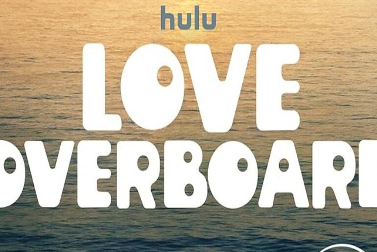
Love Overboard Font The Love Overboard Font used in the movie’s title design closely resembles Hungarian Nouveau JNL Regular, a typeface by Jeff Levine. It is a decorative display font inspired by Art Nouveau styling, featuring flowing curves, ornamental details, and elegant linework that create a romantic, vintage, and luxurious visual identity. The graceful letterforms and stylish composition perfectly match the film’s high-end, romance-driven setting. Hungarian Nouveau JNL Regular is a commercial font, meaning a…
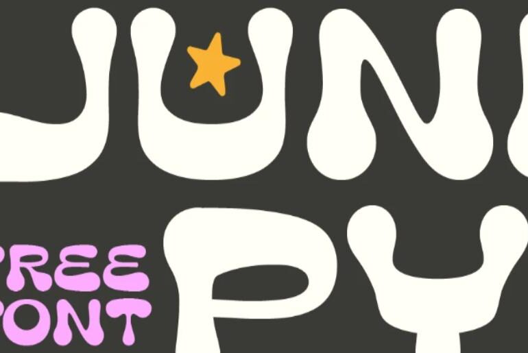
Junipy Font Junipy by Leon Hulst of TypeFaith Fonts is a display typeface with a clean, confident personality that sits comfortably between modern and playful. Its letterforms carry a crafted refinement that makes it equally at home on a logotype, a social media graphic, or a product label — offering designers a typeface that commands attention without overwhelming the composition. Free to use for both personal and commercial projects. Junipy is part of our growing…
Rajon Shoily Font Rajon Shoily by m mohibubur rahman is a Bangla display typeface born from a deeply personal commitment to enriching the Bengali script in the digital age. At a time when Bengali — one of the world’s most widely spoken languages — remained underserved by quality type design, rahman set out to fill that gap. The result is a graceful, expressive display typeface that brings cultural pride and typographic craft together in a…
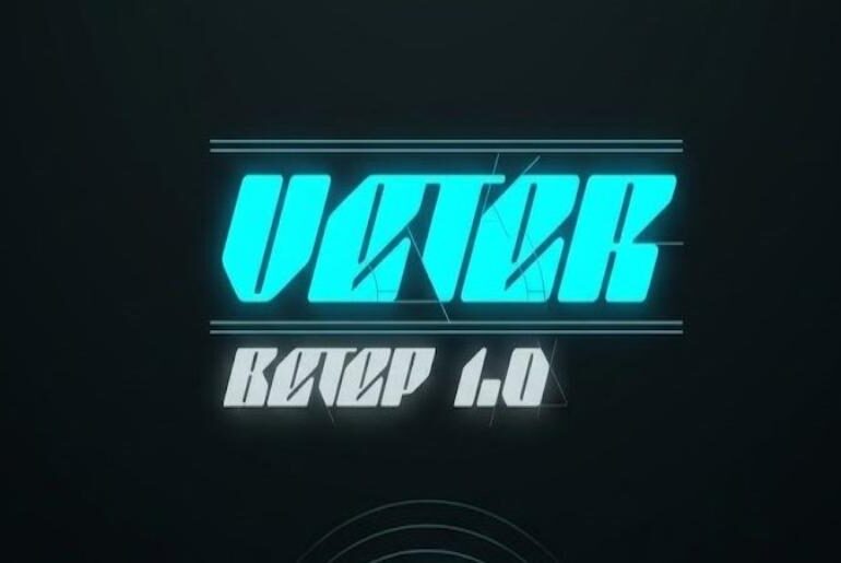
Veter Font Veter by Tim Kasimoff is a bold, futurist display typeface that moves with the kind of kinetic energy its name implies — the Russian word for “wind.” Its heavy weight and forward-leaning forms make it a natural choice for headlines, posters, and any composition that demands visual momentum. Rooted in a futurist aesthetic, Veter brings raw graphic force to branding and editorial design alike, free for personal and commercial use. Veter is a…
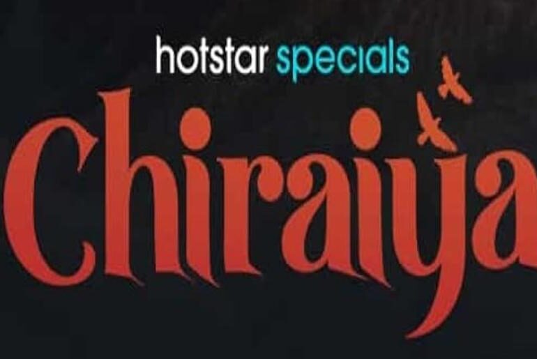
Chiraiya Font The Chiraiya Font used in the movie’s title design is Black Quality, a typeface by Alit Design. It is a decorative serif display font featuring elegant curves, high contrast strokes, and ornamental details that create a dramatic, emotional, and cinematic visual identity. The refined yet bold letterforms give the title a strong presence, making it suitable for intense storytelling and character-driven narratives. Black Quality is available for free download, making it a practical…
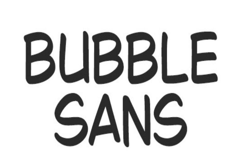
Bubble Sans Font Bubble Sans by Abay Emes and QR Type is a thoroughly crafted comic book typeface that channels the irresistible energy of classic 2000s speech bubble lettering. Built with serious typographic depth — over 700 glyphs, more than 5,000 kerning pairs, and support for over 300 languages — it punches well above its weight as a free release. Whether you’re designing a graphic novel, a playful brand identity, or social content that needs…

