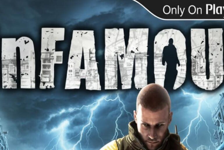
Infamous Font Infamous electrifies the superhero genre with its morally complex narrative and explosive gameplay, complemented by striking typographic choices that reflect the game’s dynamic energy. The font featured throughout this PlayStation exclusive embodies raw power, urban grit, and the duality between hero and villain that defines the series. Its bold presence makes it exceptional for action-packed gaming designs, superhero-themed projects, electric energy visuals, and high-impact promotional materials. Whether you’re crafting fan content, designing game-inspired…
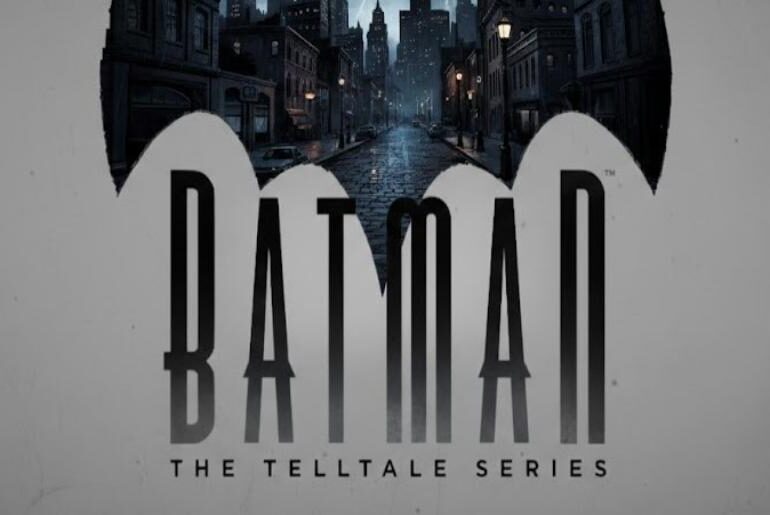
Batman: The Telltale Series Font Batman: The Telltale Series delivers a gripping narrative experience that reimagines the Dark Knight’s story, supported by compelling visual design and impactful typography. The font used throughout this critically acclaimed game captures Gotham’s noir atmosphere while maintaining exceptional readability across dialogue choices and dramatic moments. Its sophisticated character perfectly suits dark superhero themes, comic book-inspired projects, mysterious branding, and cinematic gaming content. Whether you’re designing Batman fan creations, developing narrative-driven…
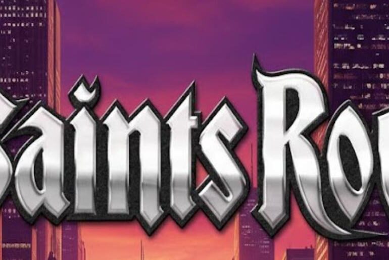
Saints Row Font Saints Row revolutionized open-world gaming with its outrageous style and unapologetic attitude, perfectly captured through its bold typographic identity. The font featured in this legendary franchise exudes urban energy, street credibility, and rebellious spirit that resonates with fans of high-octane action games. Its distinctive design makes it perfect for edgy promotional content, street culture graphics, urban-themed designs, and bold branding projects that demand attention. Whether you’re creating gaming content, designing street-style posters,…
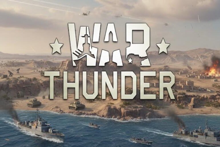
War Thunder Font War Thunder dominates the military simulation genre with its meticulously detailed combat experience, and its typography reflects the game’s commitment to authenticity and power. The font selection throughout the game’s interface and branding communicates strength, precision, and military heritage, resonating deeply with strategy and combat enthusiasts worldwide. This bold typeface excels in war-themed projects, military presentations, tactical gaming designs, and historical documentation. Whether you’re developing military-inspired content, designing combat game interfaces, or…
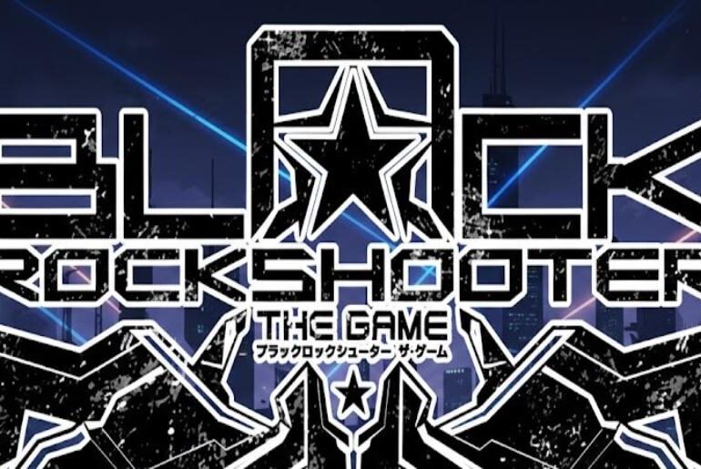
Black Rock Shooter Font Black Rock Shooter captivates audiences with its striking visual aesthetic and intense storytelling, perfectly complemented by its bold typographic choices. The font used in this iconic franchise embodies the dark, edgy atmosphere that defines the series, delivering powerful impact across all media. Its distinctive character makes it exceptional for anime-inspired designs, gaming graphics, dark fantasy projects, and bold promotional materials. Whether you’re crafting fan art, designing posters, or building content around…
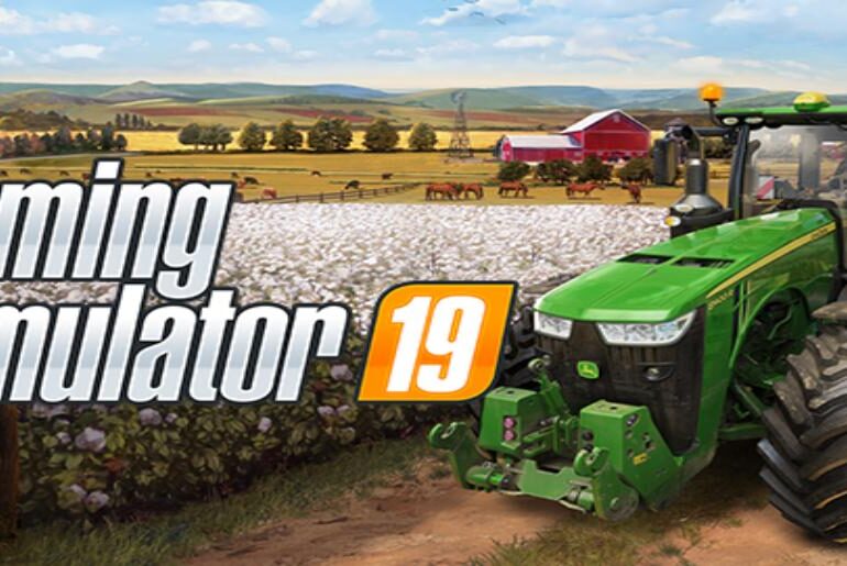
Farming Simulator Font Farming Simulator has cultivated a dedicated fanbase with its immersive agricultural gameplay, and its distinctive branding reflects the game’s professional yet approachable nature. The typography used throughout the franchise conveys reliability and modern farming excellence, making it instantly recognizable among simulation gaming enthusiasts. This font choice perfectly balances technical precision with accessible design, ideal for agricultural-themed projects, gaming content, or rustic branding materials. Whether you’re creating farm-related graphics, simulation game designs, or…
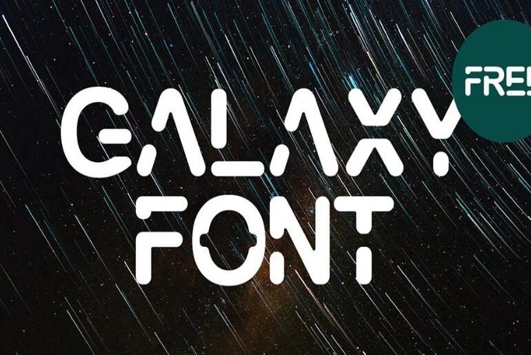
Galaxy Font Galaxy Font propels design into the future through Dmitry Baranov’s geometric display creation featuring all-caps styling with distinctive futuristic aesthetics. This sleek, modern typeface combines rounded letterforms with creative stencil elements and cool geometric precision perfect for capturing attention in headlines, titles, and display applications. Galaxy’s forward-thinking design excels in technology branding, sci-fi projects, innovative product packaging, and contemporary editorial work where standing out with sophisticated futuristic character creates memorable visual impact that…
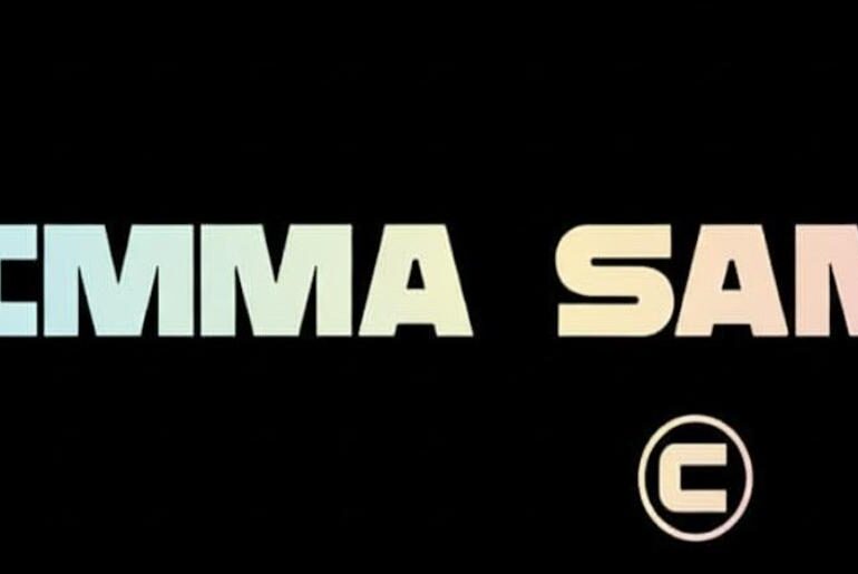
Rimma Sans Font Rimma Sans Font showcases Lesha Pushkarev’s architectural vision through bold display typography inspired by concrete constructions and monumental structures. This striking typeface features solid, powerful letterforms juxtaposed with narrow punctuation marks that reflect the harmonious relationship between metal frameworks and concrete foundations found in industrial design. Rimma Sans’s grotesque character and industrial strength make it exceptionally effective for impactful headlines, urban branding projects, architectural presentations, and any design requiring commanding typographic presence…
Poison Font Poison Font embodies powerful beauty through Jaikishan Patel’s stunning sans-serif design that masterfully conveys glamour, fame, and subtle danger in equal measure. This Latin display typeface adds sophisticated edginess to contemporary design projects with clean lines and elegant proportions that command attention without sacrificing refinement. Poison’s modern grotesque styling delivers versatile functionality perfect for fashion branding, luxury packaging, editorial design, and any application demanding bold statements tempered with tasteful restraint and contemporary aesthetic…
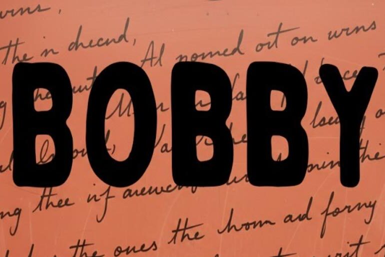
Bobby Jones Font Bobby Jones Font showcases distinctive handwritten personality through Tom Chalky’s creative vision that brings charming, casual character to every typographic application. This versatile font family combines unique letterform styling with approachable warmth perfect for adding creative flair and human touch to diverse design projects. Whether crafting fun, playful compositions or seeking to make memorable statements with authentic handwriting aesthetics, Bobby Jones delivers cool, outlined character that steals attention while maintaining excellent readability…

