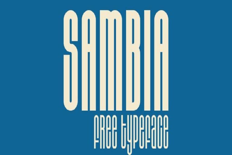
SAMBIA Font SAMBIA by Sergey Mikheev is a geometric font that channels the concentrated energy of Bauhaus design into a monoweight, extra-condensed display family. Its letterforms are built on clean geometric principles — sharp corners, closed apertures, minimal variation in stroke weight — and carry that first-half-of-the-twentieth-century sense of disciplined economy and functional elegance. Available in Regular and Bold, SAMBIA covers uppercase and lowercase letters, numerals, punctuation, symbols, and multilingual support across Latin, Latin Extended,…
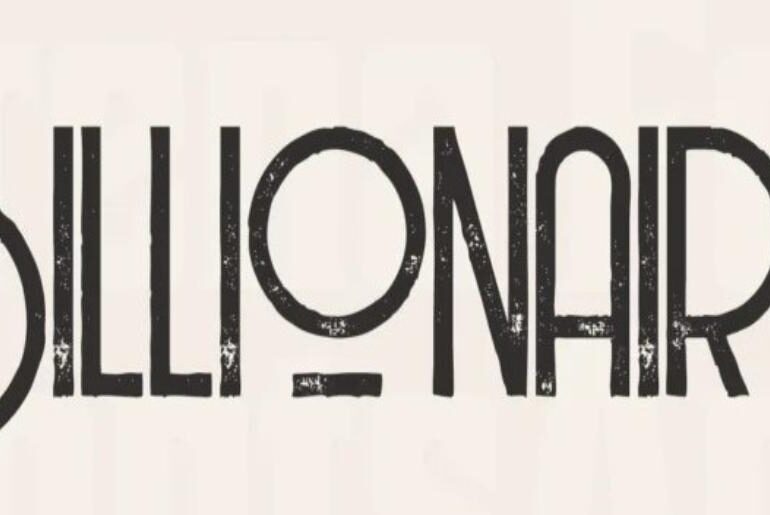
Billionaire Font Billionaire by Peter Olexa is a refined Art Deco font that balances retro charm with a clean, contemporary finish. Its all-caps design offers two distinct sets of capitals — one featuring expressive, curvy terminals for select characters, the other opting for a more restrained treatment — giving designers a versatile toolkit for logos, business cards, websites, magazines, and upscale branding where elegance and professionalism need to speak in the same breath. Free for…
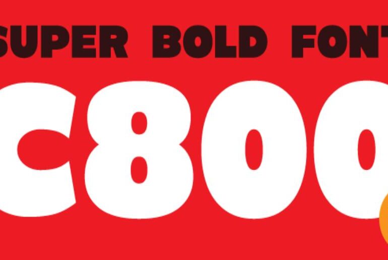
C800 Font C800 by The Trending Fonts is a bold font, all-caps and sans-serif font that gets straight to the point. Its thick, rounded letterforms command immediate attention — friendly enough to feel approachable, heavy enough to anchor any headline or title treatment with authority. Whether applied to posters, flyers, gaming graphics, t-shirts, or banners, C800 delivers maximum visual weight with minimal fuss. Released into the public domain, it is 100% free for both personal…
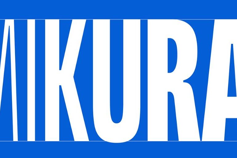
SG Mikura Font SG Mikura by Studio Gulden is a variable sans serif font that redefines what contemporary type can do. Built across 9 meticulously crafted weights and carrying over 600 carefully drawn glyphs, it moves effortlessly between elegant restraint and commanding presence. The variable axis gives designers fluid control over weight and expression — making it equally at home in editorial layouts, brand identities, packaging, and digital interfaces. Versatile by design, powerful by nature.…
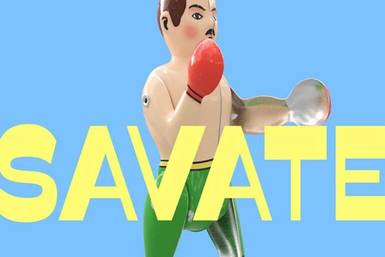
Savate Font Savate by Max Esnée is a humanist sans-serif font with reverse contrast — a quiet but deliberate subversion of typographic convention. Born from a complete redraw of an original design first released in 2016 through Velvetyne, this new version refines every glyph for improved rhythm, structure, and overall cohesion. The family arrives with a full palette of styles and expanded language support, including Latin Pan-African — making Savate as versatile as it is…
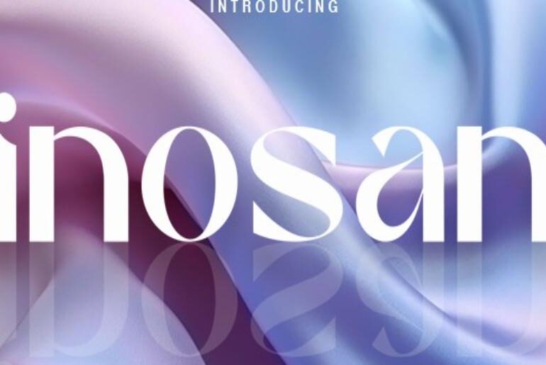
Sinosans Font Sinosans by NaZmuL is a luxurious, elegantly crafted sans-serif typeface designed to bring a quiet sense of sophistication to any project it touches. Sleek lines and graceful curves work in concert to create letterforms that feel refined without being cold — modern in spirit yet timeless in sensibility. Whether applied to fashion branding, editorial layouts, packaging, or premium digital interfaces, Sinosans carries an effortless authority that elevates whatever it sets. The free personal-use…
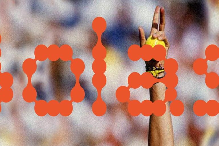
Bolas Font Bolas by Maria Figas is a playful, rounded display typeface that carries an unmistakable energy — bouncy, bold, and unapologetically fun. Inspired by the spherical geometry of sports balls, its letterforms are built around circular, inflated strokes that give the type a tactile, almost physical presence. Available in both Regular and Bold weights, it brings levity and personality to any design context: event posters, youth branding, sport-themed campaigns, or any project that benefits…
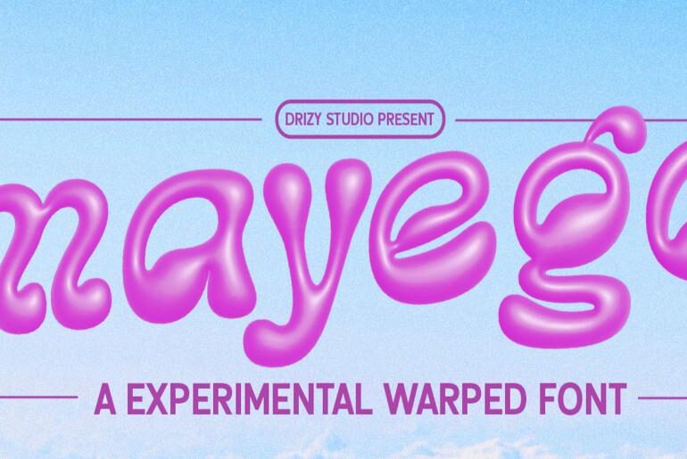
Mayego Font Mayego by Drizy Font is a modern experimental display typeface that leans boldly into distortion, fragmentation, and visual tension. Its letterforms challenge conventional typographic structure — each glyph feels stretched, warped, and deliberately off-balance in a way that generates genuine visual energy rather than mere novelty. The result is a typeface with a strong, uncompromising personality, built for designers who want their headlines to demand attention and resist easy categorisation. A free demo…
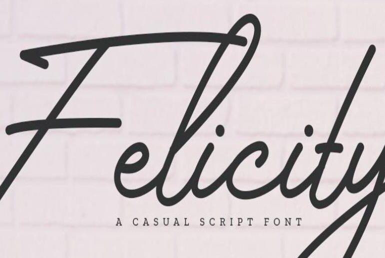
Felicity Font Felicity is a free monoline handwritten font with the quiet charm of something made by hand and offered from the heart. Born during the early days of the pandemic, it traces its origins to a personal discovery of lettering — and the idea of turning that passion into a usable typeface. Its clean, flowing strokes carry a minimalist sensibility that feels both intimate and versatile, making it a natural fit for branding, invitations,…
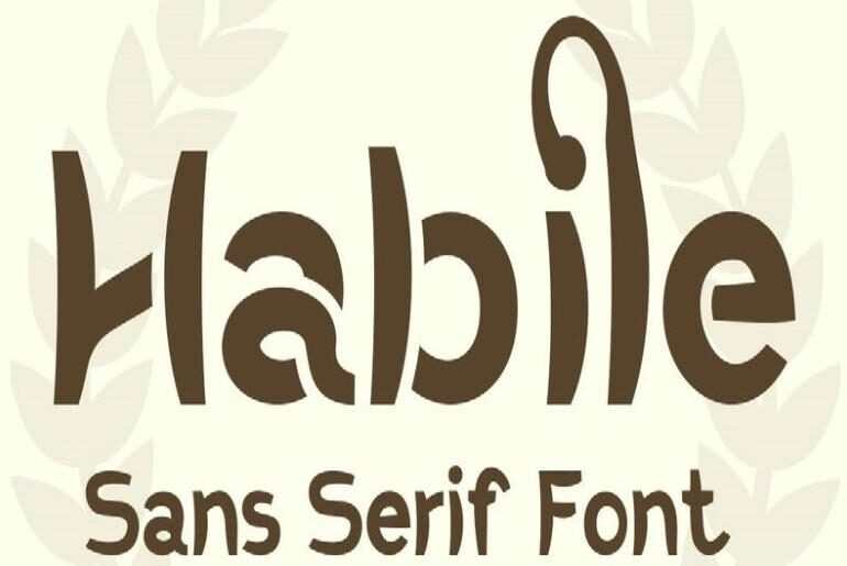
Habile Font Habile by NDNL Studio is a modern sans-serif typeface designed with a playful and approachable spirit. Its letterforms bring together soft, rounded curves and confident strokes in a balance that feels both friendly and clear — never sacrificing readability for personality. Unique detailing in each character lifts it well above the ordinary sans-serif, while an OpenType Stylistic Alternates system offers decorative character variations for designers who want an extra layer of expressiveness. Versatile…

