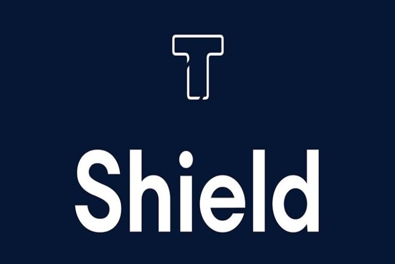
LT Shield Font LT Shield is a geometric display typeface by Daniel Lyons of LyonsType, released in February 2026 and carrying an origin story that quietly shapes its character: the design is modelled after a bespoke commission created for a software company specialising in data privacy. That context — precision, trust, clarity, a corporate environment where visual communication needs to project reliability without sacrificing distinctiveness — has produced a face that sits in a specific…
LT Icon Font LT Icon is an icon symbol typeface from Daniel Lyons of LyonsType, published in February 2026, built by converting glyph sets from Font Awesome’s Pro, Brand, and Solid icon libraries into a single distributable font file. The appeal of the concept is clear: Font Awesome’s icon vocabulary is one of the most widely recognised in interface and web design, and packaging a curated selection of those symbols as a typeface makes them…
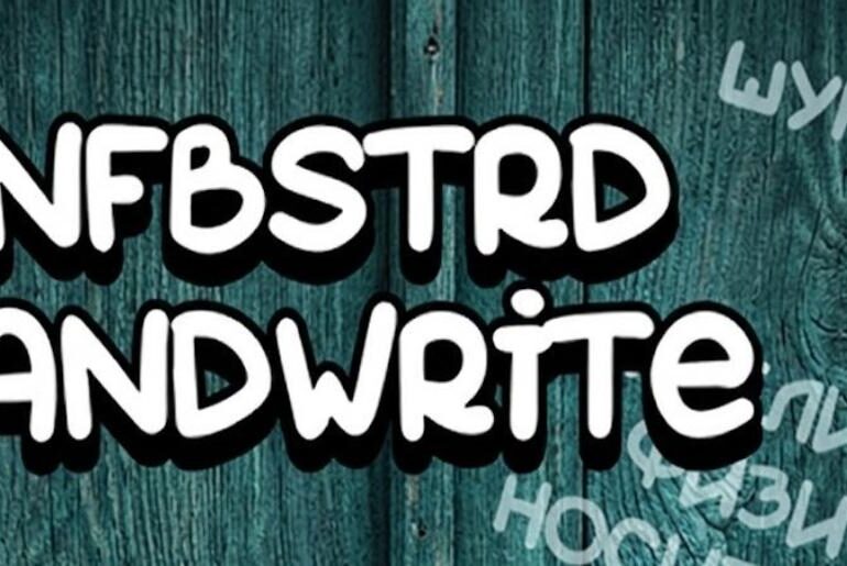
SNFBSTRD Font SNFBSTRD Handwrite by Roman Barygin is a simple, organic hand-lettered font with an easy playful vibe that never tries too hard. Its unpretentious construction — drawn with the natural looseness of someone writing quickly and enjoying it — gives it an authentic spontaneity that more polished scripts can struggle to capture. Comic-casual in spirit but broadly versatile in application: social media graphics, greeting cards, product labels, or any design that benefits from the…
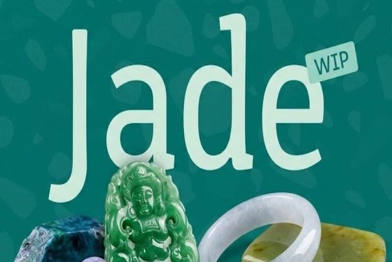
Jade Font Jade by Torneo Tipográfico is a sans-serif with a genuinely purposeful origin: it was developed through extensive research to support wayfinding needs and serve as an accessible tool for therapists and children within the autism spectrum, as well as neurotypicals with learning difficulties. That rigorous foundation shows in its construction — clear, legible, and free of visual ambiguity. The result is a typeface that functions beautifully in signage, educational materials, and accessibility-conscious design…
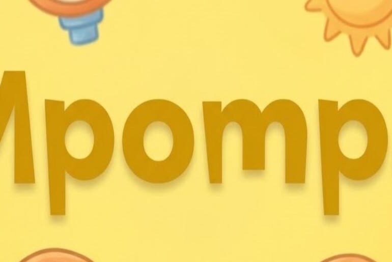
Mpompa Font Mpompa by Christos Lentzaris is a display font that commits fully to its personality: chunky, cheerful, and impossible to ignore. Bold strokes and playful curves strike a balance between visual weight and a light-hearted energy that feels genuinely joyful rather than forced. That combination makes it ideal for book covers needing warmth and impact, colourful event posters, children’s product branding, or any project where personality has to land fast. Supporting 58 languages, it…
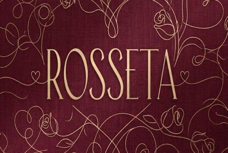
Rosseta Font Rosseta by Angin Studio is a vintage sans-serif that earns its adjectives: condensed, elegant, and genuinely feminine without being precious. Its thin strokes and clean silhouette carry the composed confidence of early twentieth-century fashion typography, making it an instinctive choice for high-end branding, event invitations, editorial headers, and packaging with a timeless edge. That narrow stance means it commands space without overwhelming a layout. Covering 64 languages, it brings classic refinement to a…
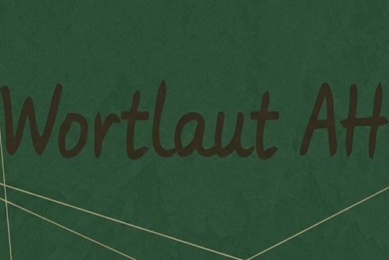
Wortlaut AH Font Wortlaut AH Typeface by Fontgrube AH occupies a rare and useful niche: a handwritten font that behaves. Its printed hand-lettered characters are modest and precise, never tipping into flamboyance or calligraphic excess. That discipline makes it genuinely usable for extended passages — think handwritten letters inserted into printed novels, diary-style layouts, or annotated grocery lists given typographic polish. Three weights (Regular, Medium, Bold) add real versatility. Wide Western and Eastern European language…
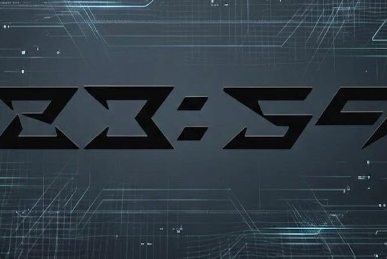
23:59 Font 23:59 is an experimental display typeface from DJSHANG DESIGN built around a deeply considered conceptual premise: the designer used the final minute of the day as a lens through which to explore what time means as a subjective experience — the weight of memory, the texture of seasonal change, the specific emotional charge of a moment about to reset. That philosophical grounding produces a typeface with a genuinely distinctive visual logic. Letterforms are…
Roundex Font Roundex is a modern geometric sans-serif by Eko Bimantara that achieves something genuinely tricky: combining technical precision with genuine friendliness. Its rounded terminals soften the geometry without undermining the design’s clean, structured confidence. The result sits in a sweet spot between playful and professional — equally at home in a startup’s logo, a digital interface, a bold headline layout, or minimalist product packaging. Clear legibility at display sizes and strong, consistent letterform construction…
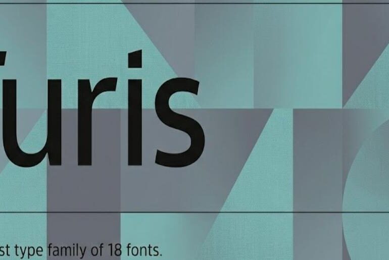
Turis Font Turis is a refined humanist sans-serif by Punchform that brings genuine warmth and legibility to the modern grotesque tradition. Its clean, balanced letterforms and well-considered proportions give it a contemporary elegance that transitions smoothly from editorial body text to brand identity work. The humanist construction ensures it never feels cold or mechanical — a quality that makes it particularly well-suited to lifestyle and professional contexts where approachability matters as much as polish. Exceptional…

