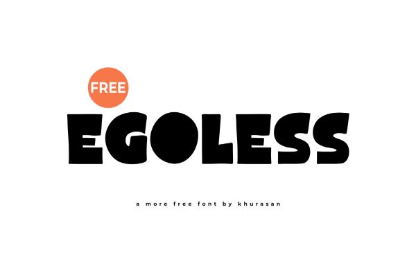
Egoless Font Egoless by syaf rizal (Khurasan Studio) is a free bold font that embodies the designer’s knack for creating letterforms that feel simultaneously modern and warm — decorative without being fussy, cheerful without being trivial. Its expressive, graphic character makes it well suited for a wide range of display applications including social media content, branding, product labelling, editorial headlines, posters, and apparel graphics where the typography needs to carry both energy and personality. Released…
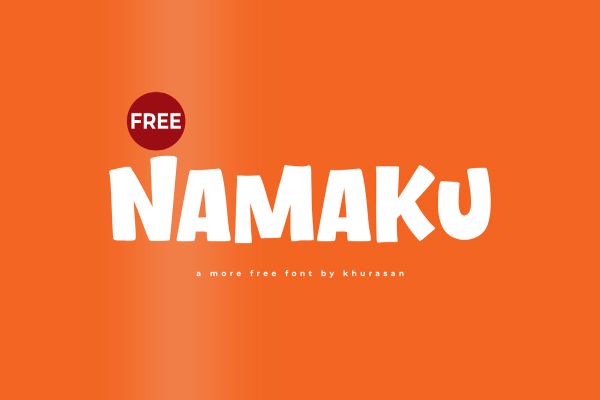
Namaku Font Namaku by syaf rizal (Khurasan Studio) is a free bold font with the confident, graphic energy that defines the best of the designer’s extensive catalog — its decorative letterforms carrying a modern, summer-inflected character that feels at ease across branding, poster design, product packaging, social media content, and apparel graphics. The name “Namaku” means “my name” in Indonesian, suggesting a typeface with enough personality to stand in as a visual signature — bold…
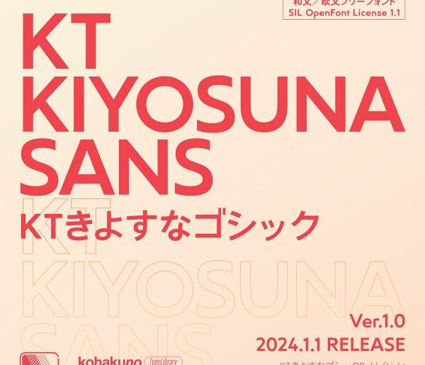
KT Kiyosuna Sans Font KT Kiyosuna Sans by Reiya Watanabe is a free open-source multilingual sans-serif font that brings together Latin, Cyrillic, and Japanese scripts in a cohesive, cheerful, and geometrically grounded design. Its smooth arching strokes and diamond-shaped dots give the Latin and Kana characters a distinctive warmth and playfulness, while the Kanji characters are sourced from the respected Zen Kaku Gothic font by Yoshimichi Ohira, ensuring quality and legibility across a genuinely broad…
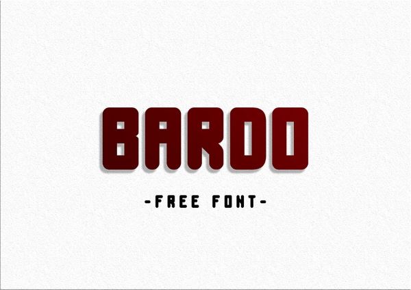
Bardo Font Bardo by Fatima Novoa is a free display font with a quietly bold personality — clean in construction but full of presence, with letterforms that feel considered and intentionally spaced. Its restrained elegance makes it equally at home on a magazine cover, a brand identity, a wedding invitation, or a minimalist poster, adapting to the tone of its surroundings without losing its own character. The kind of typeface that earns attention through quality…
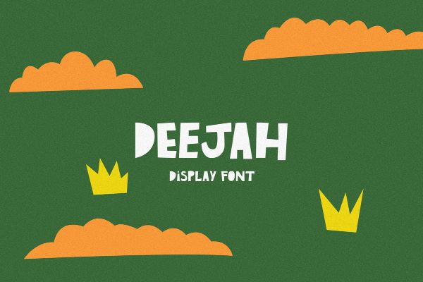
DeeJah Font DeeJah by Petroneo is a free handcrafted font born from a beautifully collaborative process — the desire to transform the hand-cut paper artwork of Brazilian artist Catarina Dee Jah into a fully realized digital typeface. The result carries that artisanal, tactile essence in every curve: expressive, organically formed, and full of personality with striking variations between its uppercase and lowercase letterforms. Built following the methodology of type designer James Grieshaber, DeeJah is simultaneously…
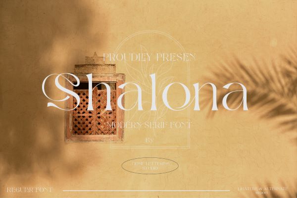
Shalona Font Shalona by tana design is a free serif font with a modern, clean sensibility and the kind of composed elegance that makes it an instinctive fit for logo design, brand identities, and visual identity systems. Its well-proportioned letterforms carry an understated sophistication — structured and precise without feeling cold, refined without being stiff. Whether used at headline scale or as a logotype anchor, Shalona communicates quality and intentionality with minimal effort. Available free…
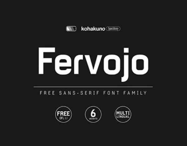
Fervojo Font Fervojo by Reiya Watanabe is a free geometric font inspired by the numeric lettering historically used in the Tokyo subway system — the original “Eidan-Typeface” — expanded here into a complete Latin, Greek, and multi-script character set covering Western and Central European languages, Chinese Pinyin, Esperanto, and more. Rather than reproducing the original faithfully, Fervojo reinterprets its industrial, retro-futuristic spirit into a fully functional typeface family available in four weights. Published under the…
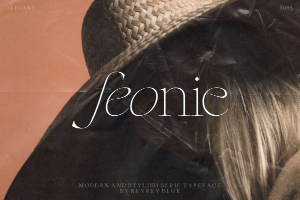
Feonie Font Feonie by ReyReyBlue Studio is a free classic and slightly curved serif font that arrives in both regular and italic styles, making it one of the more immediately complete freebies available. Its soft curves combined with high-contrast strokes give it a distinctly feminine, high-fashion sensibility — equally at home on luxury logo marks, editorial mastheads, wedding stationery, and beauty branding. Multilingual support is included, broadening its reach well beyond the basic Latin alphabet.…
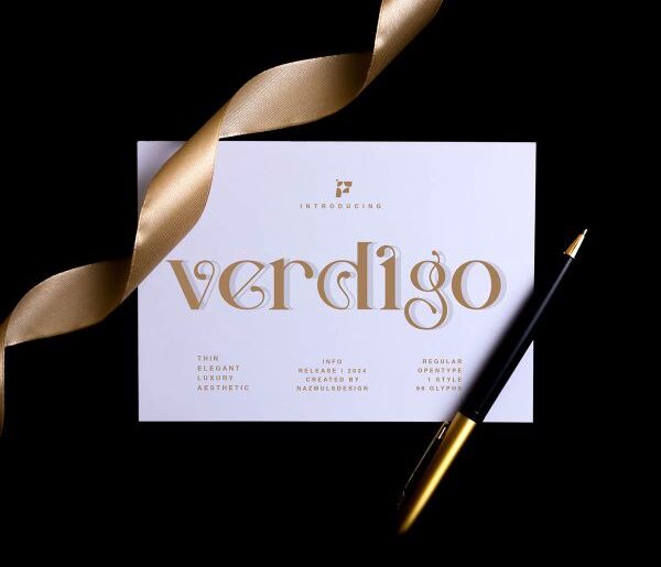
Verdigo Font Verdigo by NazmulsDesign is a free modern serif font that blends contemporary aesthetics with timeless elegance, designed to capture attention and leave a lasting impression across a wide range of design applications. Its balanced proportions and meticulous letterform detailing bring a refined sophistication to every glyph — from editorial headlines and luxury branding to logotypes and packaging where a polished serif presence is essential. Restrained and purposeful in character, Verdigo earns its place…
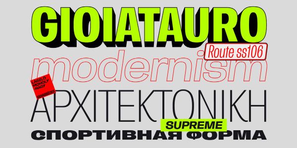
Enotria Font Enotria by Marco Battaglia is a contemporary neo-grotesque font that takes the measured legacy of Swiss Grotesk tradition as its starting point and pushes it somewhere more expressive and characterful — infused, as its creator puts it, with a distinctly Calabrian soul from southern Italy. Available in 8 weights and 7 widths for 112 total styles, it covers Latin, Greek, and Cyrillic scripts and includes four letter stylistic sets, elegant 8-degree italic angles,…

