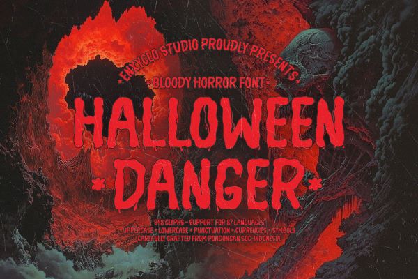
NCL Halloween Danger Font NCL Halloween Danger by Enxyclo Studio is a rough handwritten bloody freaky font with the kind of freaky, unhinged energy that the name promises and the letterforms deliver. Described by its creator as designed to bring creative ideas to the highest level, it is a typeface built for impact at large point sizes — headlines, billboards, posters, and titles where the raw, dripping character of the letterforms can fully assert themselves.…
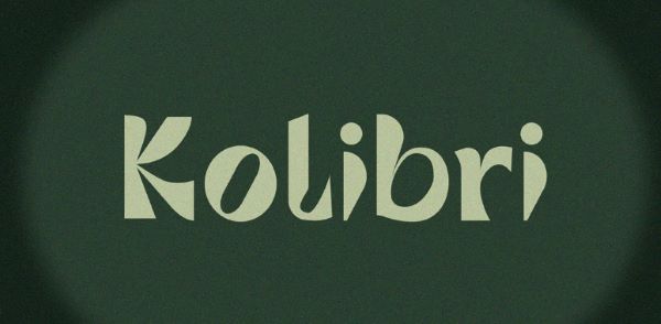
Kolibri Font Kolibri font by Réka Kiss is a free display sans-serif font with a crisp, purposeful character that makes it immediately useful for headlines, special announcements, branding, and editorial design. Its clean letterforms carry a quiet confidence — neither shouting for attention nor disappearing into a layout — giving designers a reliable tool that holds authority without aggression. Named after the Hungarian word for hummingbird, Kolibri manages the same balance the creature does: small,…
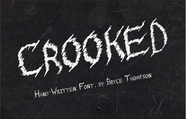
Crooked Font Crooked by Bryce Thompson is a freaky font that lives up to its name in the most satisfying typographic sense — letterforms that feel deliberately misaligned, irregular in a way that reads as deeply unsettling rather than carelessly executed. The darkness here is not ornamental; it is structural. Drawing from the gothic tradition of heavy, angular letterform construction while introducing the kind of irregular, hand-crafted distortion that gives the type its particular creepy…
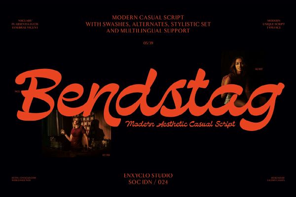
NCL Bendstag Font NCL Bendstag by Enxyclo Studio is a free modern casual script font with an effortlessly flowing character — its calligraphic letterforms carrying the warmth of hand-lettering while maintaining the polish and technical refinement of a professionally designed display face. With 283 unique glyphs, alternates and stylistic sets, multilingual support, and multiple format options including TTF, OTF, WOFF, and WOFF2, it arrives fully equipped for both print and digital work. A standard commercial…
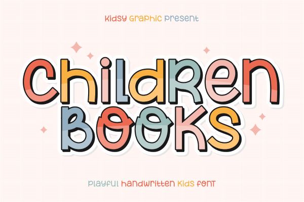
Children Books Font Children Books font by kidsy graphic is a free bold and fun sans-serif typeface inspired by the spontaneous energy of marker pen hand-lettering — thick, joyful, and radiating the kind of unguarded happiness that makes it an ideal companion for anything aimed at kids or the young at heart. Available free for personal use. Children Books is an infectiously cheerful addition to our free font collection, created by Indonesia-based kidsy graphic —…
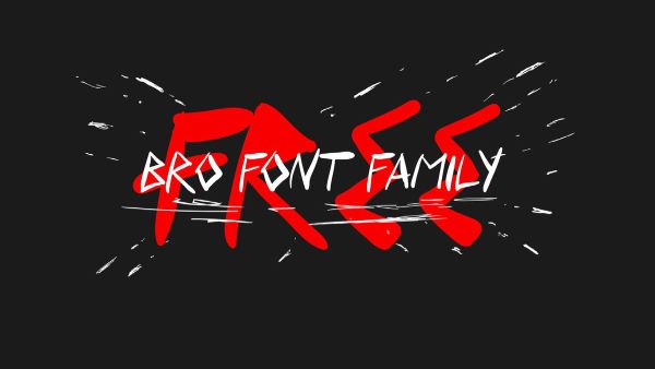
BRO Font BRO font by Colorama Studio is a free handdrawn calligraphy font family with an expressive, loosely gestural character — its letterforms carrying the warmth and spontaneity of hand-lettering with enough structural control to work across a broad range of creative applications. Bold and graphic in its visual weight, it lends itself naturally to title cards, lyric videos, editorial headlines, poster design, and any context where the typography needs to feel like it came…
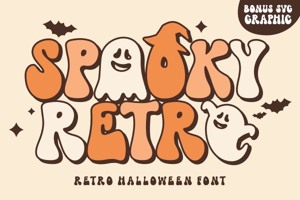
Spooky Retro Font Spooky Retro by keithzo is a Halloween and freaky font that earns its name through a deliberately considered blend of two distinct aesthetic registers — vintage nostalgia and seasonal horror. Rather than leaning entirely into either the retro or the spooky, it finds the productive tension between them: letterforms that carry the warmth and visual rhythm of classic vintage display type while simultaneously projecting an eerie, unsettling atmosphere that belongs entirely to…
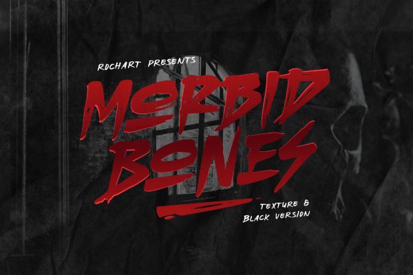
Morbid Bones Font Morbid Bones by Rochart Project is a horror-themed brush style freaky font that brings the raw, gestural quality of hand-painted lettering directly into the darkest corners of typography. Created using authentic brush strokes — not simulated ones — it carries the imperfections, pressure variations, and organic energy that only genuine hand-work produces. The result is a typeface that feels genuinely macabre rather than commercially spooky: letterforms that look as though they were…
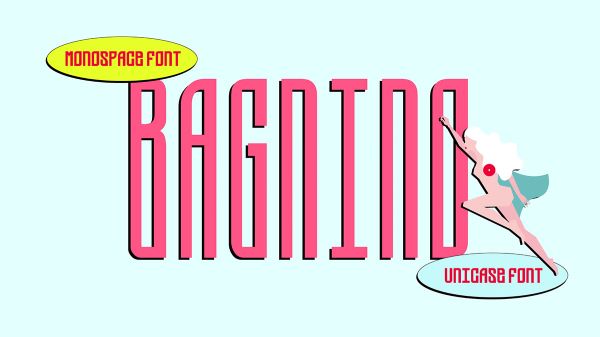
Bagnino Font Bagnino by Sabrina Bakhta Ekecik is a free monospace font with a deeply considered conceptual foundation — designed specifically for the historic municipal public bathhouses of Paris (the Bains Douches municipaux), institutions created to provide running water to those without it. The letterforms are built directly on the grid of shower stall tiles, and the font is offered in four sizes that add an ornamental, architectural dimension to the type system. Available free…
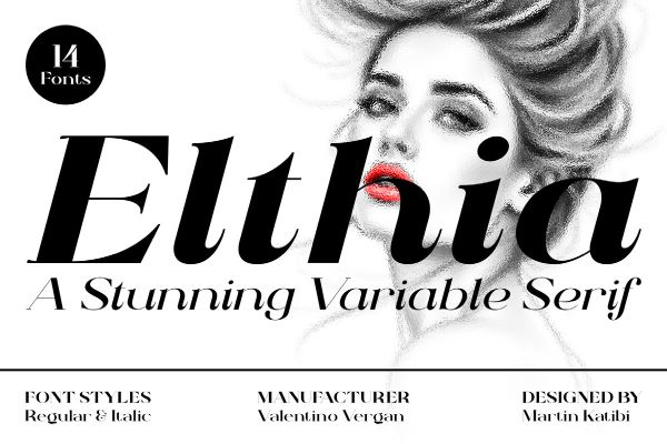
Elthia Font Elthia by Valentino Vergan is a free high-contrast variable serif font that brings together classical elegance and contemporary design sensibility in a single, technically sophisticated package. Its wide, dramatic stroke contrast commands attention across editorial layouts, branding identities, advertising campaigns, packaging, and social media graphics — anywhere a headline needs to feel simultaneously refined and visually bold. A personal use version is available free on Behance, with the full variable family available via…

