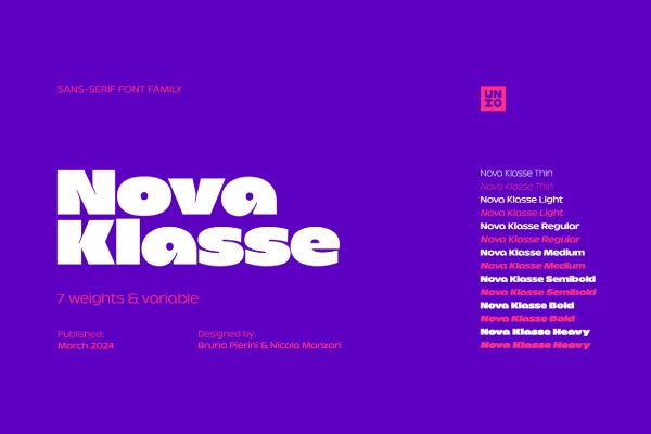
Nova Klasse Font Nova Klasse by Unio Designs is a modern geometric font that fuses circular and rectangular letterform logic with organic drawing and unconventional detailing to create something that feels both systematic and distinctly alive. Its 2-axis variable font engine offers a seamless weight range from Thin to Extrabold, while seven static weights with matching obliques, multilingual support, ink traps for clean print reproduction, and a full suite of OpenType features make it genuinely…
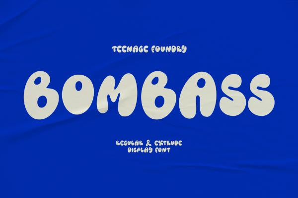
TF Bombass Font TF Bombass by Teenage Foundry is a free groovy font that reaches straight back to the psychedelic energy of 1960s and 70s design — bold, rounded, unashamedly retro, and loaded with the kind of loose, funky personality that makes it immediately unmistakable. Available in both Regular and Extrude variants, it offers two distinct ways to deploy its visual impact: the Regular for clean headline statements, the Extrude for dimensional, poster-ready boldness. Full…
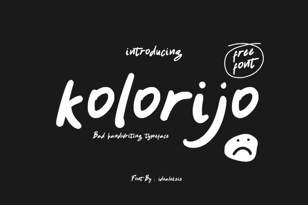
Kolorijo Font Kolorijo font by Ideal Eksis is a free brush font with an energetic, hand-lettered quality that feels spontaneous and expressive — its letterforms carrying the texture and rhythm of a real brush stroke without sacrificing legibility or control. That balance between rawness and readability makes it highly adaptable across a wide range of creative applications: editorial headlines, branding, packaging, social media graphics, event posters, and any design context where the typography needs to…
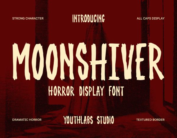
Moonshiver Font Moonshiver by Youthlabs Studio is a dramatic horror and freaky font that builds its atmosphere through texture, weight, and the particular menace of jagged hand-drawn strokes applied to a bold, all-caps structure. The design takes its inspiration from the cinematic language of classic horror — dark hallways, eerie shadows, the kind of tension that builds before anything actually happens — and translates that atmosphere directly into letterform. Ideal for horror movie posters, Halloween…
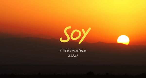
SOY Font SOY font by Jepsoy Sarmiento is a free bold font released to mark the new year of 2021 — a gift to the design community with genuine typographic character. Available in both Regular and Bold weights, SOY brings a confident, clean energy to headlines, logos, posters, and any design context where the type needs to carry weight and stand on its own. Its compact, assured construction gives it a timeless quality that works…
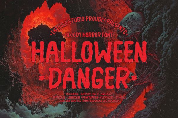
NCL Halloween Danger Font NCL Halloween Danger by Enxyclo Studio is a rough handwritten bloody freaky font with the kind of freaky, unhinged energy that the name promises and the letterforms deliver. Described by its creator as designed to bring creative ideas to the highest level, it is a typeface built for impact at large point sizes — headlines, billboards, posters, and titles where the raw, dripping character of the letterforms can fully assert themselves.…
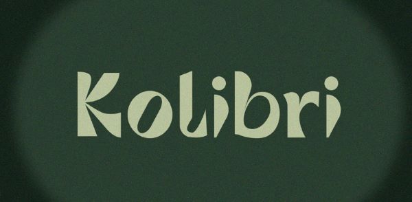
Kolibri Font Kolibri font by Réka Kiss is a free display sans-serif font with a crisp, purposeful character that makes it immediately useful for headlines, special announcements, branding, and editorial design. Its clean letterforms carry a quiet confidence — neither shouting for attention nor disappearing into a layout — giving designers a reliable tool that holds authority without aggression. Named after the Hungarian word for hummingbird, Kolibri manages the same balance the creature does: small,…
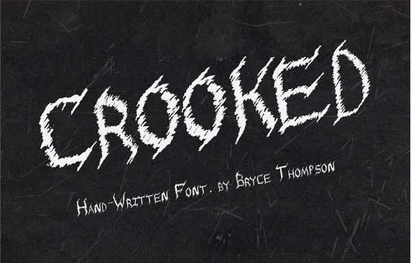
Crooked Font Crooked by Bryce Thompson is a freaky font that lives up to its name in the most satisfying typographic sense — letterforms that feel deliberately misaligned, irregular in a way that reads as deeply unsettling rather than carelessly executed. The darkness here is not ornamental; it is structural. Drawing from the gothic tradition of heavy, angular letterform construction while introducing the kind of irregular, hand-crafted distortion that gives the type its particular creepy…
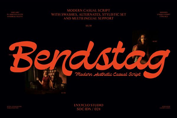
NCL Bendstag Font NCL Bendstag by Enxyclo Studio is a free modern casual script font with an effortlessly flowing character — its calligraphic letterforms carrying the warmth of hand-lettering while maintaining the polish and technical refinement of a professionally designed display face. With 283 unique glyphs, alternates and stylistic sets, multilingual support, and multiple format options including TTF, OTF, WOFF, and WOFF2, it arrives fully equipped for both print and digital work. A standard commercial…
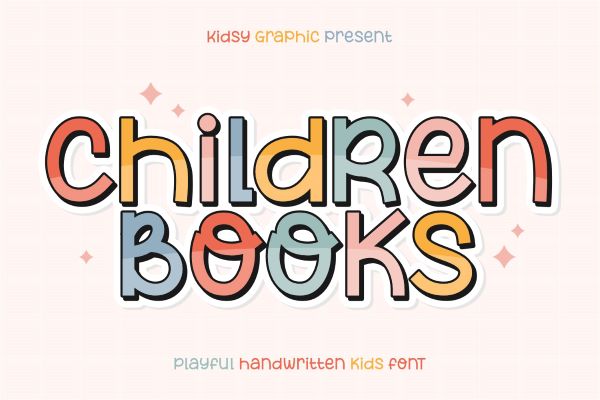
Children Books Font Children Books font by kidsy graphic is a free bold and fun sans-serif typeface inspired by the spontaneous energy of marker pen hand-lettering — thick, joyful, and radiating the kind of unguarded happiness that makes it an ideal companion for anything aimed at kids or the young at heart. Available free for personal use. Children Books is an infectiously cheerful addition to our free font collection, created by Indonesia-based kidsy graphic —…

