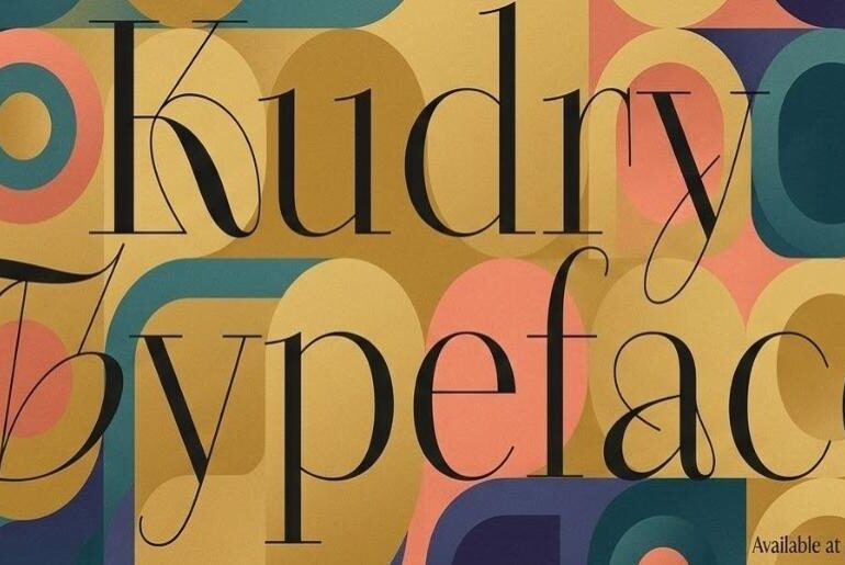
Kudri Weird Headline Font Kudri Weird Headline is a high-contrast display serif that commits fully to its own eccentric vision — wiry hairlines, offbeat curls, and jewel-like terminals that draw directly from the visual language of fin-de-siècle Art Nouveau and Silver Age poster lettering. The hand-drawn curves carry genuine character at every turn, and the inclusion of offbeat ligatures pushes the personality further, making each word feel composed rather than simply typed. It performs best…
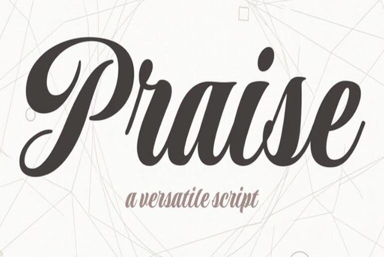
Praise Font Praise by Rob Leuschke is a handcrafted script typeface that earns its name through genuine versatility and understated sophistication. It moves comfortably between casual, non-connecting styles and more formal, flowing configurations, giving it a rare adaptability that most script fonts can’t offer within a single face. The organic, handwritten quality feels authentic rather than formulaic, with strokes that carry real rhythm and character. It excels across a wide range of applications — from…
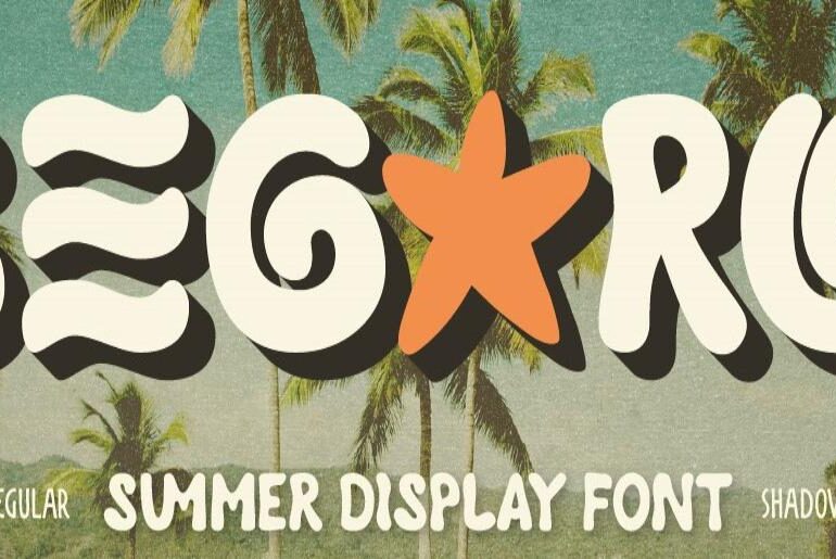
Segaro Font Segaro by Artisan Template is a fun, chunky summer display font radiating tropical warmth from every curve. Inspired by beach days and golden-hour light, its rounded, groovy retro letterforms feel bold and friendly without losing a drop of character. The demo release comes with Regular and Shadow styles, plus alternates and ligatures for more dynamic, custom-looking compositions. It shines on summer branding, packaging, posters, social media graphics, and anything with a retro tropical…
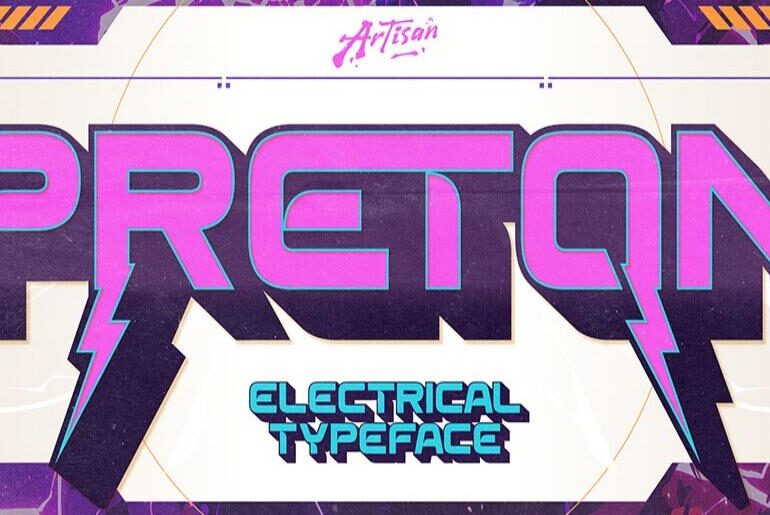
Preton Font Preton by Artisan Template is a bold electrical display typeface engineered for maximum visual impact. Its sharp, lightning-inspired cuts and hard-edged futuristic structure deliver a high-voltage presence that demands attention at any scale. The demo release includes Regular, Slant, and Extrude styles — a thoughtful trio that opens up layered, dimensional typographic possibilities. It’s purpose-built for gaming titles, esports branding, music event posters, tech visuals, and any project where power and precision must…
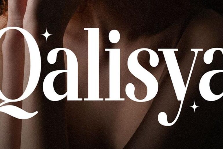
Qalisya Font Qalisya by Flawless And Co is a modern stylish serif that carries its sophistication with quiet confidence. Its refined letterforms and graceful detailing strike the balance between contemporary precision and timeless elegance — never cold, never overwrought. The demo release is ideal for designers seeking a serif that feels both polished and effortlessly current across luxury branding, editorial layouts, logo design, wedding stationery, magazine work, and premium packaging. Free for personal use. Qalisya…
Anavel Elegance Font Anavel Elegance by Eric Burntilldead is a luxury duo font that marries timeless serif beauty with flowing script grace across four carefully crafted styles: Regular, Ink Bleed, Script, and Script Ink Bleed. The result is a typographic system with genuine creative range — capable of shifting from bold and structured to soft and romantically expressive within the same project. It’s built for high-end branding, fashion and beauty logos, editorial layouts, wedding design,…
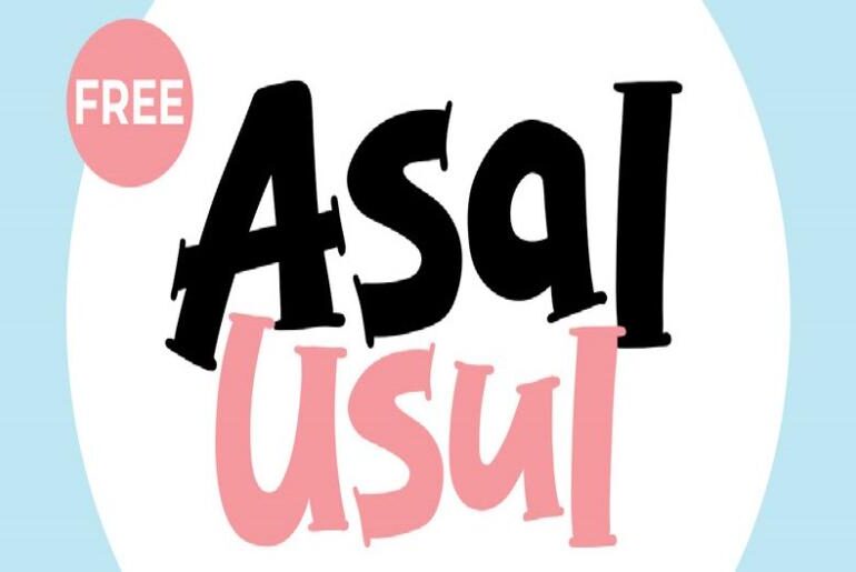
Asal Usul Font Asal Usul by syaf rizal is a cute and cheerful display font overflowing with playful personality. Its expressive, rounded letterforms carry the same warm, people-first energy that defines syaf rizal’s best work — lively without being loud, friendly without losing legibility. It hits its stride on children’s content, festival graphics, product labels, YouTube thumbnails, and modern lifestyle designs where a good-natured, characterful typeface makes all the difference. Completely free for both personal…
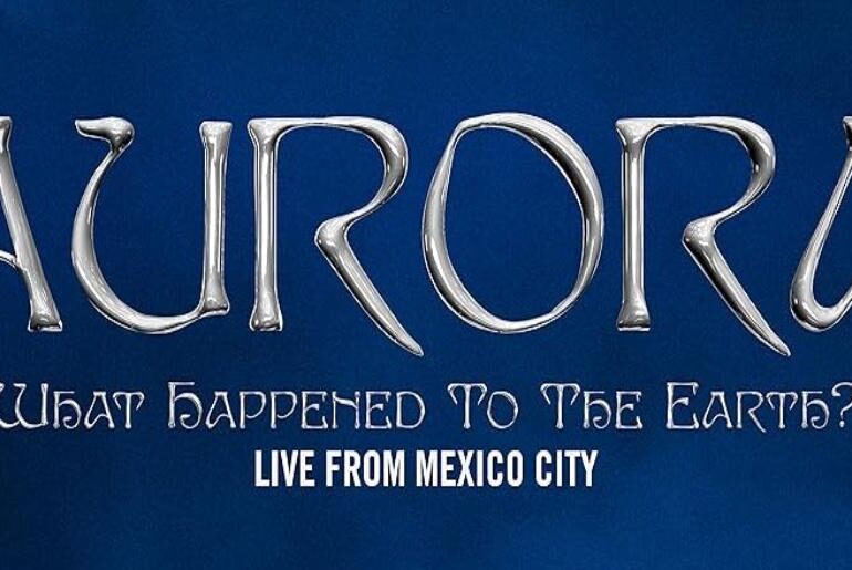
The Aurora: What Happened to the Earth? Font The Aurora: What Happened to the Earth? Font is based on the Edda typeface, but the version used in Aurora’s official branding is a modified custom edition featuring unique glyph adjustments and stylistic refinements. This makes the font seen on her website and promotional materials different from the standard Edda release. It is a decorative serif display font with elegant curves and distinctive character shapes that create…
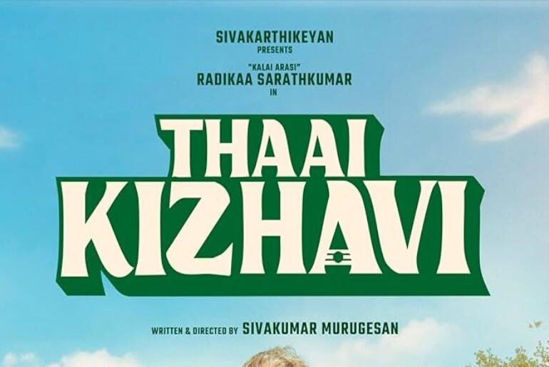
The Thaai Kizhavi Font The Thaai Kizhavi Font used in the film’s title design is a custom-designed typeface, crafted specifically to reflect the movie’s cultural and stylistic tone. Its lettering features elegant curves, expressive strokes, and a balanced rhythm that gives the title a traditional yet contemporary visual identity. Because it was custom made for the project, the original font isn’t publicly available. However, a close match is Killarney Regular, a commercial serif font with…
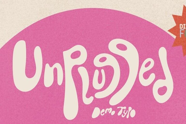
Unplugged Font Unplugged by David “Poncho” Medina is a handcrafted display typeface that channels the raw, unfiltered energy of 90s pop culture — think grunge music, alternative fashion, and the DIY spirit of hand-drawn lettering at its most expressive. Its strokes feel spontaneous and alive, carrying a retro-nostalgic charge that still reads as fresh and confident in contemporary design. The POP style is the free cut from a three-style family, and it earns its place…

