Canyono Font Canyono by Reptile Foundry is a condensed vintage typeface with a bold Western soul, drawn from the visual language of classic frontier signage and rugged desert landscapes. Its tall, narrow letterforms carry a raw, timeless authority — commanding attention without taking up excessive space — making it a natural fit for logos, posters, product labels, and Western-themed branding that needs to feel adventurous and earned rather than decorative. It’s the kind of typeface…
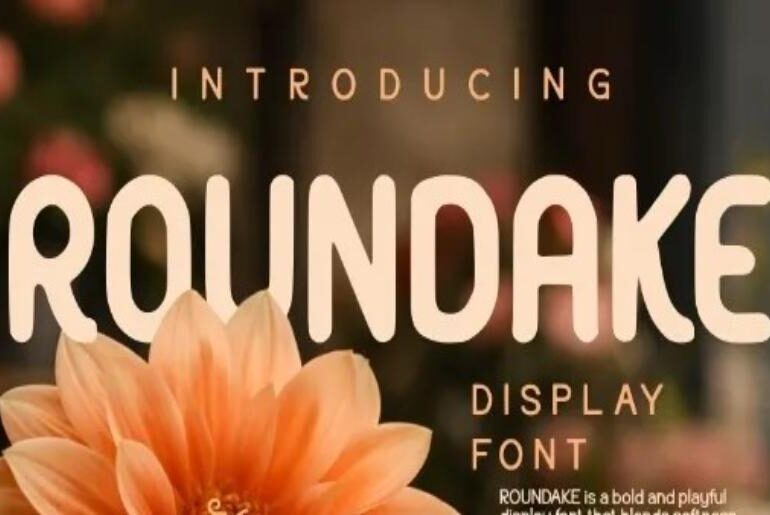
Roundake Font Roundake by Eko Kurniawan is a clean, confident rounded display typeface that brings a modern softness to bold lettering. Its smooth, generously curved terminals strike the right balance between geometric precision and approachable warmth — structured enough for professional branding, friendly enough for lifestyle and consumer-facing design. It reads with ease at display sizes and holds its character across headlines, logos, packaging, and social media graphics where rounded, contemporary type sets the tone.…
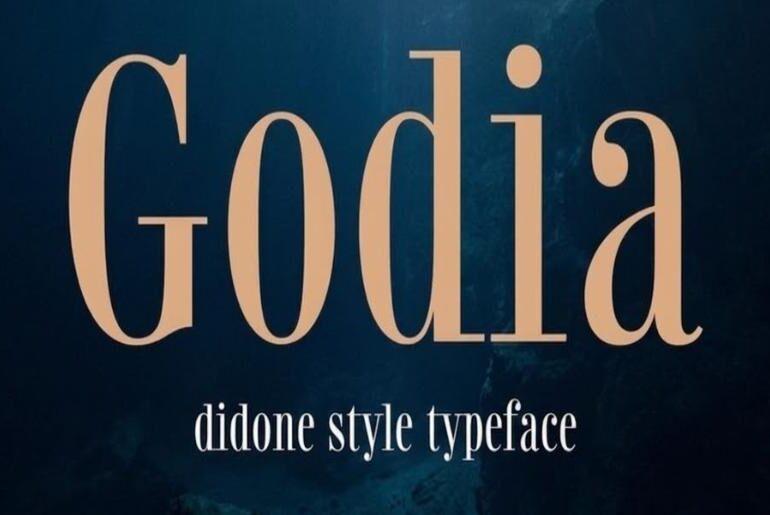
Godia Font Godia is a Didone serif by Daniel Gamage that occupies a well-judged position in a historically demanding genre. The Didone classification — defined by dramatic contrast between razor-thin hairlines and bold main strokes, vertical axis stress, and unbracketed serifs — has produced some of the most recognisable display typefaces in the Western canon, and it makes corresponding demands of any designer working within it: the proportional decisions are unforgiving and the spacing logic…
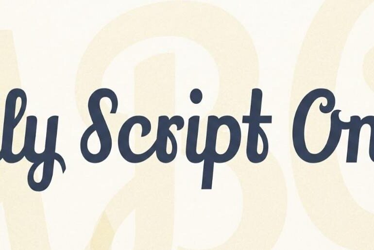
Lily Script One Font Lily Script One by Julia Petretta occupies a distinctive niche among script typefaces: it is emphatically bold, built with thick confident strokes and robust letterforms that give it presence at display sizes without any of the frailty that plagues thinner scripts when they’re pushed into headlines. The hand-lettered quality is genuine — the forms feel written rather than drawn, with an easy bounce to the baseline and variation in stroke angle…
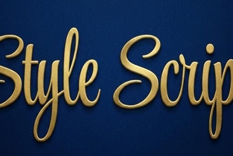
Style Font Style Script by Rob Leuschke is an upright connected script that draws its primary visual logic from a specific and underexplored moment in type history: the lettering that defined American advertising, packaging, and social expression products in the 1950s and 1960s. That era produced a distinctive handwriting aesthetic — fluid, friendly, self-assured, neither stiffly formal nor casually sloppy — that Leuschke, a former lettering artist at Hallmark Cards with decades of custom type…
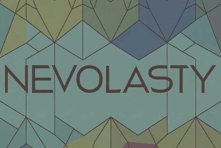
Nevolasty Font Nevolasty is a modern geometric grotesque sans-serif by Grzegorz Luk that earns its place among the more technically generous free font releases: the free version delivers the Light weight alongside what is, by any measure, a seriously capable OpenType architecture. Over 1,000 alternate glyphs populate the character set, with a Stylistic Set 01 enabling extreme contextual alternates that shift letterforms automatically as characters combine — the kind of behaviour that keeps designers returning…
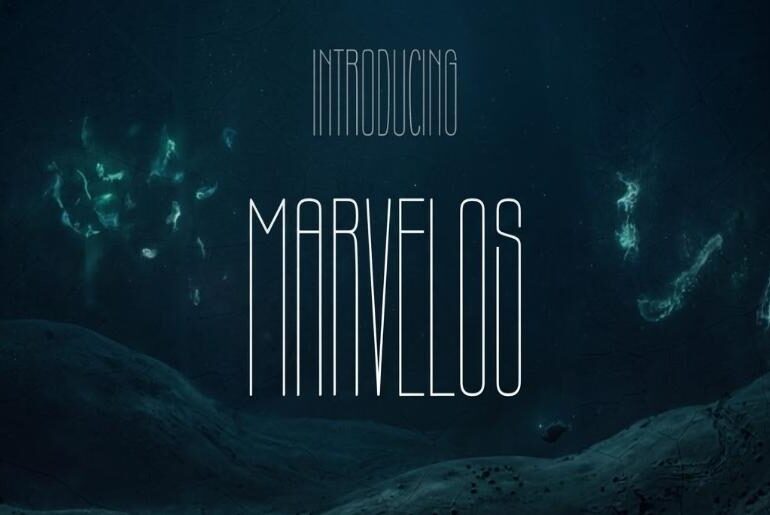
Marvelos Font Marvelos is an ultra-condensed display typeface from Akbaru Type that leans hard into the formal logic of its own constraints — every character is pulled as tall and thin as it can go, creating a vertical tension that makes even a single word feel architectural. The strokes are fine and consistent, the spacing tight without collapsing, and the overall impression one of austere minimalism: this is a typeface that succeeds by doing almost…
The digital commerce environment in 2026 revolves around speed and internal messenger ecosystems. Business owners no longer view a Telegram payment bot as a luxury but as a core requirement for reaching a global audience. Whether you sell physical products or digital services, the current infrastructure supports complex financial flows through the standard Bot API and the advanced Mini Apps framework. Success now requires a deep understanding of how Telegram Stars and traditional merchant bots…
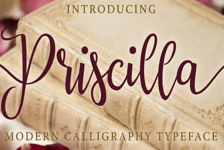
Priscilla Font Priscilla Script by Ian Mikraz is a modern calligraphy script that achieves the particular balance designers most want from the genre: it reads as genuinely handwritten — loose, lively, personally felt — while remaining controlled enough to work across a wide range of professional applications. The 282 glyphs and 109 alternate characters are the real story here, giving users through OpenType features an unusual depth of customisation. Priscilla Script is a richly featured…
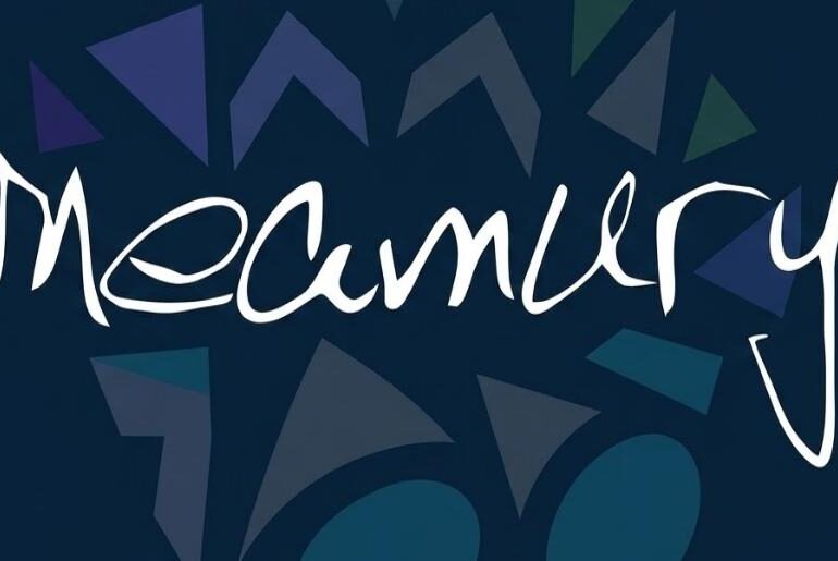
Meamury Font Meamury is a casual handwritten font by Grigoriy Sviridov that succeeds by being genuinely modest in the best sense: it doesn’t reach for elegance or drama, but settles into the comfortable, slightly imperfect rhythm of a real person’s everyday handwriting. The strokes have an ink-on-paper quality — slightly varied in pressure, naturally spaced — that gives text set in it a relaxed, approachable warmth without tipping into self-conscious quirk. Coverage spans 64 languages…


