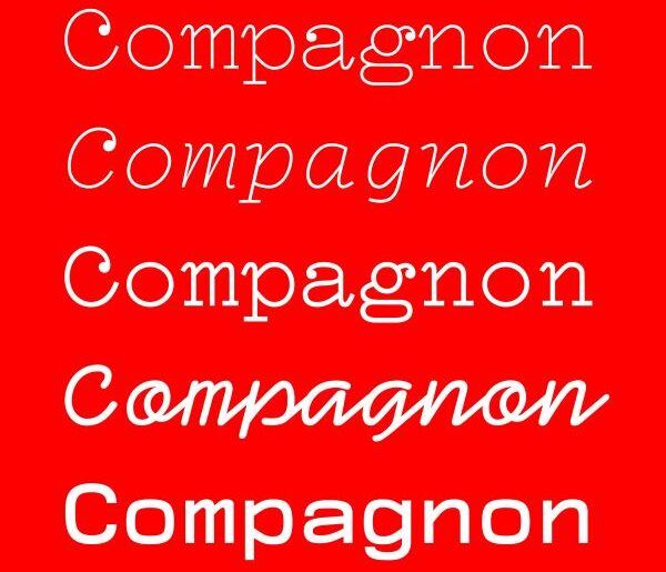
Compagnon Font Compagnon font is a libre font family from Velvetyne Type Foundry, born out of a collaborative graduation project at the Higher European School of Art in Brittany, France. Each of its five distinctive styles — Light, Roman, Italic, Medium, and Script — was designed by a different designer, with each weight drawing inspiration from a different period in the history of typewriter typefaces, tracing the evolution of the form from early serif specimens…
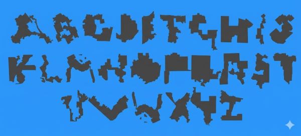
Ugly Gerry Font Ugly Gerry font is a one-of-a-kind display font created by Ben Doessel and James Lee of Leo Burnett Chicago, built entirely from the shapes of real gerrymandered US congressional districts. Each of the 26 uppercase characters is formed by the outline of an actual district whose boundaries have been so contorted by partisan redistricting that they accidentally resemble letters of the alphabet. Originally launched in 2019 in collaboration with RepresentUs, Ugly Gerry…
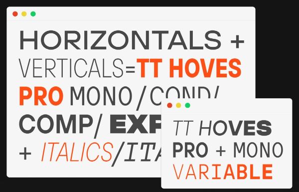
TT Hoves Pro Font TT Hoves Pro by TypeType Foundry is one of those rare typefaces that has found its way into genuine widespread use — a studio bestseller that earns that status through real utility rather than novelty. Its name encodes its design logic directly: TT Hoves is formed from the syllables of “horizontals” and “verticals,” reflecting the predominance of those strokes across all its glyph shapes. Free trial available for personal use. TT…
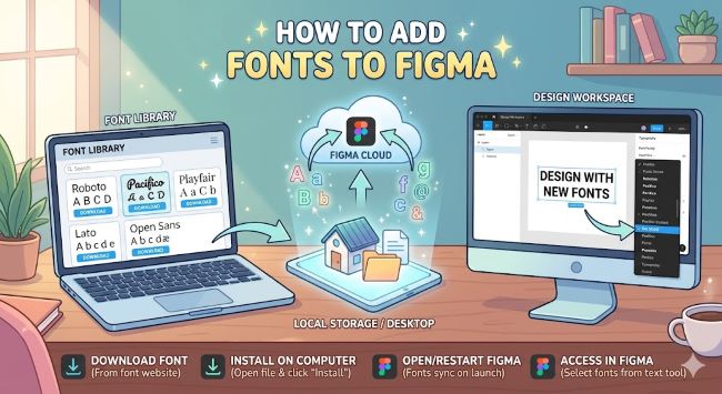
How to Add Fonts to Figma Learn how to add fonts to Figma on desktop and browser, including how to use local fonts, Google Fonts, and the Figma Font Installer for seamless design work. Figma is where a lot of design work happens today, and fonts are central to almost every project. But if you have ever opened a file and seen a font replaced with something generic, or tried to use a custom typeface…
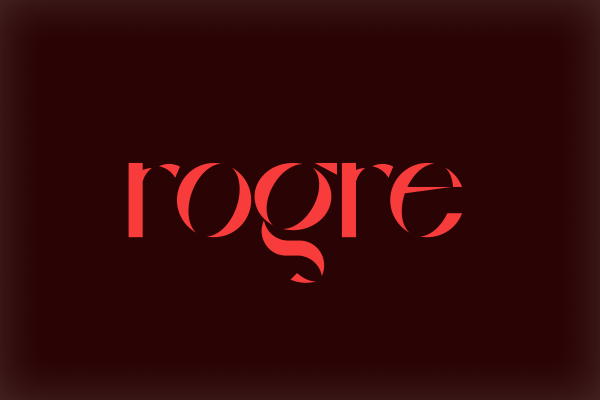
Rogre Font Rogre by Atacan Oztürk is a free display typeface with a dual identity — released in both a Fashionary and a Stencil variant, giving designers immediate flexibility in how they apply its bold, modern letterforms. Its clean, confident strokes make it a natural fit for fashion editorial, poster design, branding, and any context where a contemporary display face needs to carry real visual weight without resorting to excess. The stencil variant adds an…
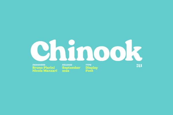
Chinook Font Chinook by Unio Designs is a free chunky display serif typeface conceived as an homage to the bold, rounded titling typography of Italian cinema from the 1970s and 80s. Heavily influenced by the classic Cooper Black, it pushes further with more contemporary letter shapes, soft rounded serifs, and a fluffy, approachable overall presence. A freebie version is available alongside the premium release on Envato Elements. Chinook is a lovingly crafted addition to our…
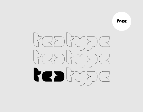
Tea Type Font Tea by Adilson Gonzales is a free display typeface with an origin story as warm as its name — originally sketched in 2007 as a college project built around a single word, then expanded into a full alphabet over a decade later when the designer rediscovered the work. Ideal for packaging, editorial headlines, branding, and any project that welcomes a touch of quiet originality. Free for personal and commercial use. Tea is…
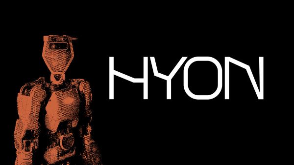
HYON Font HYON by Slide Graphic is a variable geometric font with a visual aesthetic rooted in robotics, technology, and science fiction — a visual world of mechanical precision, futuristic machinery, and the particular clean-edged graphic language associated with cutting-edge engineering and digital design culture. Free for personal use. HYON is a futuristic geometric variable display typeface in our free font collection, designed by Slide Graphic — a creative studio based in Hungary with a…
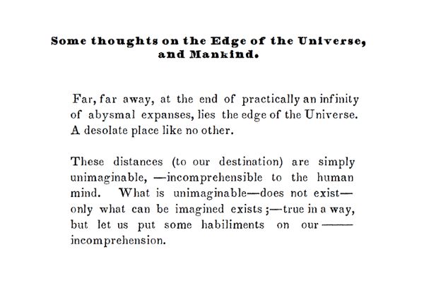
Southern Literary Mess Font Southern Literary Mess by Gary Stephens is a free revival typewriter font based on the Southern Literary Messenger — a defunct 19th-century American literary journal that published Edgar Allan Poe. Its letterforms capture the distinctive character of 1800s press typography, making it a typewriter font steeped in genuine literary history. With 358 glyphs and two styles, it suits historical editorial design, literary branding, and period-accurate printing projects. Free for personal use.…
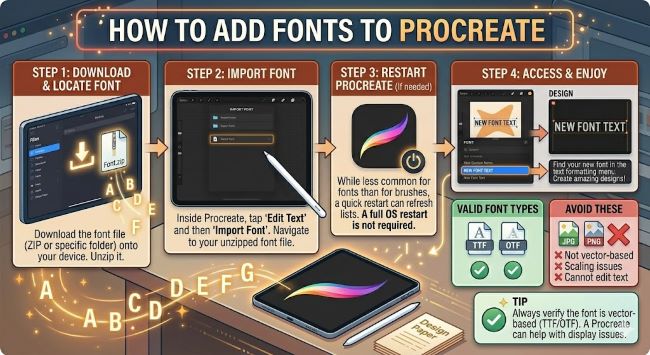
How to Add Fonts to Procreate Learn how to add fonts to Procreate on your iPad in a few simple steps. This guide covers installing fonts via Safari, AnyFont, and your Files app so they appear in Procreate instantly. Tutorial Step-by-Step Guide How to Add Fonts to Cricut Learn how to add fonts to Cricut Design Space step by step. Covers installing system fonts, Google Fonts, and accessing them in your Cricut. Procreate has a…

