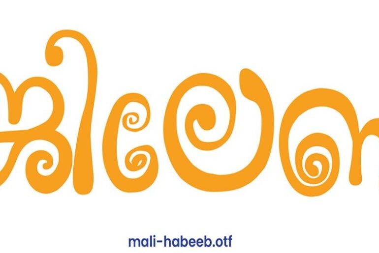
Mali Habeeb Malayalam Font Mali Habeeb is a free Malayalam typeface crafted with careful attention to the flowing, curved nature of the script. Designed to feel both authentic and clean on screen, it serves the everyday typographic needs of Malayalam speakers and designers working with South Indian language content — from digital interfaces and editorial layouts to cultural projects and regional branding. A rare and welcome addition to any multilingual design toolkit — browse more…
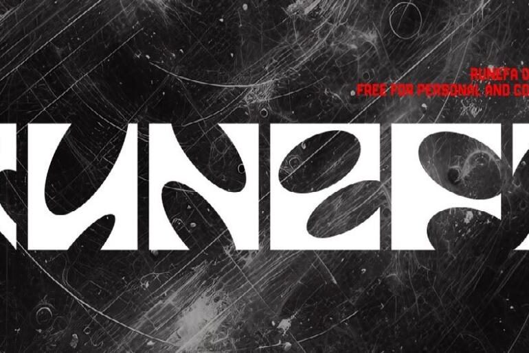
Runefa Font Runefa is a display typeface built around a single compelling design idea: transforming simple squares into fluid, organic letterforms. The result is a striking contrast between hard geometric edges and soft, flowing curves that gives each character a sculptural, almost animated quality. It works especially well in contexts where structural boldness and visual intrigue need to coexist. Completely free for personal and commercial use with no restrictions whatsoever — browse more free fonts…
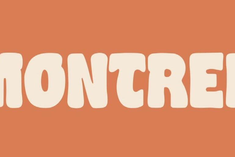
Montrek Font Montrek is a hand-lettered display typeface with an expressive, organic quality that sets it apart from purely geometric alternatives. Fluid strokes and a naturally imperfect rhythm give the letterforms genuine warmth and character, making it an excellent choice for branding, poster design, apparel graphics, and any project where a human touch and creative personality are part of the brief. The free version includes lowercase characters — the full set with commercial rights is…
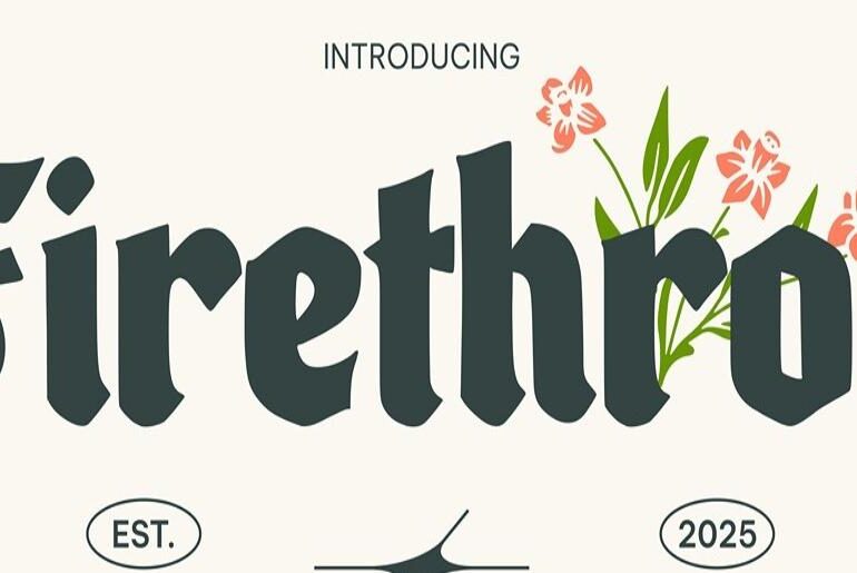
Firethron Font Firethron is an organic blackletter display typeface that brings a raw, expressive twist to the gothic tradition. Where classic blackletter tends toward rigid geometry, Firethron softens and distorts its forms with fluid, almost fire-like strokes that give the typeface a wild, untamed energy. It suits heavy metal aesthetics, dark branding, editorial work, and apparel with a rebellious edge. The free version includes lowercase characters — the full commercial release is available on Creative…
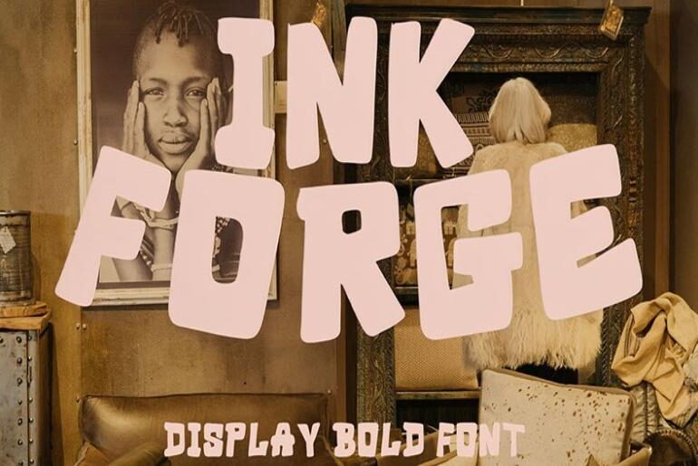
Inkforge Font Inkforge is a bold casual display typeface inspired by expressive hand lettering and the confident strokes of vintage sign painting. Strong uppercase characters deliver a nostalgic retro attitude with an authentic handmade quality that feels genuinely crafted rather than digitally sterile. It performs well across posters, branding, logos, packaging, apparel graphics, and social media content where personality matters. A great pick for projects that need raw energy and retro character — browse more…
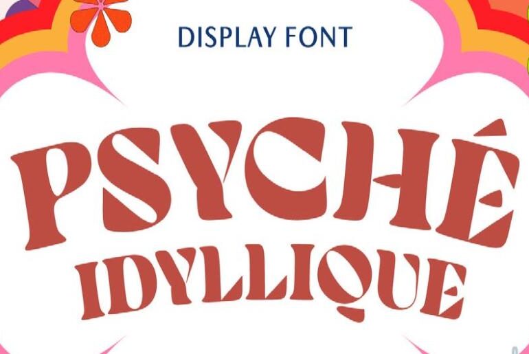
Psyche Idyllique Font Psyche Idyllique is a high-contrast retro display typeface that channels the rebellious energy of 1960s and 70s psychedelic design — fluid, melting curves meet a rhythmic letterform structure directly inspired by iconic concert posters and vintage editorial work. It covers full uppercase and lowercase, numbers, punctuation, and multilingual support for Western and Central European languages. Download this free font for both personal and commercial use — the Standard Commercial License is included…
Account-based marketing (ABM) looks ideal for complex B2B sales: long cycles, many stakeholders, and high contract values. The challenge is that not every agency offering “ABM services” actually supports that kind of sales motion. Choosing the right partner means checking readiness, goals, and fit just as carefully as buyers evaluate a new CRM or sales tool. Understand Whether the Business Is Ready for ABM Before a company signs with any ABM provider, it needs to…
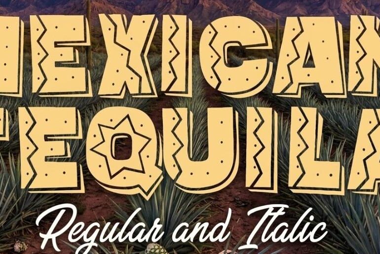
Mexican Tequila Font Mexican Tequila by Vladimir Nikolic is a bold, patterned display typeface that arrives in two styles — regular and italic — each radiating the vibrant, festive energy of Mexican folk culture. Its all-caps letterforms carry a native warmth and playful confidence that makes them a natural fit for event flyers, party designs, movie titles, music branding, and channel banners where cultural colour and visual exuberance are the brief. A typeface that brings…
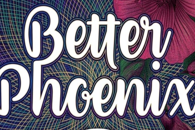
Better Phoenix Font Better Phoenix by Ana is a polished brush script typeface built with rare depth and versatility. Packing over 400 glyphs — including small caps, contextual and stylistic alternates, swashes, and ligatures — it brings a level of typographic sophistication to logos, website headers, cards, invitations, and editorial layouts that goes well beyond what most script fonts offer. Its flowing, swash-accented letterforms reward the designer willing to explore its full range, delivering results…
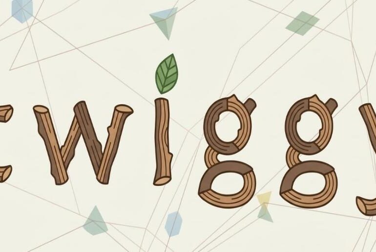
Twiggy Font Twiggy by Amy Fowler is a wonderfully characterful wood display typeface whose crooked, cartoonish lowercase letters look as though they were assembled from fallen branches on a forest floor — organic, playful, and full of personality. The slight irregularity of each character is precisely what makes it so charming: it has the handmade warmth of a children’s illustration without ever feeling sloppy or unconsidered. An inspired choice for cartoon and children’s book titles,…

