The Bluff Font The The Bluff Font used in the movie’s title design appears to be based on a custom-styled version of Cabazon, a typeface designed by Jim Parkinson. Cabazon is an informal blackletter display font known for its sharp angles, medieval influences, and bold decorative strokes, giving it a dramatic, historical, and rugged visual identity that works well for cinematic titles. The font was inspired by traditional blackletter lettering and historical manuscript styles, drawing…
Bamboozler Font Bamboozler by Chequered Ink is a bold geometric display typeface that demands attention without asking for it. Its thick, blocky forms carry a sense of controlled disorder — confident and grunge-inflected, yet structured enough to anchor posters, flyers, covers, billboards, and wood-engraved signage with equal authority. Working entirely in caps, it leans into the absence of lowercase as a design choice rather than a limitation. Free for personal use. Bamboozler is an eye-catching…
QUADPOINT Font QUADPOINT by Hadiya Davis is a strikingly original modular display typeface built from a deceptively simple premise: every letter is constructed from circles arranged within a square grid, drawing its formal language from the intersection of squares, circles, and four-pointed stars. The result is a typeface that feels simultaneously geometric and playful — bold lines and rounded corners softened by the unexpected inclusion of sharp points, creating a visual rhythm that is instantly…
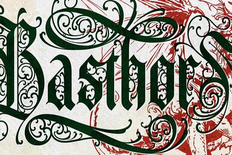
Basthor Font Basthor by Eric Burntilldead is a bold blackletter typeface of exceptional craft and presence, drawing deep from the well of medieval calligraphy and classic European lettering traditions. Its elegant curves, rich ornamental details, and dramatic swash forms bring a powerful historical character to the page — one that feels simultaneously ancient and stylishly contemporary. The typeface includes beautifully crafted alternates that give each setting its own unique typographic personality, along with a dedicated…
DeathRattle BB Font DeathRattle BB by Blambot Comic Fonts is a raw, aggressive brush script that pulls no punches. Its bold, all-caps letterforms carry the scraped, splintered energy of horror movie titles and underground comics — jagged enough to feel dangerous, yet controlled enough to work across posters, video game branding, logos, and ad brochures. There are no lowercase letters, which only adds to its uncompromising character. Free for personal use. DeathRattle BB is a…
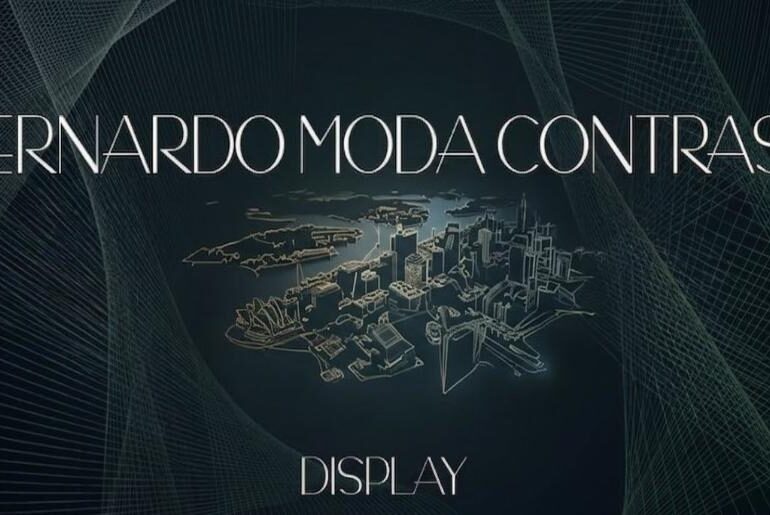
Bernardo Moda Contrast Font Bernardo Moda Contrast by Peter Wiegel is an Art Deco display typeface that captures the refined elegance of early twentieth-century design with an unmistakable sense of drama. Its high-contrast strokes — pairing razor-thin hairlines against bold, commanding verticals — give it the kind of sophisticated tension that defined the golden age of poster and theater typography. The result is a typeface that feels simultaneously vintage and modern, at home on fashion…
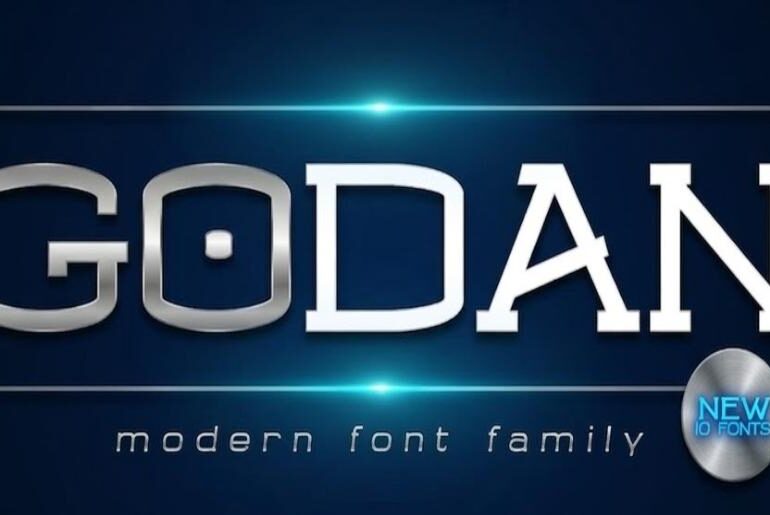
Godan Font Godan by Afkari Studio is a modern slab serif with the kind of timeless, unhurried elegance that feels at home across centuries of design tradition — from classical literature and newspaper typography to contemporary government documents and refined editorial work. Its letterforms create a natural flow between characters that keeps text legible and inviting at any scale. With four styles and two weights, Godan arrives as a well-rounded family that brings both versatility…
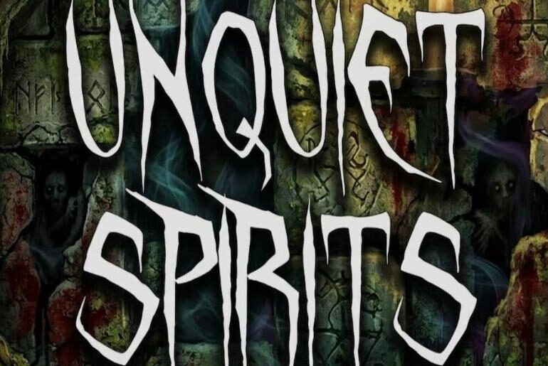
Unquiet Spirits Font Unquiet Spirits is a haunted handwriting display typeface from Sinister Fonts, a one-person operation run by a designer who goes by the name Savage and has built one of the more distinctive catalogues in the horror and Halloween font category over a sustained period of free releases. Language support covers 63 Latin-script languages. Unquiet Spirits is a free haunted handwriting display typeface from Sinister Fonts in our free font collection — ethereal…
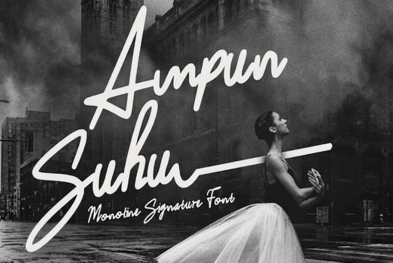
Ampunsuhu Font Ampunsuhu is a monoline signature script designed by Ideal Eksis, an Indonesian type designer who distributes their work freely and invites support via PayPal and Instagram. The font sits in the refined end of the casual script spectrum: a single-weight connected handwriting style where the absence of stroke contrast — the defining characteristic of a monoline construction — produces a clean, minimalist quality that distinguishes it from the more expressive, variable-weight scripts that…
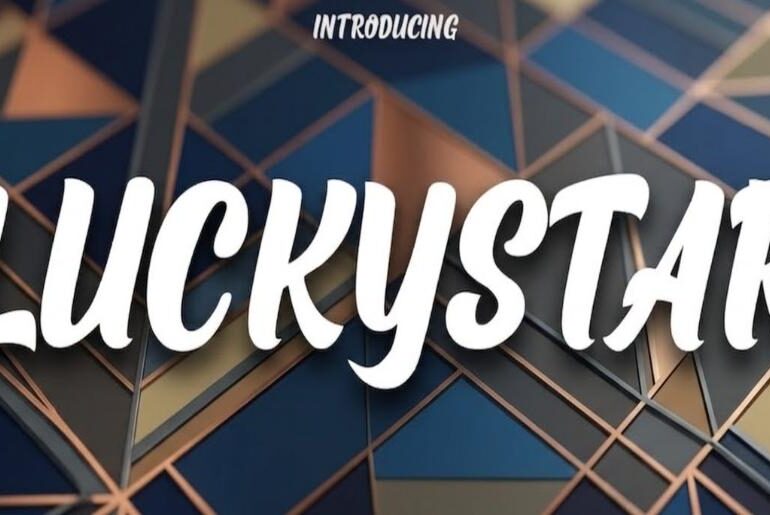
Luckystar Font Luckystar is a bold italic handwritten script from Dumadi, an Indonesian lettering artist and type designer who distributes work under that name across Fontbundles, Creative Market, and Creative Fabrica. The font occupies the bold display end of the handwritten script category: a strong forward-leaning italic with substantial stroke weight, confident connected letterforms, and the kind of rough-edged energy that makes it effective for vintage-inflected branding, retro poster work, merchandise graphics. Luckystar is a…


