Bambu Font Bambu is a playful, blocky display typeface that draws its visual identity from the organic geometry of bamboo. Available in four distinct styles — each alternating between black and white treatments peppered with charming subtleties — it brings a warm, tropical energy to signs, posters, t-shirts, book titles, and any project that calls for a fun and adventurous spirit. Its flat, chunky letterforms feel equally at home in jungle-themed branding, beach aesthetics, and…
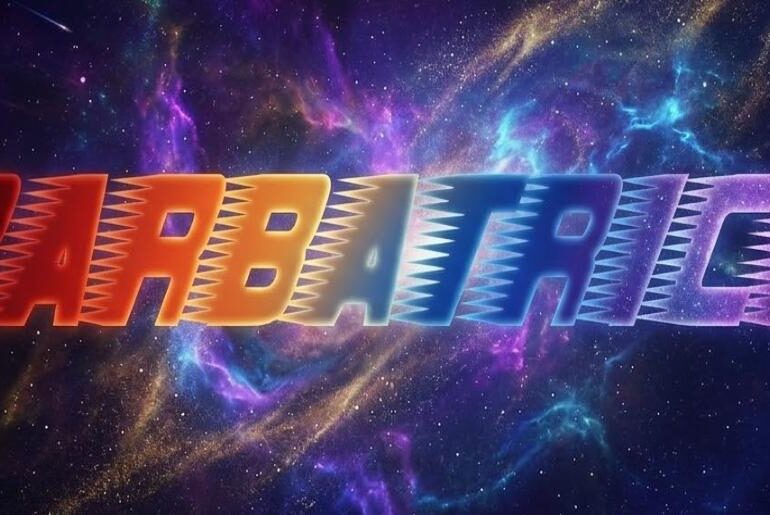
Barbatrick Font Barbatrick by Typodermic Fonts is a mid-twentieth-century-inspired speed headline typeface that brings raw kinetic energy to any layout it touches. Its sharp, condensed, all-caps letterforms lean forward with a saw-edged urgency — built for titles, logos, flyers, movie posters, sports graphics, and anywhere that demands velocity and visual punch. There are no lowercase letters, which only reinforces its singular, uncompromising identity as a display face built purely for impact. Released under a CC0…
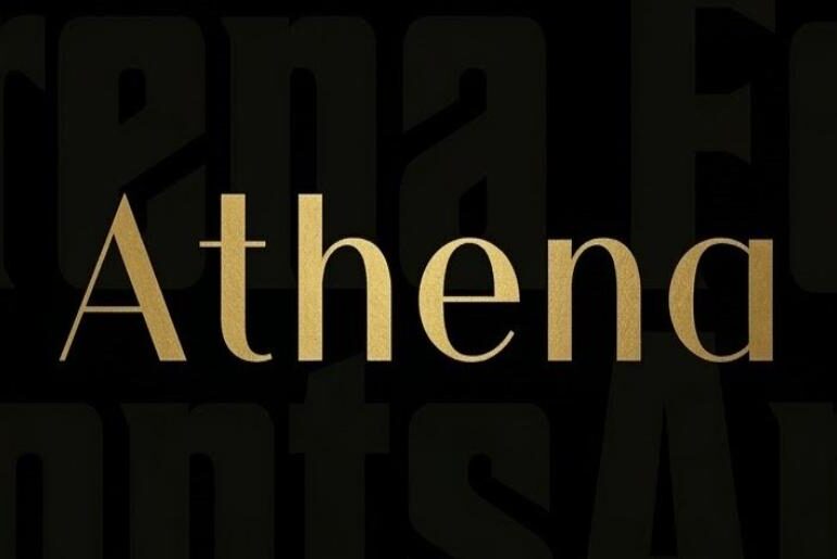
Athena Font Athena by Ellen Luff is a luxury sans serif typeface that walks the line between retro refinement and contemporary minimalism with effortless grace. Its letterforms are predominantly thin, with subtle variations in stroke weight that add visual interest without sacrificing the clean, airy quality that makes it so versatile. Whether applied to fashion editorials, book covers, magazine layouts, invitation design, or upscale brand identities, Athena brings a quiet, assured elegance to every setting.…
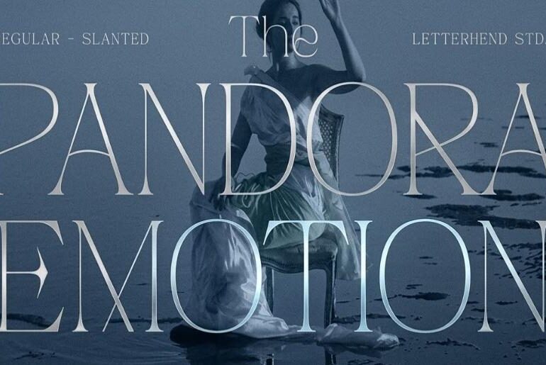
Pandora Emotion Font Pandora Emotion by Letterhend Studio is a refined luxury serif typeface that achieves its impact through restraint rather than excess. Its delicate, high-contrast letterforms — fine hairline serifs meeting gracefully proportioned strokes — project an understated sophistication that immediately signals quality and class. Ideal for hotel branding, spa identities, makeup artist portfolios, photography studios, and any luxury business looking to communicate elegance with quiet confidence. Free for personal use. Pandora Emotion is…
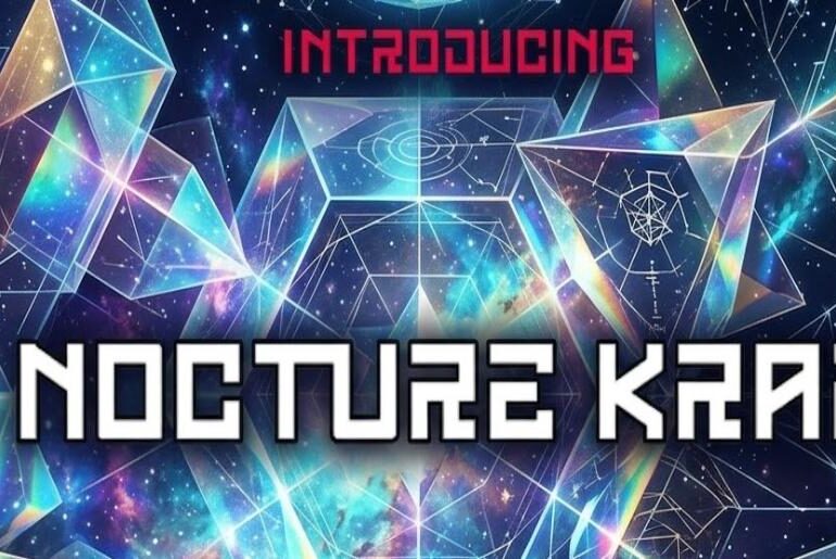
Nocturne Kraft Font Nocturne Kraft by Albert Kalingga is a sharp, all-caps square display typeface built for the modern and the futuristic. Its clean, geometric construction radiates a cool technological authority — the kind of typographic voice that feels at home on software company logos, electronic brand identities, gaming visuals, sci-fi movie titles, and social media content where a sleek, forward-looking aesthetic is the brief. Precise, bold, and unapologetically contemporary. Free for personal use. Nocturne…
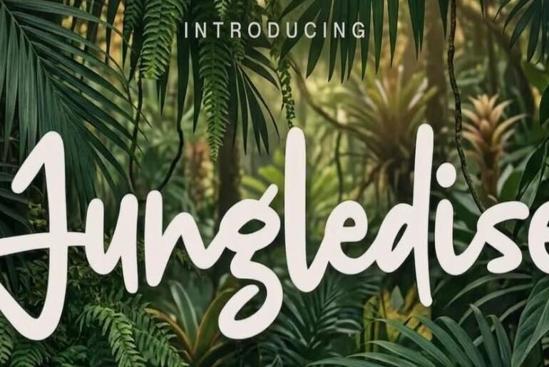
Jungledise Font Jungledise by Allouse Studio is a flowing handwritten script that wears its humanity proudly. In a design landscape often dominated by precision and uniformity, its organic letterforms offer something warmer and more personal — the kind of imperfect beauty that only comes from a hand actually moving across paper. Fluid, expressive, and naturally elegant, it brings an artisan quality to wedding invitations, logos, websites, and any project that benefits from a touch of…
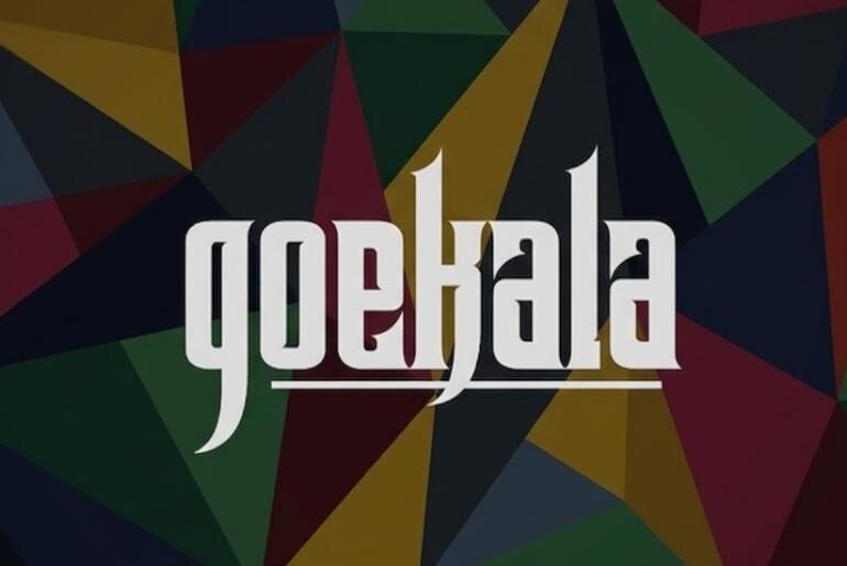
Goekala Font Goekala by Vacatype Co. is a medieval display typeface that channels the eerie, timeworn atmosphere of old manuscripts and dark fantasy worlds. Its ornate, gothic letterforms carry a sense of weight and antiquity — expressive enough to evoke momentum and vintage drama, yet versatile enough to work across movie posters, video game brochures, branding, product packaging, and social media content. A typeface that makes its presence felt from the very first letter. Free…
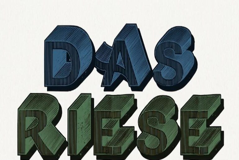
DasRiese Shadow Font DasRiese Shadow by Intellecta Design is a retro 3D display typeface with a distinctly mid-century character. Its cross-hatched, all-caps letterforms cast a visual shadow that adds depth and dimensionality, bringing a sense of drama and bold graphic presence to covers, street posters, stickers, flyers, and wood engravings. Drawing on the typographic traditions of 1940s and 50s poster art, it balances decorative flair with a raw, hand-crafted quality that feels both nostalgic and…
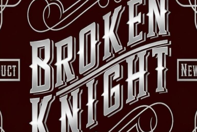
Broken Knight Font Broken Knight by EkoZero7 is a blackletter display typeface steeped in the visual language of medieval warfare and dark fantasy. Its sharp, angular letterforms recall the pointed geometry of spears and battle weapons, lending the font an epic, combative energy that feels right at home on poker game themes, tattoo designs, t-shirts, and any project calling for gothic gravitas. An all-caps typeface that makes every word feel like a declaration. Free for…
The Bluff Font The The Bluff Font used in the movie’s title design appears to be based on a custom-styled version of Cabazon, a typeface designed by Jim Parkinson. Cabazon is an informal blackletter display font known for its sharp angles, medieval influences, and bold decorative strokes, giving it a dramatic, historical, and rugged visual identity that works well for cinematic titles. The font was inspired by traditional blackletter lettering and historical manuscript styles, drawing…


