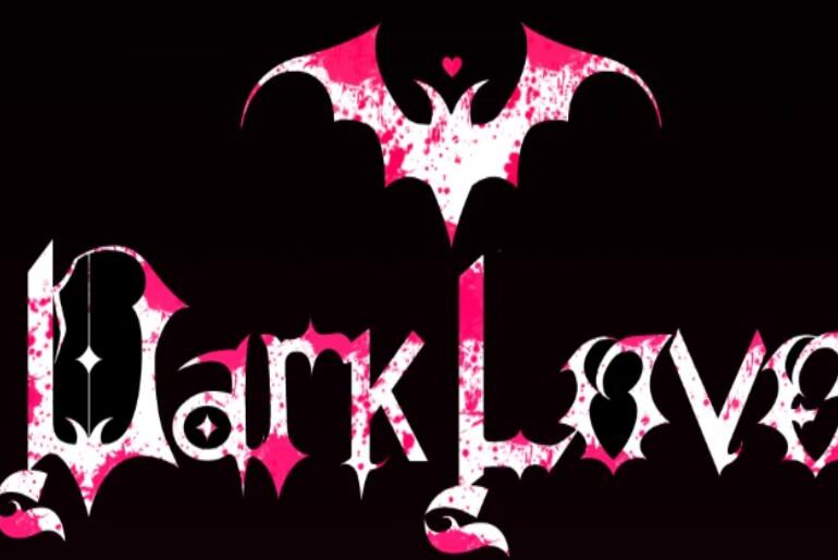
Dark Love Font Dark Love by Ana Carolina Menegon and Júlia Klem is a gothic-romantic display typeface that walks the line between darkness and elegance with quiet confidence. Its letterforms carry a dramatic, expressive quality rooted in the gothic tradition — pointed, ceremonial, and richly atmospheric — while maintaining a romantic undercurrent that makes it equally suited to dark editorial work, fashion branding, wedding aesthetics with an edge, social media graphics, and any project where…
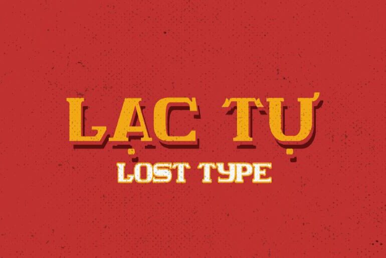
Lost Type Font Lost Type by Mack Trinh and Đức-Hải “Harry” Đinh is a bold all-caps slab serif display typeface rooted in the visual heritage of Vietnamese urban typography — the kind of commanding letterforms that once adorned storefronts, posters, and street advertisements throughout the country’s cities. Drawing inspiration from the iconic Clarendon style while pushing toward a boxier, wider form, Lost Type achieves a heightened visual impact and strong legibility that makes it ideal…
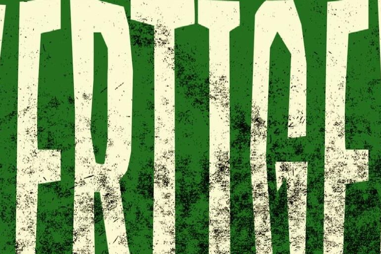
Vertiger Font Vertiger by Ilya Designgsta is a display typeface inspired by the atmospheric poster art of mystical films from the 1950s and 60s — repetitive, rough-edged, and carrying a distinctly theatrical presence. Its letterforms have a vintage cinematic quality: slightly coarse, boldly expressive, and tinged with the sense that they belong on a film marquee or a concert poster pulled from another era. The designer describes it as “reptile-rough and a little artistic,” built…
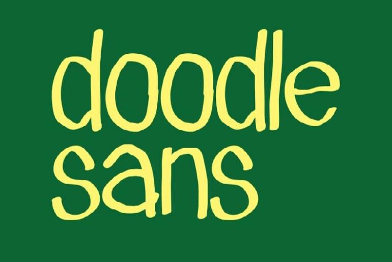
Doodle Sans Font Doodle Sans by João G. Gonçalves is a spontaneous handwriting typeface that radiates lightness and creative energy. Its loose, irregular strokes capture the unfiltered charm of hand-drawn doodles — the kind that fills sketchbook margins and sticky notes with personality. Far from polished or rigid, it thrives in designs that call for an authentic, playful touch: casual branding, editorial illustrations, greeting cards, social content, and any project that benefits from a human…
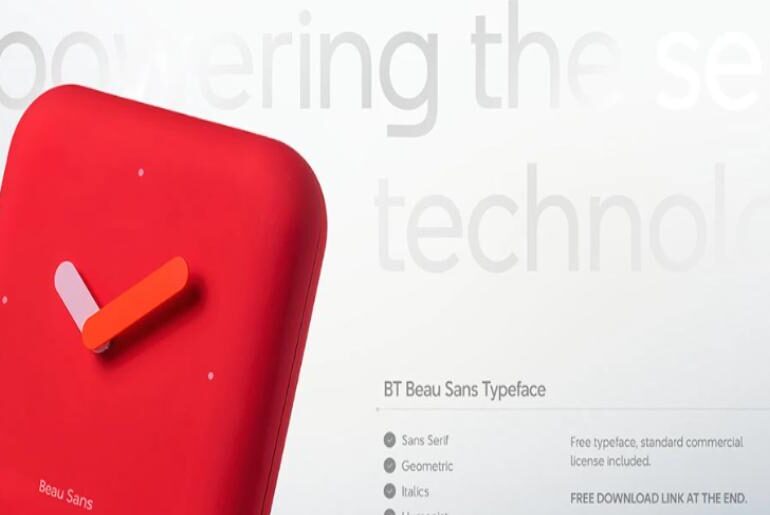
BT Beau Sans Font BT Beau Sans is a geometric humanist sans serif typeface developed by Beautique Consultancy and BeauType Studio in Hanoi, with a design philosophy rooted in the convergence of human experience and digital technology. Available in ten weights, it covers the full range from delicate light settings to commanding display use — making it an exceptionally versatile choice for branding, UI design, editorial, and technology-focused identities. The Regular weight is free for…
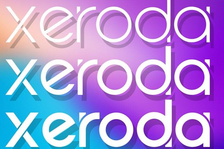
Xeroda Font Xeroda is a clean, modern sans serif with confident proportions and a logotype-ready character that works particularly well in Adobe Illustrator-based design workflows. Its balanced geometry and refined stroke consistency make it a solid choice for social media graphics, logo design, branding, and product identity work where a polished yet understated contemporary typeface is needed. Available for personal use via Fontspace — a commercial license can be purchased on Creative Market — browse…
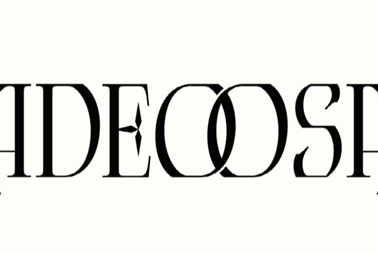
Adeoosa Font Adeoosa is a serif display typeface by Mooneseye Studio that blends masculine strength with modern elegance, weaving subtle Gothic undertones into a refined classical structure. OpenType features including ligatures and alternate characters give it typographic depth well beyond a basic display face — ideal for standout logotypes, poster headers, magazine layouts, and premium brand apparel where a commanding presence is essential. A demo version is available for personal use — the full commercial…
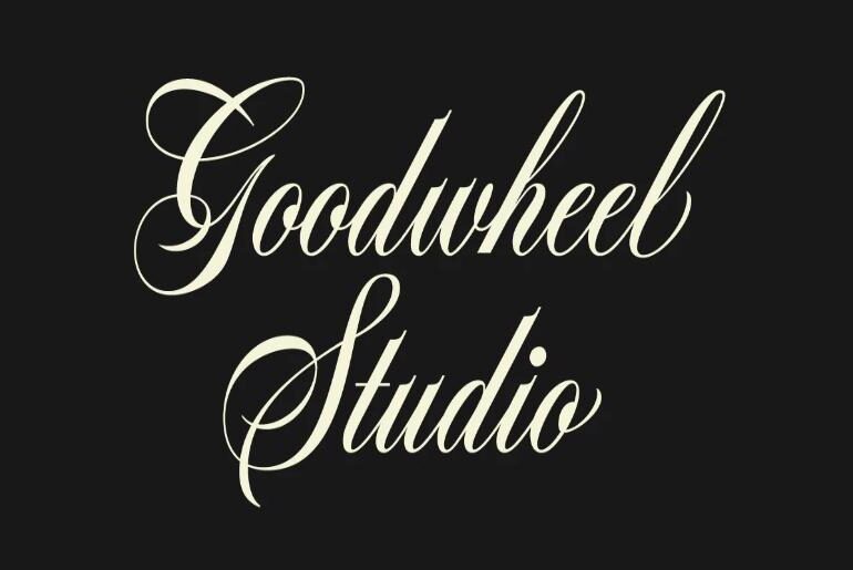
GW Bantley Script Font GW Bantley Script is an elegant Copperplate-inspired script typeface with refined swashes, polished stroke endings, and contextual alternates for select letterforms. The result is a calligraphic script with a premium feel that sits naturally in wedding stationery, high-end branding, editorial headers, luxury packaging, and any design context where classical typographic elegance is the intended impression. A beautifully crafted script available as a free personal-use demo — the full version is on…
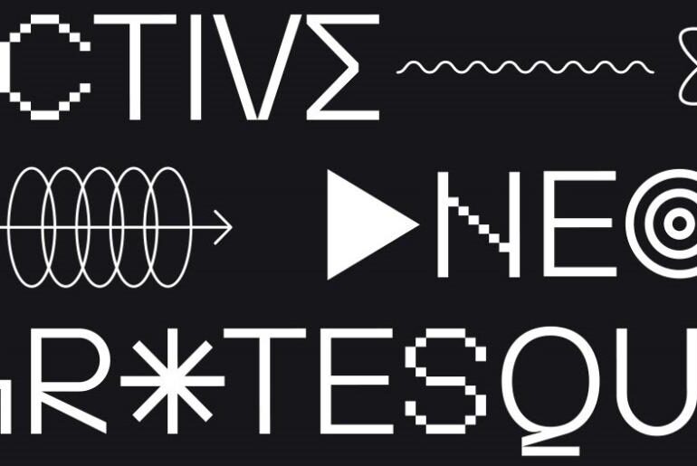
FT Activica Font FT Activica is a five-style uppercase sans serif that functions as both a calm, classical typeface and a full graphic system. Enriched with a range of shapes and symbols that go beyond standard text characters, it becomes an emotional, adaptable tool capable of shifting a layout between rigour and expressiveness — a genuinely versatile typeface with multilingual Latin support for international design use. The Pixel style is available for free personal use…
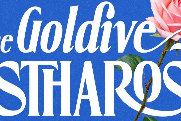
Goldive Estharose Font Goldive Estharose is a modern elegant serif designed to bring sophistication and timeless editorial charm to any project. Stylish curves and sharp detail work combine in three styles — regular, oblique, and italic — with multilingual support and a full character set including uppercase, lowercase, numbers, and punctuation, making it as practical as it is beautiful for both digital and print use. A refined serif equally at home in wedding design, fashion…

