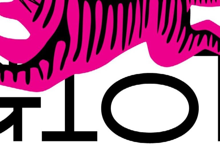
TT Globs Font TT Globs by TypeType Foundry is a slab serif with genuinely wild proportions — the kind of typeface that commands attention not through volume but through sheer typographic personality. The design merges historical slab serif traditions with a thoroughly contemporary sensibility, and the result is something that feels both rooted and fresh. Its most immediately recognizable feature is the long, exuberant serifs that, combined with stretched letterform proportions, create a near-pattern effect…
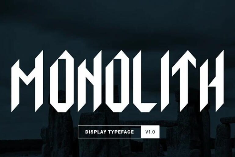
Monolith Font Monolith by Georges Yannopoulos is a blackletter-inspired geometric display typeface built around a single powerful design constraint: every glyph was constructed around a vertical pillar pointing upward, directly referencing the monolith — the large single upright block of stone most recognizable as a pillar or ancient monument. The result is a typeface that fuses the angular, vertical thrust of Gothic blackletter with the measured precision of geometric construction, creating something that feels simultaneously…
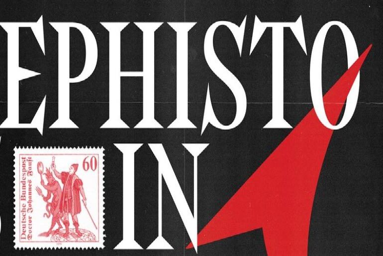
Mephisto Font Mephisto by Даниэль Рипли (Daniel Ripley) is a display serif typeface from Saint Petersburg, Russia-based designer Daniel Ripley — published on March 19th, 2026, making it one of the most recently released fonts in this entire collection. The name and the concept are inseparable: Mephisto takes Goethe’s Mephistopheles as its typographic reference point — the devilish trickster of Faust — and builds a letterform character that earns that name. Mephisto is a sharply…
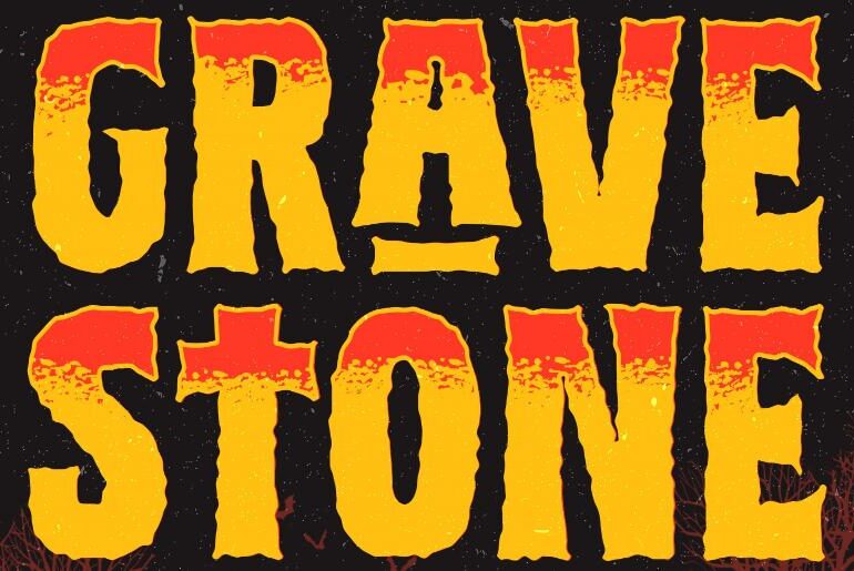
Gravestone Font Gravestone by Rian Dryana / Dryy Type is a horror display typeface from Bandung-based designer Rian Dryana, purpose-built for the grunge-saturated aesthetic language of Halloween, horror, and dark-themed creative work. The letterforms are heavily textured and irregularly shaped, channeling the visual energy of weathered stone carving, decaying signage, and handmade lettering from the margins of the macabre. Three distinct styles — Regular, Outline, and Texture — give it real versatility within its niche,…
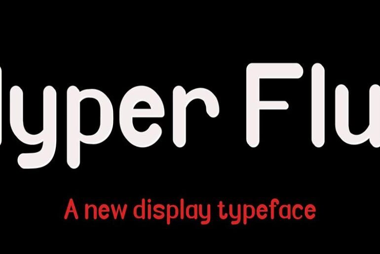
Hyper Flux Font Hyper Flux by Muhamad Fauzan is a dynamic, futuristic display typeface from Bandung-based designer Muhamad Fauzan, built around sharp geometric lines and a bold, energetic aesthetic that makes it a natural fit for posters, logos, and display headlines where visual impact is the primary requirement. Its clean construction keeps it readable at large sizes while the geometric sharpness ensures it projects unmistakable forward-looking energy. A free personal-use download is available; commercial use…
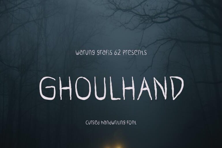
Ghoulhand Font Ghoulhand by Migunani Studio is a cursed handwriting display typeface from Kediri-based Migunani Studio — a font that commits fully to its horror premise. The letterforms are deliberately twisted and malevolent: contorted strokes, jagged edges, and an overall quality that suggests the writing was produced not by any living hand but by something far less benign. It is exactly the kind of typeface that delivers genuine atmosphere rather than generic spookiness, with enough…
How to Use AI for Better Due Diligence on a New Rental Property Buying a rental property is exciting. But it’s also risky. On paper, almost any listing can look like a strong investment. The numbers might seem solid, the neighborhood may appear stable, and the seller’s disclosures might not raise any immediate red flags. But seasoned investors know that real estate profits are made, or lost, during due diligence. The good news is that…
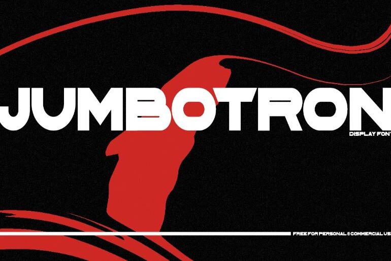
Jumbotron Font Jumbotron by Ian Langley is a free sans-serif display typeface from New York-based designer Ian Langley — bold, modern, and built for maximum visual presence. Its clean geometric construction and strong stance give it a versatile range of applications spanning sports branding, gaming, futuristic UI design, and any context that calls for a commanding, no-nonsense headline face. The name itself is well chosen: this is a typeface designed to read across distances, in…
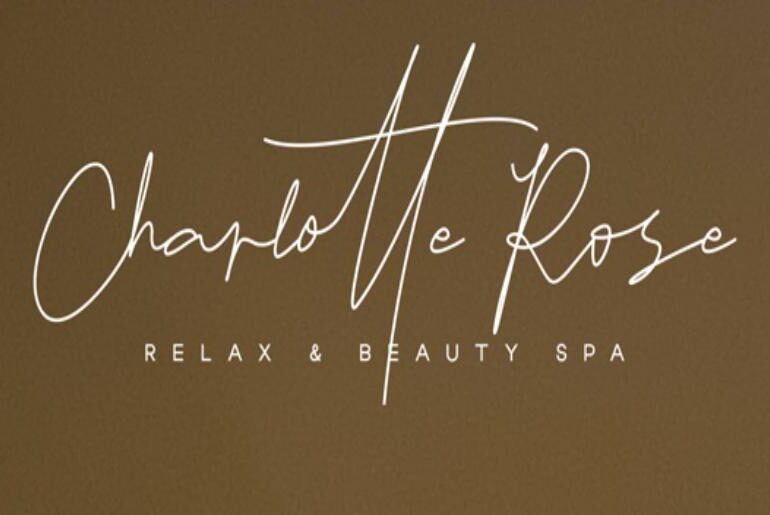
Oshawa Font Oshawa by Intuisi Creative is a signature font with a natural, flowing quality that sits in that useful space between genuinely handwritten and professionally refined — personal enough to feel human, controlled enough to read with ease across a wide range of applications. With 177 handwritten ligatures built in to add natural variation in letter angle and connection, it carries an organic credibility that many competing signature fonts lack. Logos, wedding stationery, photographer…
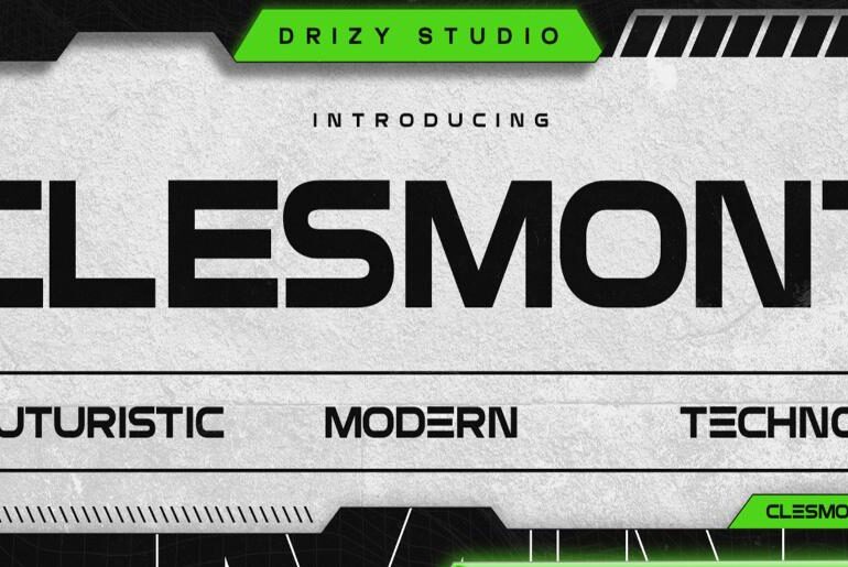
Clesmont Font Clesmont by Drizy Font is a futuristic techno display typeface with clean lines, sharp edges, and a precise industrial quality that sits squarely within the modern sci-fi design lexicon. The letterforms balance contemporary geometry with a technological flair — structured enough to remain legible at display sizes, distinctive enough to make an immediate visual statement. It is well-suited to branding, digital art, product packaging, and website headings where a futuristic or high-tech tone…

