
Designing Business Materials That People Actually Understand
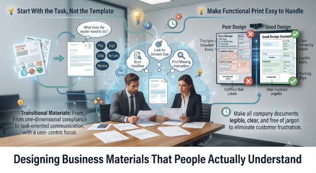
The quickest way to judge a brochure, form, invoice, or mailer is to watch someone use it without a designer nearby. They scan the headline, look for the amount due, circle back to a missing instruction, then decide whether to act or set it aside.
Business materials do more than carry a logo. They tell customers how to pay, sign, ship, return, renew, or prepare. If the design makes those steps harder, the company pays through calls, mistakes, delays, and people who quietly give up.
Start With the Task, Not the Template
Maybe an old flyer has to become a renewal letter, or a sales sheet is being turned into a trade show handout. Before choosing colors, grids, or icons, name what the reader needs to do after seeing the piece.
The hierarchy should follow that job. Put the action, deadline, amount, location, or decision near the top instead of burying it under background copy. Readers don’t care which department supplied the text. They want the next step to look obvious.
Make Functional Print Easy to Handle
Forms, envelopes, packing slips, shipping documents, and mailing labels are where design errors can become expensive. Tiny type, crowded boxes, vague instructions, and similar-looking fields can send the wrong item, delay a response, or leave staff unsure which version to trust.
In offices that still mail notices, contracts, or account documents, Certified Mail Labels need the same care as a form field or return envelope, because users have to see what goes where and what has been recorded.
Write Like the Reader Is Busy
People often read business materials with divided attention. They may be checking a bill after work, opening a delivery at their desk, or looking for one instruction before a deadline. Long introductory copy slows them down when the useful information appears halfway down the page.
Short labels, direct verbs, and familiar wording reduce the amount of guessing a reader has to do. The same idea shows up in digital design, where cognitive load piles up quickly when screens ask people to interpret too much at once. Printed materials deserve similar restraint, with plain headings, enough white space, and instructions that sound like a person wrote them.
Test the Page Before It Goes Out
Before thousands of pieces are printed, hand the draft to someone outside the project and ask them to complete the task. Don’t explain the goal first. Watch where their eyes go, what they miss, and which words make them pause when the material includes numbers, dates, signatures, or return steps.
Design teams also need to protect consistency. If every department creates its own version of a letter, label, or handout, customers get mixed signals and staff spend time correcting avoidable errors. Content strategy treats useful content as part of the design system, which means the words, layout, and reuse rules should be managed together rather than patched at the end.
Before sending the next form, insert, notice, or label into production, ask whether someone can act on it without help. If the answer is no, the design isn’t finished.


