

The It Was Just an Accident Font
The It Was Just an Accident Font used in the movie’s title design appears to be a custom-designed typeface created specifically for the film’s branding and promotional materials. The lettering features a stylized serif display look with distinctive shapes and artistic proportions that give the title a dramatic, mysterious, and cinematic visual identity. Because the original font seems to be custom, it is not publicly available. However, a similar typeface called Seta Reta NF closely matches the overall structure and style of the title lettering, making it a useful alternative for fan art, poster recreations, and design mockups.
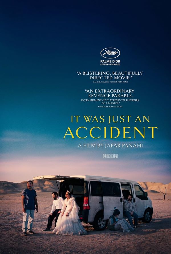
About It Was Just an Accident
It Was Just an Accident is a film centered on a seemingly small incident that triggers a chain of unexpected consequences. As the story unfolds, characters become entangled in mystery, tension, and emotional conflict. The narrative blends drama and suspense while exploring how a single moment can dramatically change lives, with the film’s typography reinforcing its serious and intriguing tone across promotional materials.
Continue exploring with The Big Lebowski Font, La Haine Font, Pirates of the Caribbean Font, Logan Font, and The Deer Hunter Font — and more.


