

Super Smash Bros. Font
What Font Does Super Smash Bros. Use?
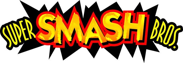
The Super Smash Bros. Font uses a combination of two sans-serif typefaces in the game’s cover logo and branding. The word “SMASH” is set in ITC Kabel Std Bold, while “SUPER BROS” appears in Bodega Sans Light Old Styles. Together, they create a bold yet balanced look that feels both energetic and playful, matching the fast-paced action of the series.
Both Kabel and Bodega Sans are commercial fonts, meaning they require a license for professional use. Designers often look for similar free sans-serif alternatives when recreating the Super Smash Bros. logo for fan art or mockups.
About Super Smash Bros.
Super Smash Bros. is a crossover fighting game franchise created by Nintendo and first released in 1999. The series brings together characters from multiple Nintendo universes, including Mario, Link, Pikachu, and Kirby. Known for its chaotic multiplayer battles and competitive scene, Super Smash Bros. became one of Nintendo’s most beloved franchises. Its bold typography reinforces the series’ high-energy, competitive, and celebratory tone across logos, box art, and promotional materials.
Check out entertainment and restaurant typography with Marvel Zombies Font, Applebees Font, Wayward Font, Arbys Font, and Atkins Font — and more.
Please make sure to follow the license terms for each font. All fonts provided are free for personal use, while some may also allow commercial use. For details, check the included Read Me file with each download. If you’re uncertain about usage rights, we recommend contacting the font’s creator directly.


