Top Gear Font
What Font Does Top Gear Use?
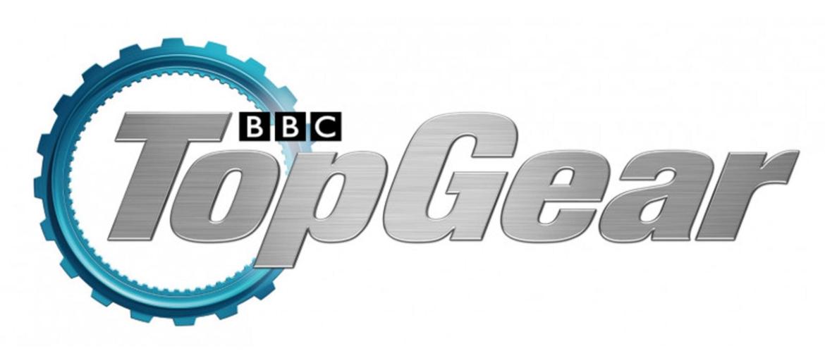
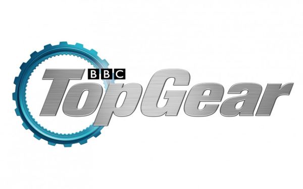
The Top Gear Font is a custom-designed typeface created specifically for the show’s logo and branding. The lettering features a bold, industrial sans-serif style with thick strokes, mechanical proportions, and strong angles, giving the Top Gear wordmark a powerful, fast, and masculine look. This rugged typography perfectly matches the show’s focus on cars, speed, and automotive engineering.
Because the original logo font is custom and not publicly available, there is a free alternative font designed to closely match the Top Gear lettering, making it ideal for fan designs, car-themed graphics, and non-commercial projects.
About Top Gear
Top Gear is a British motoring television show that first aired in 1977. It became globally famous for its car reviews, challenges, and humorous presenting style, especially during the era of Jeremy Clarkson, Richard Hammond, and James May.
The show blends automotive journalism with entertainment, creating one of the most successful and recognizable car programs in the world. Its bold logo and industrial-style typography reflect the show’s high-performance, mechanical, and adrenaline-fueled identity.
Discover fashion retail brand fonts with Claires Font, Diadora Font, Crocs Font, Cartier Font, and Ray Ban Font — and more.
Please make sure to follow the license terms for each font. All fonts provided are free for personal use, while some may also allow commercial use. For details, check the included Read Me file with each download. If you’re uncertain about usage rights, we recommend contacting the font’s creator directly.

