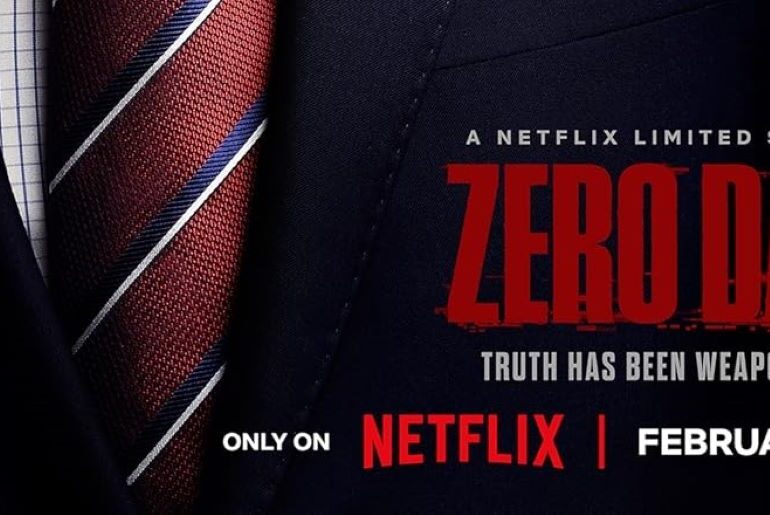
Zero Day Font What Font is Zero Day? Zero Day Font reflects the tense, high-stakes atmosphere of political intrigue and digital warfare. The font is most likely Press Gothic Biform, a commercial typeface recognized for its bold, compact structure and authoritative tone. Its sharp geometry and impactful form mirror the show’s themes of secrecy, leadership, and power struggles in a hyper-connected world. For designers seeking a similar aesthetic, a free alternative font captures the same…
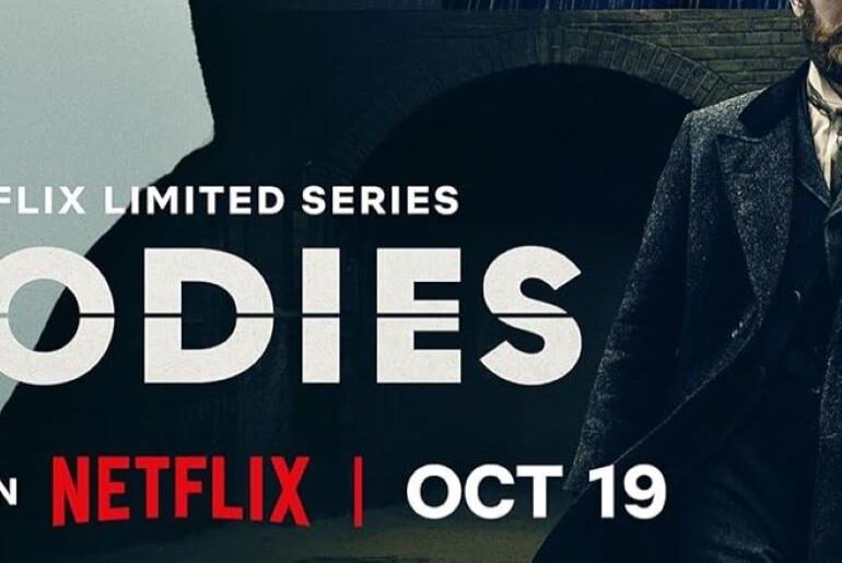
Bodies Font What Font is Bodies? Bodies Font carries a dark, investigative tone that mirrors the intricate mystery and time-bending narrative of the series. The font is most likely a modified version of Regulator Nova Alts Heavy, a commercial typeface known for its geometric boldness and modern edge. Its sharp lines and structured form give a sense of tension and precision, perfectly aligning with the show’s themes of crime, conspiracy, and connection across timelines. A…
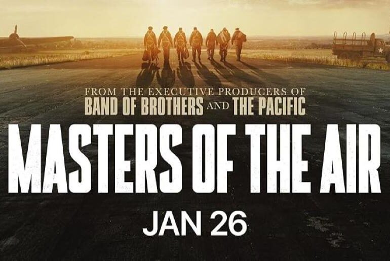
Masters of the Air Font What Font is Masters of the Air? Masters of the Air Font showcases a bold, military-inspired design that captures the courage and determination of World War II aviators. The font was custom-designed by Corey Holms and evolved into a typeface known as Flying Fortress, created specifically for Apple’s production of the series. Notably, the letter “S” underwent subtle refinements during development, adding to the authenticity and uniqueness of the design.…
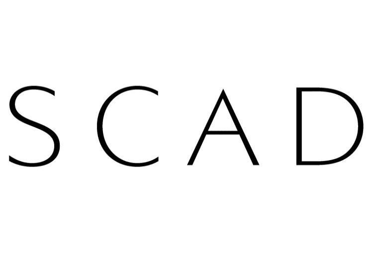
Escada Font What Font is Escada? Escada Font exudes elegance and sophistication, much like the fashion house it represents. The typeface closely resembles Linotype Aroma Extra Light, a commercial font, though we’ve also found a free alternative that captures its refined essence. With its thin, graceful strokes and timeless letterforms, the Escada Font evokes luxury and femininity — making it ideal for fashion branding, high-end packaging, and editorial design that seeks to convey understated class…
Ellesse Font What Font is Ellesse? Ellesse Font features a stylish and sporty aesthetic that perfectly reflects the brand’s dynamic identity. The typeface closely resembles Gourmandise by ClaudeP, which is free for personal use. With its smooth curves and bold yet approachable letterforms, this font captures the balance between performance and fashion — just like Ellesse’s apparel. It’s an excellent choice for modern sports branding, lifestyle projects, or any design aiming for an energetic yet…
Dolce Gabbana Font What Font is Dolce Gabbana? Dolce & Gabbana Font embodies modern elegance and precision, much like the fashion house it represents. The typography used in the logo is Futura PT Demi by ParaType, a commercial font celebrated for its clean geometry and bold balance. Its refined structure and contemporary simplicity make it a perfect fit for luxury branding. For designers who want to achieve a similar aesthetic, we’ve also found a free…
DKNY Font What Font is DKNY? DKNY 2025 Font features a strong, contemporary aesthetic that reflects the brand’s urban sophistication and bold minimalism. The typography closely resembles Handbills And Posters JNL by Jeff Levine, a commercial font known for its structured and timeless appeal. Its solid, confident strokes capture the energy of New York City—modern, assertive, and effortlessly stylish. For those seeking a similar visual impact, we’ve found a free alternative font that closely mirrors…
Diesel Font What Font is Diesel? DIESEL 2025 Font showcases bold minimalism and industrial strength, reflecting the brand’s fearless and modern aesthetic. The typography used in the latest DIESEL 2025 branding is most likely Franklin Gothic Std Extra Condensed, a commercial font originally designed by Morris Fuller Benton recognized for its compact yet powerful structure. Its tall, narrow letterforms capture attention instantly, symbolizing confidence and forward-thinking design. For those wanting a similar look, we’ve also found…
Ray-Ban Font What Font is Ray-Ban? The Ray-Ban font is based on a fully custom-designed script logo that has been used for decades, giving the brand its instantly recognizable handwritten flair. Since the original lettering is not an actual typeface, there’s no perfect match. However, we found two commercial script fonts (Suave Script Pro Bold and Cuisine Pro) that share a similar flow and retro brush-style aesthetic. For those who prefer not to purchase a…
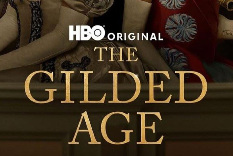
The Gilded Age Font What Font is The Gilded Age? The Gilded Age Font exudes timeless sophistication, much like the opulent era it represents. The typography used in the series logo is most likely Caslon Titling Std Regular by Monotype, a commercial font known for its elegant serifs and refined proportions. Its classical design reflects the grandeur and refinement of the late 19th century, making it a perfect fit for historical dramas and luxury branding.…

