Bank of America Font
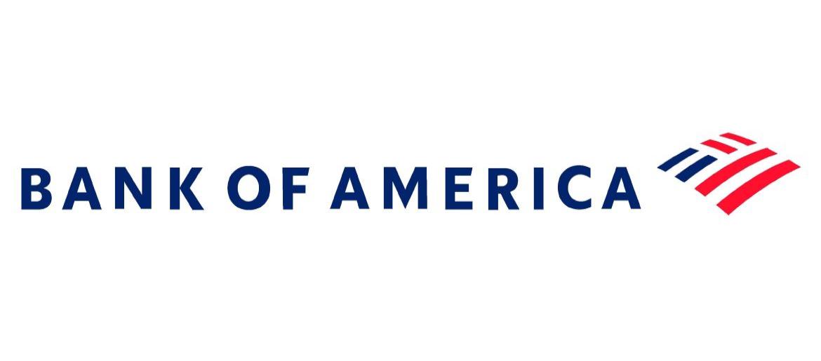
What Font is Bank of America?
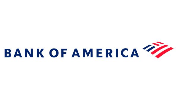
The Bank of America font seen in the 2025 branding update most closely matches Elisar DT Infant Bold, a commercial typeface designed by DTP Types. Its rounded terminals and balanced structure give the logo a modern, friendly, and highly legible look that aligns with the bank’s clean, customer-focused identity. Since Elisar DT Infant Bold is a premium font, we also found a free alternative that delivers a similarly smooth, approachable style—perfect for designers seeking a comparable option for personal or conceptual work.
Free Download Bank of America Font (alternative)
About Bank of America
Bank of America is one of the largest and most recognized financial institutions in the United States, tracing its origins back to the early 20th century. Known for its broad network of branches, digital banking innovations, and extensive financial services, the company serves millions of customers worldwide. Over the years, Bank of America has continued to evolve its branding to reflect trust, stability, and modern accessibility. The 2025 identity continues this direction, emphasizing clarity, approachability, and a more contemporary visual tone. Today, the bank remains a major force in global finance, offering everything from consumer banking and credit services to wealth management and corporate financial solutions.
Don’t miss these fonts: Kia Font, Hummer Font, Renault Font, GMC Font, and The Handmaiden Font — and more.
Please make sure to follow the license terms for each font. All fonts provided are free for personal use, while some may also allow commercial use. For details, check the included Read Me file with each download. If you’re uncertain about usage rights, we recommend contacting the font’s creator directly.

