

Slow Horses Font
What Font is Used in the Slow Horses Poster?
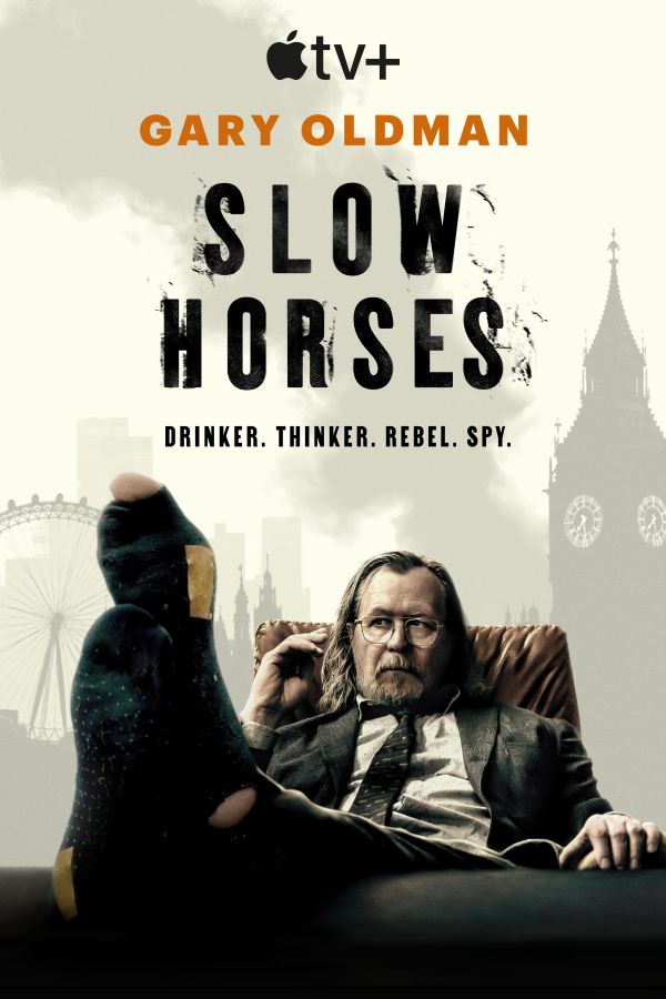
The Slow Horses font used in the Apple TV+ series title is most likely Kipp Clean No. 1, a premium typeface recognized for its bold, utilitarian design. Its sturdy letterforms and minimalist structure convey a sense of grit and realism, perfectly complementing the show’s tone of espionage, tension, and dark humor. However, we’ve found a free alternative font that closely mirrors the original design, making it a great choice for similar stylistic projects.
Free Download Slow Horses Font (similar)
About Slow Horses
Slow Horses is an Apple TV+ espionage drama that follows a group of British intelligence agents relegated to the “Slough House” department after career-ending mistakes. Led by the unorthodox Jackson Lamb, the series combines sharp wit with suspenseful storytelling. The strong, understated typography of its title aligns seamlessly with the show’s grounded and quietly intense atmosphere.
Since you’re already here, feel free to browse our FREE fonts collection for Sans Serif Fonts, 3D Fonts, Handwritten Fonts, Calligraphy Fonts as well as Cartoon Fonts and Rounded Fonts.
Please make sure to follow the license terms for each font. All fonts provided are free for personal use, while some may also allow commercial use. For details, check the included Read Me file with each download. If you’re uncertain about usage rights, we recommend contacting the font’s creator directly.


