Before Sunrise Font
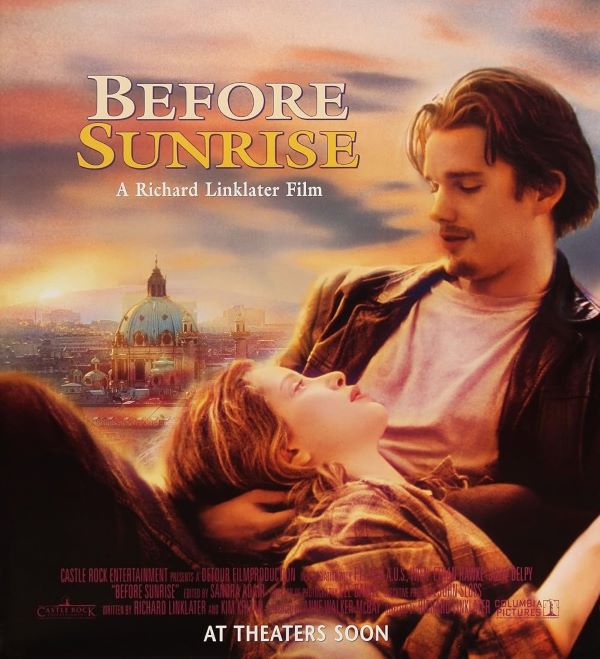
What Font is Used in the Before Sunrise Poster?
The Before Sunrise Font used in the film’s title design is most likely ITC Galliard Pro Bold, a premium serif typeface known for its romantic and timeless appeal. Its elegant curves and classic proportions perfectly complement the film’s gentle tone and emotional depth. This typeface beautifully conveys the sense of intimacy and fleeting connection that defines Before Sunrise.
I think the Before Sunrise Font captures the essence of the movie’s atmosphere—sophisticated yet natural, much like the spontaneous conversation between Jesse and Céline as they wander through Vienna. While ITC Galliard Pro Bold is a paid font, we’ve also found a free alternative that offers a very similar look, making it a great choice for fans who want to recreate the film’s warm and poetic aesthetic.
Free Download Before Sunrise Font (alternative)
About Before Sunrise
Before Sunrise (1995), directed by Richard Linklater, tells the story of two strangers who meet on a train and spend one unforgettable night together in Vienna. The film’s minimalist design and graceful typography perfectly mirror its heartfelt storytelling and quiet beauty.
Since you’re already here, feel free to browse our FREE fonts collection for Sans Serif Fonts, 3D Fonts, Handwritten Fonts, Calligraphy Fonts as well as Cartoon Fonts and Rounded Fonts.
Please make sure to follow the license terms for each font. All fonts provided are free for personal use, while some may also allow commercial use. For details, check the included Read Me file with each download. If you’re uncertain about usage rights, we recommend contacting the font’s creator directly.

