
Snickers Font
What Font is Used in the Snickers Logo?
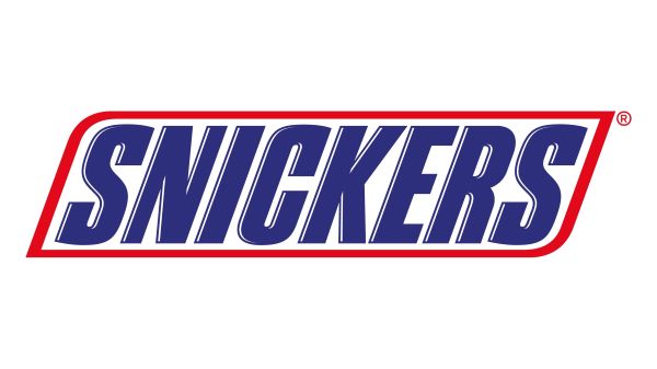
The Snickers Font used in the famous candy bar logo is Snickers Font designed by Samuel Park, a strong and industrial-style typeface that complements the brand’s bold personality. While the Snickers logotype has been slightly customized over time, it remains the closest match to its blocky, confident lettering.
The Snickers Font is bold, angular, and full of energy, which I think perfectly matches the brand’s identity. Its sharp edges and heavy weight give it an impactful, no-nonsense look that stands out on shelves. I think what makes this font special is its ability to communicate strength and satisfaction—just like the candy bar itself. It’s a font that doesn’t whisper; it shouts with confidence, making it memorable and instantly recognizable.
Free Download Snickers Font
About Snickers
Snickers, produced by Mars, Incorporated, was first introduced in 1930. Known for its mix of nougat, caramel, peanuts, and chocolate, it has become one of the best-selling candy bars worldwide. The Snickers Font reinforces the brand’s bold, satisfying image, making it as iconic as the bar’s unforgettable flavor.
Since you’re already here, feel free to browse our FREE fonts collection for Sans Serif Fonts, 3D Fonts, Handwritten Fonts, Calligraphy Fonts as well as Cartoon Fonts and Rounded Fonts.
Please make sure to follow the license terms for each font. All fonts provided are free for personal use, while some may also allow commercial use. For details, check the included Read Me file with each download. If you’re uncertain about usage rights, we recommend contacting the font’s creator directly.


