

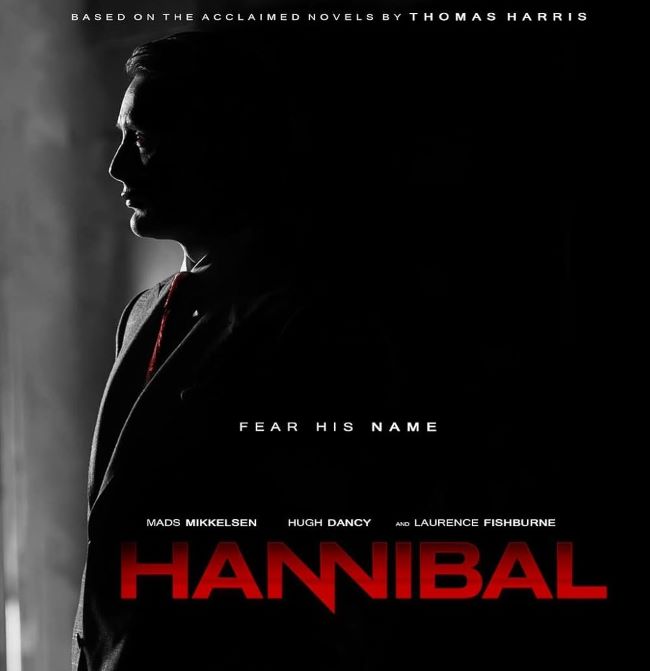
The Hannibal font gives off a chilling elegance that fits the series’ dark and sophisticated atmosphere perfectly. I think what fascinates me most about this font is how it blends sharp precision with a quiet, almost seductive style. Its clean, serif lettering feels refined and classy at first glance, but the subtle spacing and razor-like edges add an unsettling tension. I like how it looks beautiful and dangerous at the same time—just like the character of Hannibal Lecter himself. The font is probably Eagle font but take a look at the below alternative font for free.
Hannibal Font
Free Download Hannibal Font (Alternative)
From a design perspective, the Hannibal font thrives in minimalist layouts. Pairing it with deep reds, stark blacks, or muted grays enhances its sinister charm and makes the text feel both luxurious and menacing. It’s the kind of typeface that doesn’t need to shout; its quiet confidence carries a sense of dread all on its own.
Hannibal Tv Series
The series Hannibal explores the complex relationship between FBI investigator Will Graham and the brilliant yet terrifying Dr. Hannibal Lecter. Much like the font, the show is elegant, psychological, and unforgettable—drawing you in with beauty while hinting at something dark beneath the surface.
Since you’re already here, feel free to browse our FREE fonts collection for Fashion Fonts, Cinematic Fonts, Handwritten Fonts, Decorative Fonts as well as Sketch Fonts and Retro Fonts.
Please make sure to follow the license terms for each font. All fonts provided are free for personal use, while some may also allow commercial use. For details, check the included Read Me file with each download. If you’re uncertain about usage rights, we recommend contacting the font’s creator directly.


