

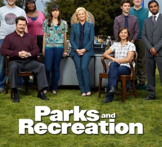
The Parks and Recreation font feels exactly like the show—friendly, approachable, and quietly hilarious. I think what I love most about this font is its clean, down-to-earth design. It’s simple and easy to read, but it still has a warm personality that makes you want to stick around. There’s something honest about it, like the font isn’t trying too hard, which perfectly matches the small-town charm of Pawnee. I like how it strikes a balance between professional and playful, making it just as fitting for a government sign as it is for a goofy flyer about waffles. Original font is Champion Gothic Heavyweight. You can also try the below alternative font.
Parks and Recreation Font
Free Download Parks and Recreation Font (Alternative)
From a design perspective, the Parks and Recreation font works beautifully in bright, cheerful layouts. Its smooth letters and steady spacing make it perfect for titles, posters, or anything that needs a touch of wholesome comedy. Pair it with sunny colors, and it instantly gives off that cozy Parks Department vibe.
The series Parks and Recreation is all about community, friendship, and relentless optimism. Much like the font, it’s warm, funny, and full of heart—proof that even the most ordinary designs (or towns) can be unexpectedly unforgettable.
Since you’re already here, feel free to browse our FREE fonts collection for Fashion Fonts, Cinematic Fonts, Handwritten Fonts, Decorative Fonts as well as Sketch Fonts and Retro Fonts.
Please make sure to follow the license terms for each font. All fonts provided are free for personal use, while some may also allow commercial use. For details, check the included Read Me file with each download. If you’re uncertain about usage rights, we recommend contacting the font’s creator directly.


