Train Dreams Font
The Train Dreams font carries a quiet, vintage charm that feels perfectly in tune with its name. I think what makes this font so compelling is its blend of old-world character and subtle modern refinement. Its slightly weathered serif style gives it the feeling of something pulled from a classic railway poster or an aged book cover, while clean letterforms keep it easy to read. I like how the Train Dreams font creates a mood of nostalgia and quiet reflection—ideal for book titles, period pieces, or designs that need a touch of timeless Americana. Train Dreams font is probably 1689 GLC Garamond Pro Italic.

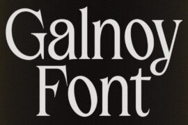
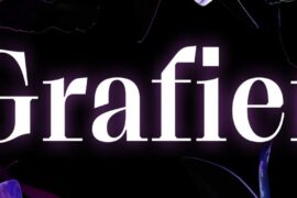
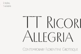
Download Train Dreams Font (Free Alternative 1 – Free Alternative 2)
Design-wise, the Train Dreams font works beautifully in settings where texture and atmosphere matter. Pairing it with earthy tones or muted photography really brings out its historical warmth, while its sturdy shapes keep it grounded and strong. It’s a typeface that invites you to slow down and take in the scenery, much like a long journey by train.
Inspired by Denis Johnson’s acclaimed novella, Train Dreams tells the poignant story of Robert Grainier, a logger and railroad worker whose ordinary life unfolds with surprising depth and quiet beauty amid the sweeping changes of early 20th-century America. Much like the font, it remains simple, timeless, and deeply unforgettable.
Since you’re already here, feel free to browse our FREE fonts collection for Fashion Fonts, Cinematic Fonts, Handwritten Fonts, Decorative Fonts as well as Sketch Fonts and Retro Fonts.
Please make sure to follow the license terms for each font. All fonts provided are free for personal use, while some may also allow commercial use. For details, check the included Read Me file with each download. If you’re uncertain about usage rights, we recommend contacting the font’s creator directly.

