
")
I love how the Tangerines font captures the quiet strength and humanity of Zaza Urushadze’s 2013 film Tangerines. The movie, set against the backdrop of war, tells a deeply personal story about compassion, survival, and the possibility of peace. The typography used in the title reflects that same simplicity—modest, understated, and yet full of meaning.
Tangerines Font
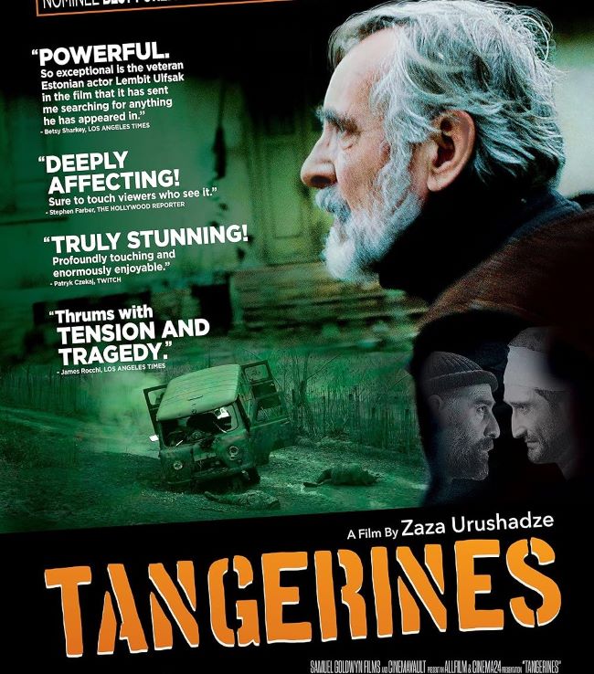
I think what makes the original Tangerines movie font (Aquacia Font) so compelling is that it doesn’t try to overwhelm. Much like the film itself, the lettering feels humble, almost fragile, but with a dignity that lingers long after you see it. Fonts that echo this aesthetic are usually clean serif styles or simple sans-serifs—such as Georgia, Garamond, or Helvetica—all of which share that balance of clarity and quiet presence.
I feel that the Tangerines font works because it mirrors the film’s themes of empathy and resilience. Just as the story reminds us that humanity can survive even in the darkest moments, the typography reflects a sense of honesty and sincerity. It’s the kind of font choice that doesn’t shout—it whispers, but you still hear it clearly.
To me, the Tangerines font is a reminder that sometimes the most powerful designs are the simplest ones, carrying their message with quiet conviction.
Since you’re already here, feel free to browse our FREE fonts collection for Sans Serif Fonts, 3D Fonts, Handwritten Fonts, Calligraphy Fonts as well as Cartoon Fonts and Rounded Fonts.
Please make sure to follow the license terms for each font. All fonts provided are free for personal use, while some may also allow commercial use. For details, check the included Read Me file with each download. If you’re uncertain about usage rights, we recommend contacting the font’s creator directly.


