

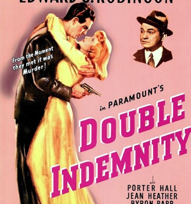
The Double Indemnity font embodies the tension, allure, and danger of classic film noir. Billy Wilder’s 1944 masterpiece is a story of betrayal, crime, and fatal attraction, and its typography reflects those same themes with bold, dramatic lettering. The film’s title design carries a sense of shadowy intrigue, instantly setting the tone for a tale where nothing is as it seems.
Double Indemnity Font
Download Double Indemnity Font (Alternative)
While there isn’t an official Double Indemnity font, designers often capture the same atmosphere using sharp serif or gothic-style typefaces. Font like Borghs Normal can be a choice to emulate that vintage, hard-edged noir look. Their weight and presence on the page recall the dark alleys, smoke-filled rooms, and tense encounters that define the genre.
The Double Indemnity font is more than just letters—it’s an invitation into the world of moral ambiguity and suspense. Its classic yet imposing style is perfect for projects that need to evoke mystery, drama, or an old-Hollywood crime aesthetic. From posters to book covers, this font style delivers a sense of intrigue that lingers, much like the film itself.
The Double Indemnity font remains a visual echo of noir’s golden age, reminding us that typography, like cinema, can pull you into a world of shadows and secrets.
Since you’re already here, feel free to browse our FREE fonts collection for Sans Serif Fonts, 3D Fonts, Handwritten Fonts, Calligraphy Fonts as well as Cartoon Fonts and Rounded Fonts.
Please make sure to follow the license terms for each font. All fonts provided are free for personal use, while some may also allow commercial use. For details, check the included Read Me file with each download. If you’re uncertain about usage rights, we recommend contacting the font’s creator directly.


