

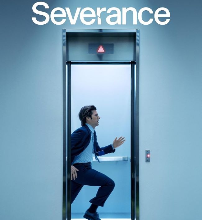
The Severance font is clean, modern, and unsettling in its simplicity—just like the series itself. The logo for Severance uses DIN 2014, a sans-serif typeface with geometric shapes and precise lines. Its straightforward, almost sterile design gives off a corporate and controlled feeling, which perfectly matches the eerie world of Lumon Industries.
Severance Font
Free Download Severance Font (Alternative)
What makes the Severance font (A custom typeface carefully crafted to closely resemble the style and appearance of Helvetica) so effective is its lack of decoration. There’s no flair, no dramatics—just cold, professional lettering that feels stripped of personality. That stark design choice reflects the show’s core theme: the separation of work and personal identity, and the unsettling consequences of that divide.
Severance explores the lives of employees who undergo a procedure to split their work and personal selves into two different consciousnesses. Much like the font, the show is precise, minimal, and quietly disturbing, drawing viewers into its strange, corporate nightmare.
Since you’re already here, feel free to browse our FREE fonts collection for Sans Serif Fonts, 3D Fonts, Handwritten Fonts, Calligraphy Fonts as well as Cartoon Fonts and Rounded Fonts.
Please make sure to follow the license terms for each font. All fonts provided are free for personal use, while some may also allow commercial use. For details, check the included Read Me file with each download. If you’re uncertain about usage rights, we recommend contacting the font’s creator directly.


