

South Park Font cracks me up every single time I see it because it looks like it was written by an actual fourth-grader with a crayon, which is honestly the most brilliant design choice ever. There’s something so wonderfully crude and childish about those wonky, hand-drawn letters that instantly puts me in the mood for some seriously inappropriate humor from Stan, Kyle, Cartman, and Kenny.
South Park Font
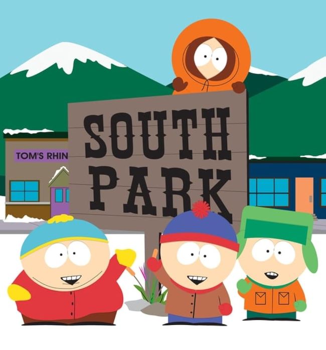
What I absolutely love about the South Park Font is how it perfectly matches the show’s whole “made by kids in a basement” aesthetic. The uneven, sketchy letterforms look like they were scribbled on construction paper during art class, but that’s exactly what makes them so genius. It’s like Trey Parker and Matt Stone said “let’s make our title card look as amateur as possible” and somehow created television gold.
I’m completely obsessed with how the South Park series has maintained this same font style for over 25 years. Every time those crooked letters appear on screen, I know I’m about to laugh until my sides hurt while simultaneously questioning everything about society.
What really gets me is how this font became the ultimate symbol of irreverent, no-holds-barred comedy. It’s beautifully ugly and perfectly imperfect. You can also check our free fonts collection.
Please make sure to follow the license terms for each font. All fonts provided are free for personal use, while some may also allow commercial use. For details, check the included Read Me file with each download. If you’re uncertain about usage rights, we recommend contacting the font’s creator directly.


