

I love how the Citizen Kane font perfectly matches the film’s larger-than-life presence. When I think of Citizen Kane (1941), Orson Welles’ masterpiece that changed cinema forever, I immediately picture bold, commanding typography that reflects the ambition and power of Charles Foster Kane himself. The lettering feels timeless, almost as if it carries the weight of history along with it. I couldn’t find the exact font but there is a font similar to Citizen Kane font which is Flying Leatherneck. (free for personal use)
Citizen Kane Font
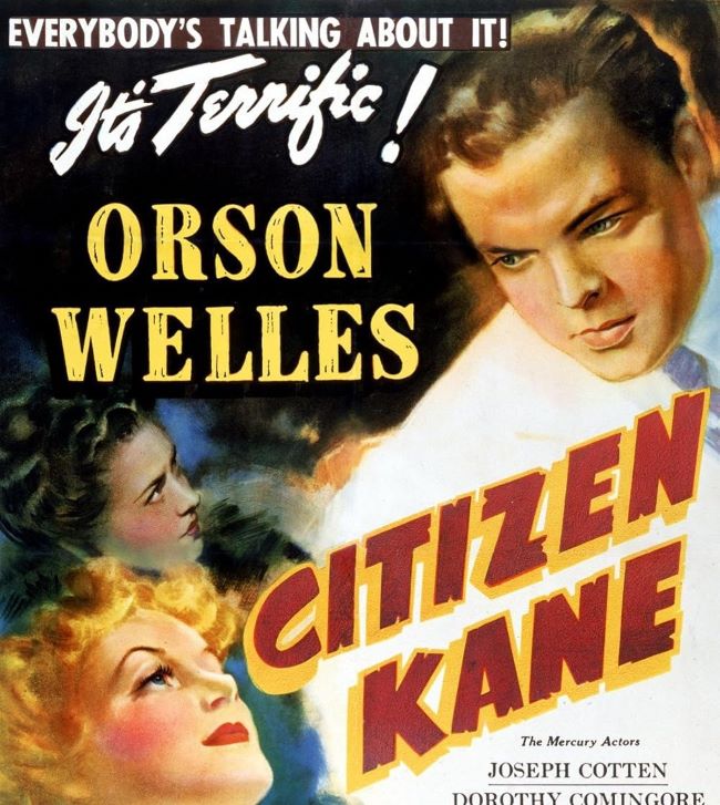
Free Download Citizen Kane Font (Alternative)
I think what makes the Citizen Kane font so fascinating is its balance between authority and elegance. Much like the film, it doesn’t rely on unnecessary decoration—it speaks directly, with confidence, and leaves a lasting impression. Fonts that capture a similar spirit include Times New Roman, Garamond, and Caslon, each carrying that same blend of classic sophistication and gravitas.
I feel the Citizen Kane font works because it mirrors the themes of the movie: ambition, legacy, and the unstoppable march of time. Just as Kane’s story is both personal and universal, the typography has a presence that feels intimate yet grand. If you’re working on a project that needs to communicate importance, tradition, or dramatic storytelling, this style is a perfect choice.
For me, the Citizen Kane font is more than just type—it’s part of why the film’s image is burned into our cultural memory. It reminds us that great stories, and great design, never lose their impact. You can also check our free fonts collection.
Please make sure to follow the license terms for each font. All fonts provided are free for personal use, while some may also allow commercial use. For details, check the included Read Me file with each download. If you’re uncertain about usage rights, we recommend contacting the font’s creator directly.


