

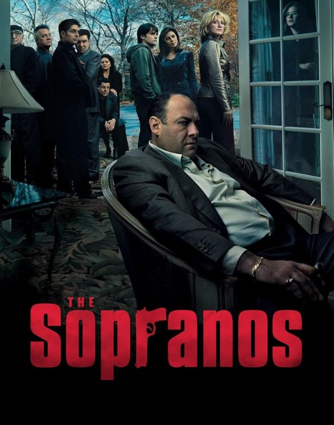
I’m completely fascinated by how The Sopranos Font perfectly encapsulates the gritty authenticity of HBO’s groundbreaking drama series. There’s something incredibly powerful about how this typeface manages to feel both street-smart and sophisticated, just like Tony Soprano himself.
The Sopranos Font
Free Download The Sopranos Font
What I absolutely love about The Sopranos Font is its bold, condensed design that screams New Jersey attitude without being overly flashy. I find it remarkable how the typography captures the show’s blue-collar roots while maintaining enough elegance to represent the complex psychological depths of its characters. The slightly weathered appearance gives it that lived-in quality that I think perfectly matches the series’ realistic portrayal of mob life.
I really appreciate how The Sopranos series revolutionized television drama, and this font choice was integral to that success. The typography worked seamlessly with the show’s opening sequence, featuring those iconic New Jersey locations that I still remember vividly today.
What I find most impressive is how The Sopranos Font influenced crime drama branding for decades afterward. I’ve noticed countless shows trying to recreate that same authentic, working-class aesthetic through similar typographic choices. It’s amazing how a font can become so synonymous with quality storytelling and cultural impact. You can also check our free fonts collection.
Please make sure to follow the license terms for each font. All fonts provided are free for personal use, while some may also allow commercial use. For details, check the included Read Me file with each download. If you’re uncertain about usage rights, we recommend contacting the font’s creator directly.


