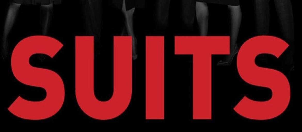
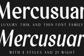
Suits Font is seriously one of those typography choices that just screams “I’ve got my life together” in the best possible way. Like, every time I see those sleek, sharp letters, I immediately want to put on my nicest blazer and pretend I’m closing million-dollar deals in Manhattan, you know?
Suits Font
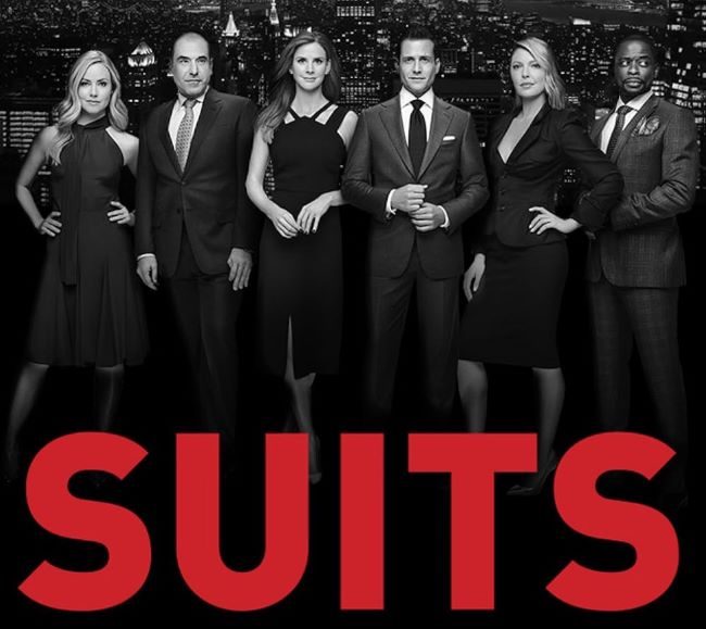
What absolutely kills me about the Suits Font is how it perfectly matches Harvey’s whole vibe – confident, sharp, and just the right amount of show-offy without being tacky. The clean lines and sophisticated spacing make me think of expensive letterhead and corner offices with killer city views. It’s like the font equivalent of a perfectly tailored Tom Ford suit.
I’m totally obsessed with how the Suits series nailed every single detail, and this font choice was honestly genius. It sets the tone before you even meet Harvey and Mike – you already know you’re in for some serious legal drama with characters who don’t mess around.
What really gets me excited is spotting similar fonts in legal dramas now. Everyone’s trying to capture that same “I’m successful and dangerous” energy that the Suits Font delivers so effortlessly. It’s become the gold standard for any show wanting to look professional and intimidating at once! You can also check our free fonts collection.
Please make sure to follow the license terms for each font. All fonts provided are free for personal use, while some may also allow commercial use. For details, check the included Read Me file with each download. If you’re uncertain about usage rights, we recommend contacting the font’s creator directly.

