

The Wizard of Oz font captures the enchanting, timeless magic of one of cinema’s most beloved classics. In the film’s posters and promotional artwork, the typography leans into bold, whimsical lettering that reflects both fantasy and adventure. The Wizard of Oz font feels playful yet iconic, embodying the wonder of Dorothy’s journey from Kansas to the vibrant world of Oz.
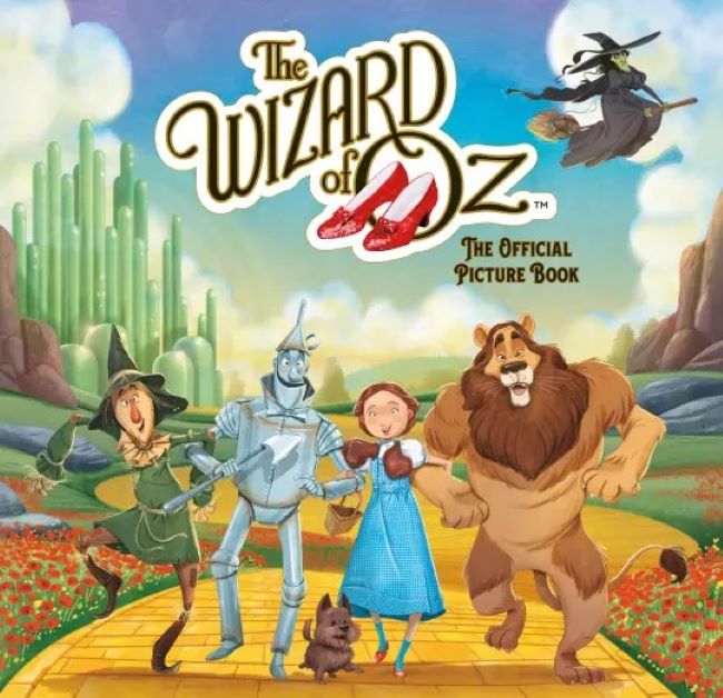
The Wizard Of Oz Font (book)
Download The Wizard Of Oz Font
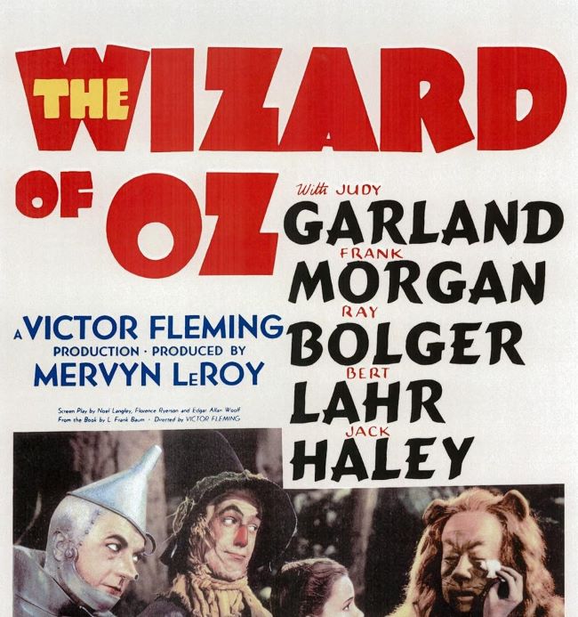
The Wizard Of Oz Font (movie)
Download The Wizard Of Oz Font (Alternative 1 – Alternative 2)
Fonts that echo this style often carry a whimsical or vintage touch. Typefaces such as ITC Cheltenham, Bookman Old Style, or even decorative retro display fonts can evoke the same sense of charm. Their slightly theatrical curves and bold strokes bring out the fantasy element that makes the Wizard of Oz font so memorable.
What I love about the Wizard of Oz font is how it balances nostalgia with imagination. It doesn’t try to be overly formal—it invites you in, much like the yellow brick road does, guiding viewers toward a world of color, curiosity, and dreams. Typography here becomes part of the magic, an entryway into the story itself.
The Wizard of Oz font captures both wonder and nostalgia, making it a timeless representation of storytelling’s ability to transport us into another world. You can also check our free fonts collection.


