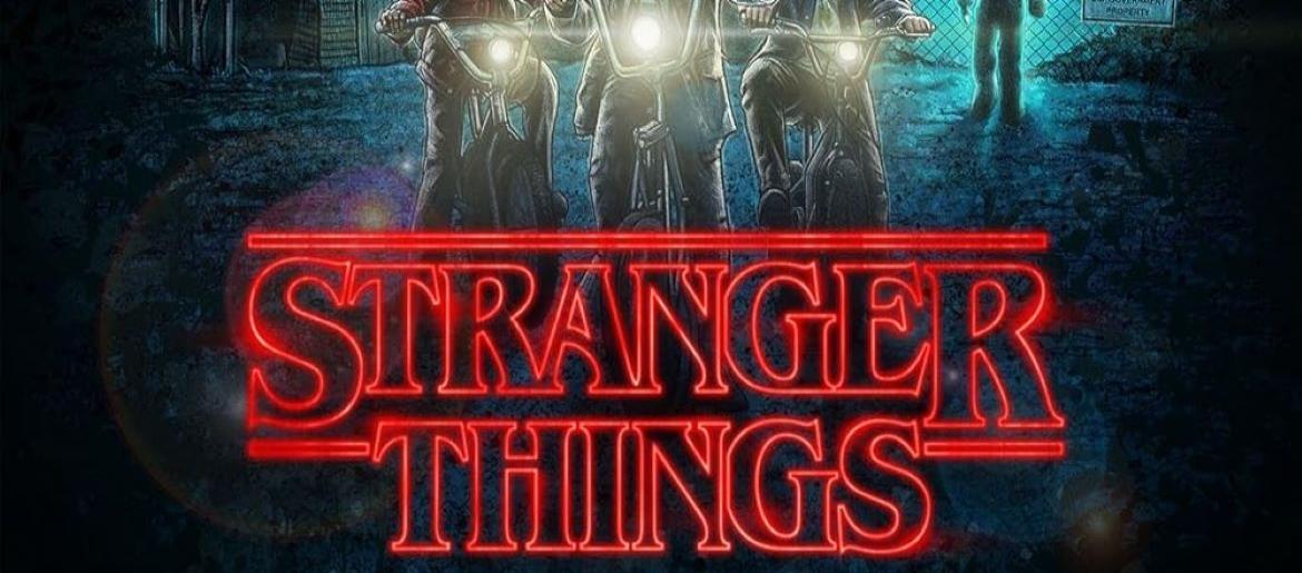
I like the Stranger Things font because it instantly transports me back to the 1980s, with its retro, horror-inspired style that perfectly matches the show’s nostalgic yet eerie vibe.
Stranger Things Font
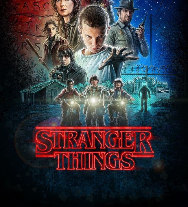
Download Stranger Things Font (ST Font – OUTLINED version)
The title of the web TV series uses ITC Benguiat Bold Condensed. This typeface was designed by Ed Benguiat in 1977 for the International Typeface Corporation. I think the bold serif lettering, combined with its dramatic spacing and shadowed effect, creates a sense of suspense and mystery, making it ideal for capturing the supernatural feel of Hawkins, Indiana. I like how the font is both simple and striking, allowing it to be memorable while setting the tone for the show’s thrilling adventures.
I think Stranger Things is a modern TV phenomenon that blends supernatural horror, friendship, and 80s nostalgia in a way few series have. It follows a group of kids uncovering dark secrets in their small town, balancing suspense, heartfelt moments, and unforgettable characters. I like that the show keeps viewers on edge while also celebrating the charm and quirks of its era, making it a true cultural icon.

