

I like the Sherlock font because it feels modern, sharp, and clever—just like the series itself. I think its clean, sans-serif style gives off an intellectual and contemporary vibe, perfectly matching the fast-paced, analytical world of Sherlock Holmes in the 21st century.
Sherlock Font
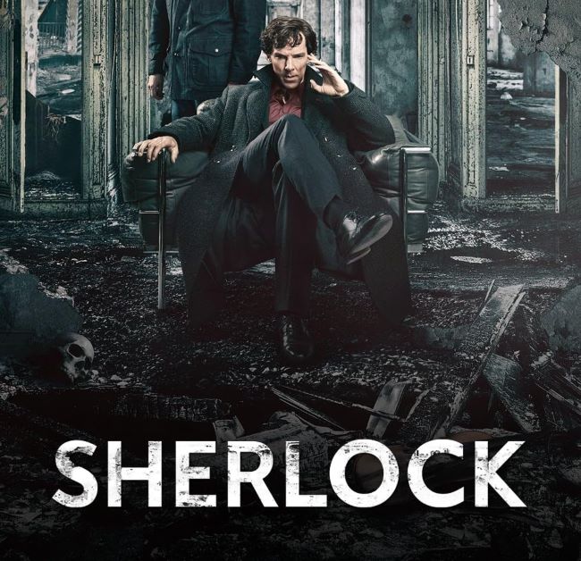
I like how minimal yet bold it looks, creating a sense of sophistication while leaving room for mystery. I think the Sherlock font works so well because it reflects both logic and intrigue, qualities that define the famous detective’s character.
I like that Sherlock, the BBC series starring Benedict Cumberbatch and Martin Freeman, reimagined the classic stories in a smart, modern way. I think the show’s mix of suspense, humor, and clever storytelling made it stand out as one of the best adaptations of Holmes. I like how it keeps the spirit of Sir Arthur Conan Doyle’s original work alive while adding a fresh twist for today’s audience. You can also check our free fonts collection.
Please make sure to follow the license terms for each font. All fonts provided are free for personal use, while some may also allow commercial use. For details, check the included Read Me file with each download. If you’re uncertain about usage rights, we recommend contacting the font’s creator directly.


